Search This Blog

Tuesday, 10 February 2015

RAS Exhibition


Retford is a small market town and it doesn't have an art gallery.  The Art Society Exhibition before Christmas was held in a Church and figure drawing pieces were not permitted.

However, just as I am embarking on Figure Drawing the Art Society is holding its annual Life Class Exhibition in Bassetlaw Museum.  There is dedicated gallery space so the lighting is good but I'm afraid that being small many of the paintings were a little high for me.

The exhibition showed the nude in a variety of styles and media and I was able to take photographs of what I liked best. When I got home I realised that out of all the coloured images I could have taken I'd actually taken none.  These were my favourites.   I seem to have unconsciously chosen modest poses. 


Seated Nude - Ann Everitt
Line and wash

This resonates with my current tasks.  It is line and wash and also has some contextual fabric which at the moment I'm finding hard to draw.  I particularly like the tones of the wash as they show the definition of muscle (the arm) and the way the skin folds as the model is slightly bent. I have tried using an ink wash and found there was little room for manoeuvre if things go wrong.  It is a very spare image but very sensitive.


Life Drawing 1 (Male) - Michael King
Charcoal and chalk

I like this pose because it has lots of shapes that give long sweeping lines - the back is a case in point. However, the image owes as much to tone as line. The chalk highlights are very pronounced and I think this sits well with the general darkness of the picture. The darkness of the outlines varies throughout the drawing from dark to almost not there at all.  The background is indeterminate but indicated in charcoal in three ways, straight sweeps, a hatching and the model is on a scribbly seat. This gives additional interest.

Life Drawing Kim - Michael King
Charcoal

The torso of "Kim" is also by Michael King.  This time he uses the paper as his way of indicating the highlights and charcoal to show the shadows - it's an altogether lighter picture than the one above.   There is some darkness around Kim's right shoulder and this adds both definition and interest,  There is almost the same tone under the right arm leaving just a sliver of highlight on the top.  I'm wary about getting things too dark but this shows that it works.

I've looked closely at the marks that King makes for the hair because it's very textural.  The male model has very short hair and this is shown with short, even marks of different densities.  The skull can be seen below the hair.  I think I know what it feels like.


Kim's hair is different, a little longer but springy and ruffled probably with some gel on.  I think this because of the spikiness shown with dark uneven marks.


Pensive - Sally Telfer
Ink and pencil

Even if I didn't know this drawing is called "Pensive" that's what I would have called it.  Somehow it just gets the mood.  Maybe it's the uncertainty of the washes (I'm sure intentionally) and the way it is cropped.  There are no indications of creases in the skin and the image looks smooth.  The context is not distracting; just a square cushion briefly sketched in.  I am drawn in by his thoughfulness.


After the Shower - Margaret Presley
Pen and ink

 "After the Shower" is different to the other images I have chosen.  It is far less textural, almost like an illustration.  Although the hair is a few curvy lines somehow I know it is damp.  Even being so insubstantial it evokes a mood of  repose and some wistfulness.   The context here is the couch which is drawn with the same precision and emphasis as the figure. I wish I could be so accurate with ink.

This is a lovely exhibition and I've probably not done it justice.  I seem to have chosen from the heart instead of looking more widely at what was shown.  Whilst I have been doing Drawing 1 I have involved myself in various art activities locally and been amazed at how much talent there is even in a small market town.  Who knows I might even exhibit in next years show! 

Monday, 9 February 2015

Part 4 Research Point 1


I feel that I would like to put figure drawing into some sort of historical context so I'm planning to look at the nude study as it has developed over time.

I have taken much of my information from http://www.visual-arts-cork.com/genres/female-nudes-art-history.htm
as it is concise but gives me pointers for further investigation.

Nakedness is an ever present condition for human beings and is dependent on the climate, circumstances, beliefs and culture of a given particular society.

The nude has been a recurrent theme in art ever since man started to draw.  The nude had a place in cave drawings, ancient Greek art, Roman art and more recently European art.  The depiction of the nude tends to follow the social mores of the geographical area and the era.  As society changes so do the norms.


Carving showing the story of the Ramayana at Borobudur, Java
My photo

I took the above photo in Java at the archaeological site at Borobudur. Borobudur is a 9th century Mahayana Buddist Temple complex and all around the largest building is carved the story of the Ramayana.  There are many nudes and explicit sexual images in what is a site of religious devotion.


The Greeks and Romans accepted nudity as a fact of life and were not worried by it.  The Greeks particularly revered the naked male body. Sportsmen competed unclad and the gymnasium was literally "a place to be naked".   Statues and paintings of nudes were usually of gods and goddesses or famous athletes. (1)  Attitudes to female nakedness were quite different and for many centuries women were portrayed clothed.  Thereafter depictions of women were usually idealised and had strategically placed covering for modesty.  They were aesthetically beautiful and intended to be gazed on. (2)

In Byzantine art the naked female figure rarely seen.  If it is seen it is to depict shame, guilt or smutty humour.  The image of a barely clad Christ at his Crucifixion is prevalent and aims to show suffering. There was a hardening of attitudes towards the nude because of its association with paganism.

This hardening of attitudes was reinforced in the Middle Ages.  While art of all kinds flourished the nude became sinful and pinned firmly at the door of Adam and Eve.  In a curious twist the naked female was sometimes depicted in Church art to indicated the purity of the virgin.  There is a celebrated carving by Gregor Erhart (c.1470-1540) showing a serene and undoubtedly pure (?) Mary Magdalene.


St Mary Magdalene - Gregor  Erhart (1510)
Wood carving (2)


In the Renaissance there was a cultural shift and attitudes to the nude changed again.  This time the perfection of the proportion of the Greeks gave way to depictions of sensuality and voluptuousness. In fact the Church became concerned that things were getting out of hand and they tried to call a halt to what they saw as licentious and depraved.

From this time we have images like Susanna and the Elders by Tintoretto (1555).


Susannah and the Elders - Tintoretto (1555) (3)


Tintoretto's painting shows a Bible story where the pure (and naked) Susanna is threatened by  older men and she is unaware of them.  The clothed men are barely discernible in the bushes and the focus is firmly on Susannah as she completes her bath.  We are witnesses and voyeurs.


Titian's Venus of Urbino is instantly recognisable as the archetypal reclining nude.  This image is so different - the self absorption of  Tintoretto's Susannah is replaced by open sensuality in Titian's painting.


Venus of Urbino - Titian (1538) (2)


Itself an interpretation of the work of Giorgione (1510) Venus of Urbino has been re-interpreted many times by artists like Manet who based Olympia on it in 1863.


In Baroque art figure drawing was seen as the way to learn to draw and academies were set up for the purpose.  Rubens set great store by drawing and in some of his paintings he only took responsibility for the "hard" bits like faces and hands because he was so good at it.  The Three Graces is a painting everyone knows.  There are several versions but the one we know so well is one of his later paintings.


The Three Graces - Rubens (1639) (4)


The painting gives the opportunity for three studies all from different angles and they seems to have a really good relationship with each other.  There is no attempt to hide parts of the body that had previously been (sometimes awkwardly) covered.


Interestingly Rubens also painted Susannah and the Elders (1607) but in his version Susannah is being openly threatened and looks afraid.


Susannah and the Elders - Rubens (1605) (5)


As time went on the nude stayed high on the agenda and became more sensual and suggestive. The French Rococo style gave us paintings like Jupiter and Antiope by Watteau.


Jupiter and Antiope - Watteau (1714-1719) (6)


In this painting the sleeping Antiope is clearly the object of Jupiter's lustful gaze - he is even lifting the cover to peer at her more closely.  It is very suggestive of the coarse and dark having power over the pale and vulnerable.  Society must have changed to allow such a depiction.

At this time there was something of a return to the classical style of the Greek style. Maybe it was some sort of denial about the more explicit nature of other work.


Venus, English -   Joseph Nollekens (1773) (7)


In this statue there is much more of a distance between the viewer and the model.  There is no obvious story and no emotion.

During the 19th century the nude was painted by many artists but the styles varied considerably. Whilst most nudes were shown  modestly La maja denudan by Goya pushed the boundaries into something quite new.  The model unapologetically  makes eye contact with the viewer and for the first time pubic hair is shown with no negative intention.


La maja desnuda - Goya (1800) (8)


This image upset the Church and titillated the public.

This is the point at which Manet painted Olympia (1863).  Remember Titian?  This is rather less coy.


Olympia - Manet (1863)


La Sommeil by Courbet (1866) shows two women lying entwined the inference being they have just made love.  This really was going too far and the image caused a scandal and became the subject of a police report.  It was not permitted to be shown publicly until 1988.


La Sommeil by Courbet (1866) (9)


Undaunted, the same year Courbet painted L'Origine du monde which is a close up view of the genital area and stomach of a woman.

We are steadily moving towards a discussion about the place of sensuality and eroticism in art and more specifically when it becomes pornography.  Interestingly the image of a pubescent girl by Munch (Puberty, 1893) is probably more unacceptable today than when it was painted.  The voyeur is well provided for with these paintings.

During the 20th century the nude kept pace with the rapid changes that all art confronted.  Cezanne, Picasso and  Klimt all painted the female nude. 


Nude Woman in a Red Chair - Picasso (1932)


Balthus continued the tradition of pushing the boundaries with The Guitar Lesson (1934) which graphically depicted child abuse. 


How does all this apply to me I wonder?  Over the last few weeks I have become familiar with some contemporary painters who follow the tradition of using nude models.  They all owe something to what went before.


Augustus John (1878-1961)

Two Nude Studies - Augustus John (1920-26) (10)


John might not be exactly contemporary but these are very serious drawings and the sorts of studies I have the opportunity to do at my figure drawing group.  Sometimes I have to concentrate on proportion and have plenty of time but at other times I have to draw in a  fast gestural way.


Ramon Kelley (b 1939)

Ramon Kelley - pastel  (11)


Kelley is an American/Mexican artist. I aspire to his use of pastel blends in his background. They are exuberant and interesting. However, he uses his pastels very differently in his figure; it is very considered, the tones are more subtle and emphasise the softness of the skin and the roundness of the limbs. Lovely.


John Wonnacott (b 1940)


Watching the Beautiful Women - John Wonnacott  (12)


In this painting the model is being watched through a mirror.  We see her with her head turned away yet looking at us as well.  The surroundings are a large part of the context and give us a lot of information.  They are almost as important as the figure.


Ken Howard (b 1932)


Ken Howard (13)


Ken Howard is a Cornwall based artist who is renowned for his figure drawing.  In this painting we know clearly that the model is in a studio but she is undoubtedly the central point of interest with little distraction from other information.

This has been something of a whistle stop tour of the nude in history.  I can see a process of development and then years of regression as society changed.  It has been important for me to make the link with my own work but I have some serious questions to ask myself about the art versus pornography/abuse debate.


(1) http://en.wikipedia.org/wiki/Depictions_of_nudity

(2) http://www.visual-arts-cork.com/genres/female-nudes-art-history.htm

(3)  http://www.wikiart.org/en/tintoretto/susanna-and-the-elders

(4) http://www.peterpaulrubens.net/the-three-graces.jsp

(5) http://en.wikipedia.org/wiki/Susanna_and_the_Elders_(Rubens)

(6) http://en.wikipedia.org/wiki/Jupiter_and_Antiope_(Watteau)

(7) http://www.getty.edu/art/collection/objects/1157/joseph-nollekens-venus-english-1773/

(8)  http://en.wikipedia.org/wiki/La_maja_desnuda

(9) http://en.wikipedia.org/wiki/L%27Origine_du_monde

(10)  http://www.tate.org.uk/art/artworks/john-two-nude-studies-n05299

(11http://www.kelleyfamilyfineart.com/Ramon1.htm

(12)  http://www.nua.ac.uk/

(13) http://www.redraggallery.co.uk/

Sunday, 1 February 2015

Part 3 Reflections

Demonstration of technical and visual skills

Observation is key to good drawing and I've sometimes found these skills sadly lacking.  When I've been drawing outdoors I've sometimes not put in enough detail to carry me through the development of my work.    It's to do with confident selection of content and I think this will probably come with experience. I always have photographic back up but at times this has led me up blind alleys by giving me more information than I actually need.  Gainsborough Old Hall is a case in point where I zoomed in to the window and there was no need. 

It has taken some time for me to be able to apply the rules of perspective to my work; particularly 3 point perspective.  My eyes and brain constantly deceive me.  However, I'm getting better at sorting it out quickly rather than having to work it through laboriously .


Quality of outcome

Because I started this course from a low base I can't help but be pleased and proud with what I've achieved.  However, I find it hard to integrate all my learning (I note I said this at the end of Part 2 as well).  An example from Part 3 would be overlooking composition when my focus is perspective.

I have a tendency to get too involved with detail and ignore the mark that will indicate my meaning.

I have found tone difficult in my outdoor work and there's a long way to go with using it confidently.


Demonstration of creativity

I have the desire to be creative but often not the technical skill to achieve my aspirations.  Assignment 3 is a case in point.  I really wanted to test myself with watercolours but ended up so frustrated that I abandoned it in favour of charcoal.  Sometimes my lack of experience is a great hindrance but in some ways it can be liberating as I can try things without baggage; for instance drawing sheds with bits of card.  It might not have worked so well this time but another time it might.


Context reflection

I have tried to use the work of contemporary artists both to develop my thinking and learn from. I find that some work (like that of John Virtue) can be hard to understand but falls into place as my knowledge increases.  I used my research to inform my thinking about Assignment 3.

I am trying to be more analytical in my approach and trying to tease out what is relevant to my own work.

General

I have struggled with outdoor work because of the season. I have arthritis which adds to the difficulty - getting cold can make me quite ill. But in an odd sort of way I loved sketching outdoors and this is something I will pursue as the summer approaches.  I find my quick sketches are often more pleasing to me than the work I develop from them.  It's a freedom that I seem to lose once I'm "trying hard" to be creative.  Some of the content of Part 3 relies on practising theory and maybe that has got in my way a bit and stopped me being free.

I've been going to a Figure Drawing Group where speed is often of the essence and been amazed at the feeling that can be captured in just a few short minutes.  It seems that things can easily be overworked.


Part 3 - Assignment 3 - Final piece

I've been pretty frustrated about my success rate for Assignment 3 so I'm changing everything in the hope that I can kick start myself into a decent piece of work that feels satisfying.  I need to stop messing about and just get on with it.  Have I wasted my time with the water colour I wonder? Maybe not from an experimental point of view but certainly I have when I've an assignment to complete. 

I'm returning to the sketch I did of the Tumbledown Shed in Treswell Wood.  First there was an outdoor sketch and then a drawing completed at home.


Initial sketch of Tumbledown Shed


Drawing 1 of Tumbledown Shed

Having made the decision to pursue this I had one or two thoughts


  • my tonal work wasn't wasn't good enough
  • the foreground tree saplings looked as though they were crossing out the shed
  • the large trees were ill defined so lost their impact (another tonal problem)


I set about working on the drawing adding dark tones and lightening up the pale areas.  While I was doing this the foreground saplings reduced in impact a bit.

This is where I ended up:

Tumbledown Shed with more definition

I think this is much improved by the additional tones and I'm going to use it to base my assignment on.

I had another go at watercolour but produced a piece of work my tutor will never see!  It can join the pastel I've not owned up to! 

I usually try to challenge myself (hence the water colour attempts) but an artist friend suggested that as I was working on an Assignment I should work with what I feel most comfortable with so I'm going to use graphite and charcoal. 

I have suitable A2 paper which is a bonus.

I have spent some time looking at the mark making of famous artists like van Gogh, Nicholas Herbert and Turner.  So I turned back to that work for a refresher before I began.

This work went well and I enjoyed every minute.  I can see where it might be better but generally I feel that the medium has suited the subject and that I have managed to make a wide variety of marks and tones.  There came a point towards the end where I felt I needed to stop introducing new elements for fear of making it too fussy.  For this reason the foreground logs disappeared.


The Tumbledown shed in Treswell Wood
Charcoal and graphite


Saturday, 24 January 2015

Part 3 - Assignment 3a


I've decided to make my final piece of work for Part 3 a development of the Open Shelter and Sheds drawing from the previous post.


I want to introduce some colour but I think that to try a water colour might be too complex for my skill level.  After drawing in my initial pencil shapes I'm going to try a mixture of techniques:


  1. water colour wash for the sky (raw sienna and aquamarine blue)
  2. stippled trees in background (pale payne's grey) wet on wet
  3. water colour wash for the ground
  4. removal of any unwanted colour inside sheds (should be minimal)
  5. more prominent trees water colour (payne's grey)
  6. card strips for the shed detail (peat brown Indian ink) 
  7. card strips for the logs in the undergrowth
  8. blown ink for the undergrowth
  9. swishy marks with filbert brush for the lane

Some of these things need a bit of sampling 2, 8 and 9 most definitely.  I would like to be a bit flamboyant with the undergrowth but it depends on how it looks when I get there.

I know my course notes say I should use A2 or A1 paper but as I want to use water colour as a way to indicate distance I'm using Bockingford paper that's A3 because that's what I have.  I began with my washes. 

  • Sky - I immediately knew that the sky needs less (if any) raw sienna.
  • Lane - I had a practice at the lane on scrap Bockingford and was happy but when I did it for real the paper was too wet and I didn't get the texture right.  Later I tried lifting out some paint but it didn't give me what I wanted either. 
  • Background - I didn't put in enough background bushes in the distance or the foreground.  


At this early stage I decided that this would be a trial.  

Assignment 3 (1)

Once I had decided this I did no more practice runs.


  • Sheds - I used ink for the sheds as planned but I think thick, dark payne's grey might be preferable.  
  • Trees - I like the foreground trees but with reservations.  They are well placed but I could do with another one above the long shed.  They are also a little on the yellow side.  I used raw sienna as the highlight and then introduced payne's grey but could have done with a little more.
  • I'm reasonably happy with the buildings except for the corrugated tin on the roof of the long shed - the angle is so wrong and I knew it was the minute I applied the ink.
  • I need to develop the undergrowth a bit but in principle it's done what I wanted.  I found the ink didn't travel as well on the bumpy paper, it dried quicker so it didn't mix as well as on my earlier trial. 


Next time:

  • Sky - blue only
  • Lane - more texture with drier paper
  • Background - more bushes
  • Sheds - payne's grey watercolour, watch the angles
  • Trees - more paynes grey on trunks, raw sienna for highlights only, additional tree
  • Undergrowth - try water colour


Assignment 3 (2)


The changes I made are largely for the better:


  • it's less yellow
  • there are more bushes
  • the grey sheds are a bit more definite and the corrugated roof looks better
  • the water colour undergrowth blew better but is more effective on the right than the left.
  • the background trees


There are things I could change:

  • the additional tree is too chunky and probably too central
  • the lane is now a bit wishy washy
  • work the middle ground trees up a bit


I'm going to live with it for a day or two before I commit myself to it being fully fledged Assignment 3.

I returned to this and thought it was awful.  This happens sometimes - I get so tied up in what I'm doing I lose objectivity and it takes some time before I regain it.  What's wrong?  Lots.

  • the style of the foreground trees is wrong for the style of the sheds and undergrowth
  • the sheds don't look an intrinsic part of the scene
  • the background trees look like sticks because of my technique (card)
  • my perspective just isn't right.


Considering how exasperated I feel about this work I'm going leave it and relook at the Tumbledown Shed drawing and hope it poses less problems and that this experience will be a learning point.

Sunday, 18 January 2015

Part 3 - Assignment 3 - Drawing undergrowth


I'm going to look at how established artists have rendered undergrowth so that I can think about it in the context of Treswell Wood.

Nicholas Herbert


Herbert draws landscapes of the Chiltern Hills.  I'm unfamiliar with this part of the country but initially my feeling was that undergrowth is undergrowth.  How wrong can you be?  When I looked at Herbert's work it was so very different to what I need.


From the Chiltern Hills series - Nicholas Herbert  (1)


Here I see swaying grass but what I need is bramble, scrubby hawthorn, honeysuckle and clematis, all of which is looking pretty dead at the moment.


Treswell undergrowth


Frederick Sandys 1829-1904


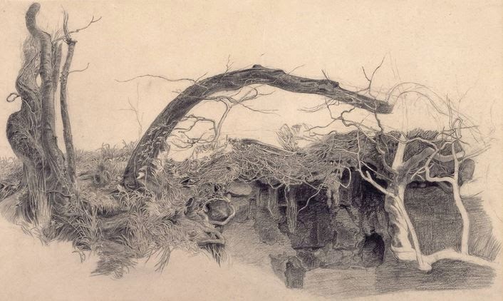
Sandys did a very detailed study of tree roots and undergrowth but it's too grassy for me.


Study of Trees and Undergrowth - Frederick Sandys. 1855?
Graphite on paper (2)

Vincent van Gogh


Wild Vegetation in the Mountains - van Gogh 1889
Reed pen, brown ink  (3)


This is getting closer to what I'm trying to achieve.  There are lots of different marks; small round ones, dashes and different groupings of the marks.  Nothing is really identifiable but but the effect is random and disordered.  If I was to try something like this I'd need to draw less round marks and introduce some longer ones.


Lesley Hicks


Hicks work is getting closer to what I want.  It has the feeling of interlocking vegetation of lots of different kinds.


Undergrowth Campsite Porto - Lesley Hicks. 2009
Pencil on paper (4)


Close up it looks almost like stitches (4)


I'll be trying to figure out a way to amalgamate some of these styles and integrate some of the work I tried with unusual materials in the last post.


This is a sample up of the undergrowth I need to achieve:


I need to identify the colours


It's difficult to sort out the colours in this photo as at first glance they appear neutral with pale and green highlights. On closer inspection the colours I think I can see are dark purple, several shades of green, blue, white, yellow and grey.  It looks as though Lesley Hicks drew what she saw but it makes me think that there's a fair degree of license to be creative here.

I think the packaging (last post) for long grass might be really useful and, although I didn't try it, wool dipped in ink might make good trailing plants.  I'm also going to try blowing some ink and see if that trails.


I just chose colours at random but with hindsight I should have used the ones I identified from my photo.

Blowing Indian ink - black, peat brown and purple
Greyscale


I found I could influence the way the ink flowed considerably so it's feasible to use this method as undergrowth.  It has a lovely tangled feel.  I used black, peat brown and purple so that I could see how well they mixed.


Inky undergrowth detail showing considerable mixing


I tried ink soaked wool with less success:


Double knitting wool
Quink ink

Throwing the yarn at the paper


I tried adding this technique to the blown ink:


It made quite large marks that were very different to the drops I applied before.  They had very little movement so I blew them.  There was no mixing because the first 3 colours were already dry. This adds another dimension but there's too much green. I found the Quink and the green Indian ink worked differently when applied in this way.  The Quink made much more dynamic marks.


Unfortunately this looks rather like Treswell Wood at the height of summer - it's the purple that does it aided and abetted by the very bright green.


(1)  https://nicholasherbert.wordpress.com/

(2) http://www.tate.org.uk/art/artworks/sandys-study-of-trees-and-undergrowth-t00685

(3) http://www.vangoghgallery.com/catalog/Drawing/1727/Wild-Vegetation-in-the-Mountains.html

(4) http://www.lesleyhicks.com/Individual/Drawings/Undergrowth_Campsite_Porto.htm


Saturday, 17 January 2015

Part 3 - Assignment 3

I have some freedom to decide what to do for this assignment but there is some guidance.


  • an outdoor scene that includes natural vegetation
  • use linear perspective
  • take the opportunity to draw straight line objects like fences or buildings


I have to make preliminary sketches and experiment with composition and then try out a variety of media to check out what suits the subject best considering atmosphere and energy.

I feel drawn back to the countryside in particular to Treswell Wood.  Tomorrow I will take a walk and look for possible subjects.

For once the weather was good.  Although it was very cold the harsh wind had gone, the sun was out and the Wood was peaceful.  In the Wood there are a range of wooden sheds and shelters - none in the first flush of youth.  They are used for storing products of the Wood, like bean poles and for the volunteers who manage the Wood to take a break.  I wandered around these buildings with my camera and absorbed the atmosphere.  There were lots of birds, I saw a fox and best of all three roe deer.

Here are some of my photos:


A range of sheds and shelters for the woodsmen
showing linear and aerial perpective

Treswell Wood is very atmospheric

Bean poles under cover in the open shelter


The door of a tumbledown shed with green mould
It was a quite magical morning and I want to capture some of the magic.


As a little additional bit of atmospheric information this lovely, but complex, photo is one my husband took last week while he was working in the wood:

Treswell on a sunny winter morning
The trees in the background look hazy and almost pink and the trunks are really dark in contrast.   It was almost midday but the shadows are long and show the bumpy terrain where the earth has been moved to create the new track.  There are icy puddles in the foreground.


I used charcoal (made in the Wood) to make some very quick sketches.


Sketch 1 - The open shelter straight on, looking to the far wall


Sketch 2 - the open shelter

Sketch 3 - The open shelter from the other end

Sketch 4 - The tumbledown shed

These sketches were rapid and they have a rusticity that fits with the Wood very well.  I will use these to make some more detailed drawings and then select the best to develop for my assignment.  I think I will need to refer to my photos for detail.

Because I liked it best I drew Sketch 4.  The shed is slowly falling into disrepair and will soon be just a pile of wood on the floor. Using pencil, a little charcoal and very little white soft pastel I tried to get this feeling of the shed being at one with the Wood.


The tumbledown shed
(from Sketch 4)


I think the composition works: the shed is the focus but there is interest elsewhere.  The eye is led around with the gate and the logs against the tree trunk. Maybe the fallen branches on the right emphasise the tree rather too  much.  The undergrowth is dense and crackly underfoot and there are spindly trees right in the foreground.  I need to look at ways to depict the undergrowth because whichever sketch I pursue I'm going to need it.  I'm pleased with this but it doesn't fulfil the perspective criteria all that well.  I think it is a very traditional sort of drawing offering nothing of the unexpected.
.


I think Sketch 3 will offer me what I need perspective wise but I'll not be able to do it for a couple of days.  In the meantime I'll give some thought to trying something a little more adventurous.

What I decided to do was use black ink and try to get a variety of tones to indicate distance.  The "adventurous" bit is in the equipment I chose to use.

Equipment for my drawing


I chose

  • Seawhite 150 gsm paper
  • Quink black ink in a variety of strengths
  • pieces of corrugated card - various lengths - foreground trees and shed roof
  • pieces of flat card - various lengths - all lines for buildings and logs in foreground
  • a cocktail stick - good for fine grass
  • a cotton bud - long smooth lines - for path and trees
  • a piece of packaging - made good lines and stippled well - really useful


I was amazed that I could get such a wide variety of marks and that I could render my scene quite accurately.  I wish that I had started with a pale ink wash because the white particularly in the sheds looks very stark.


Open shelter and sheds


The tones could have been better distinguished.  I must remember that like water colour diluted ink dries paler.  The lane goes uphill and I'm pleased that I managed to make it look as though it does.  I think there's a little work to do on shadows across the lane and some highlights on the side of the trees.

With some highlights and shadows

I used soft pastels to put in some highlights on the trees and shadows on the lane.  I think they perhaps look a bit heavy handed. I may smudge them.  I'm not sure how the ink will react to fixative so I won't bother with it.  As my finger was a bit black with pastel I rubbed it into the doorways.