I'm going to look at how established artists have rendered undergrowth so that I can think about it in the context of Treswell Wood.
Nicholas Herbert
Herbert draws landscapes of the Chiltern Hills. I'm unfamiliar with this part of the country but initially my feeling was that undergrowth is undergrowth. How wrong can you be? When I looked at Herbert's work it was so very different to what I need.
 |
| From the Chiltern Hills series - Nicholas Herbert (1) |
Here I see swaying grass but what I need is bramble, scrubby hawthorn, honeysuckle and clematis, all of which is looking pretty dead at the moment.
 |
| Treswell undergrowth |
Frederick Sandys 1829-1904
Sandys did a very detailed study of tree roots and undergrowth but it's too grassy for me.
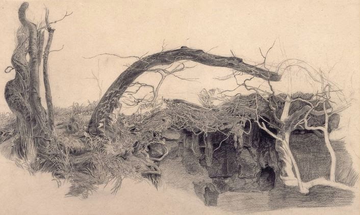 |
| Study of Trees and Undergrowth - Frederick Sandys. 1855? Graphite on paper (2) |
Vincent van Gogh
 |
| Wild Vegetation in the Mountains - van Gogh 1889 Reed pen, brown ink (3) |
This is getting closer to what I'm trying to achieve. There are lots of different marks; small round ones, dashes and different groupings of the marks. Nothing is really identifiable but but the effect is random and disordered. If I was to try something like this I'd need to draw less round marks and introduce some longer ones.
Hicks work is getting closer to what I want. It has the feeling of interlocking vegetation of lots of different kinds.
I'll be trying to figure out a way to amalgamate some of these styles and integrate some of the work I tried with unusual materials in the last post.
This is a sample up of the undergrowth I need to achieve:
I just chose colours at random but with hindsight I should have used the ones I identified from my photo.
I found I could influence the way the ink flowed considerably so it's feasible to use this method as undergrowth. It has a lovely tangled feel. I used black, peat brown and purple so that I could see how well they mixed.
(1) https://nicholasherbert.wordpress.com/
(2) http://www.tate.org.uk/art/artworks/sandys-study-of-trees-and-undergrowth-t00685
(3) http://www.vangoghgallery.com/catalog/Drawing/1727/Wild-Vegetation-in-the-Mountains.html
(4) http://www.lesleyhicks.com/Individual/Drawings/Undergrowth_Campsite_Porto.htm
Lesley Hicks
Hicks work is getting closer to what I want. It has the feeling of interlocking vegetation of lots of different kinds.
 |
| Undergrowth Campsite Porto - Lesley Hicks. 2009 Pencil on paper (4) |
 |
| Close up it looks almost like stitches (4) |
I'll be trying to figure out a way to amalgamate some of these styles and integrate some of the work I tried with unusual materials in the last post.
This is a sample up of the undergrowth I need to achieve:
 |
| I need to identify the colours |
It's difficult to sort out the colours in this photo as at first glance they appear neutral with pale and green highlights. On closer inspection the colours I think I can see are dark purple, several shades of green, blue, white, yellow and grey. It looks as though Lesley Hicks drew what she saw but it makes me think that there's a fair degree of license to be creative here.
I think the packaging (last post) for long grass might be really useful and, although I didn't try it, wool dipped in ink might make good trailing plants. I'm also going to try blowing some ink and see if that trails.
I just chose colours at random but with hindsight I should have used the ones I identified from my photo.
 |
| Blowing Indian ink - black, peat brown and purple |
 |
| Greyscale |
I found I could influence the way the ink flowed considerably so it's feasible to use this method as undergrowth. It has a lovely tangled feel. I used black, peat brown and purple so that I could see how well they mixed.
 |
| Inky undergrowth detail showing considerable mixing |
I tried ink soaked wool with less success:
I tried adding this technique to the blown ink:

It made quite large marks that were very different to the drops I applied before. They had very little movement so I blew them. There was no mixing because the first 3 colours were already dry. This adds another dimension but there's too much green. I found the Quink and the green Indian ink worked differently when applied in this way. The Quink made much more dynamic marks.
Unfortunately this looks rather like Treswell Wood at the height of summer - it's the purple that does it aided and abetted by the very bright green.
 |
| Double knitting wool Quink ink |
 |
| Throwing the yarn at the paper |
I tried adding this technique to the blown ink:
It made quite large marks that were very different to the drops I applied before. They had very little movement so I blew them. There was no mixing because the first 3 colours were already dry. This adds another dimension but there's too much green. I found the Quink and the green Indian ink worked differently when applied in this way. The Quink made much more dynamic marks.
 |
Unfortunately this looks rather like Treswell Wood at the height of summer - it's the purple that does it aided and abetted by the very bright green.
(2) http://www.tate.org.uk/art/artworks/sandys-study-of-trees-and-undergrowth-t00685
(3) http://www.vangoghgallery.com/catalog/Drawing/1727/Wild-Vegetation-in-the-Mountains.html
(4) http://www.lesleyhicks.com/Individual/Drawings/Undergrowth_Campsite_Porto.htm
No comments:
Post a Comment