Still life using line
There's lots to think about in this exercise
- the items and how they link (or not)
- composition
- practical considerations like background and medium
- the concept
- differentiation
- viewpoint
...enough to make my head spin and I feel far from confident. I chose some beach items to work with. My items were a large patterned shell, a mussel shell, a cockle shell, a small piece of razor shell, some driftwood and a stone heavily covered in some swirly material left by a creature. I began by making some sketches to find a good composition.
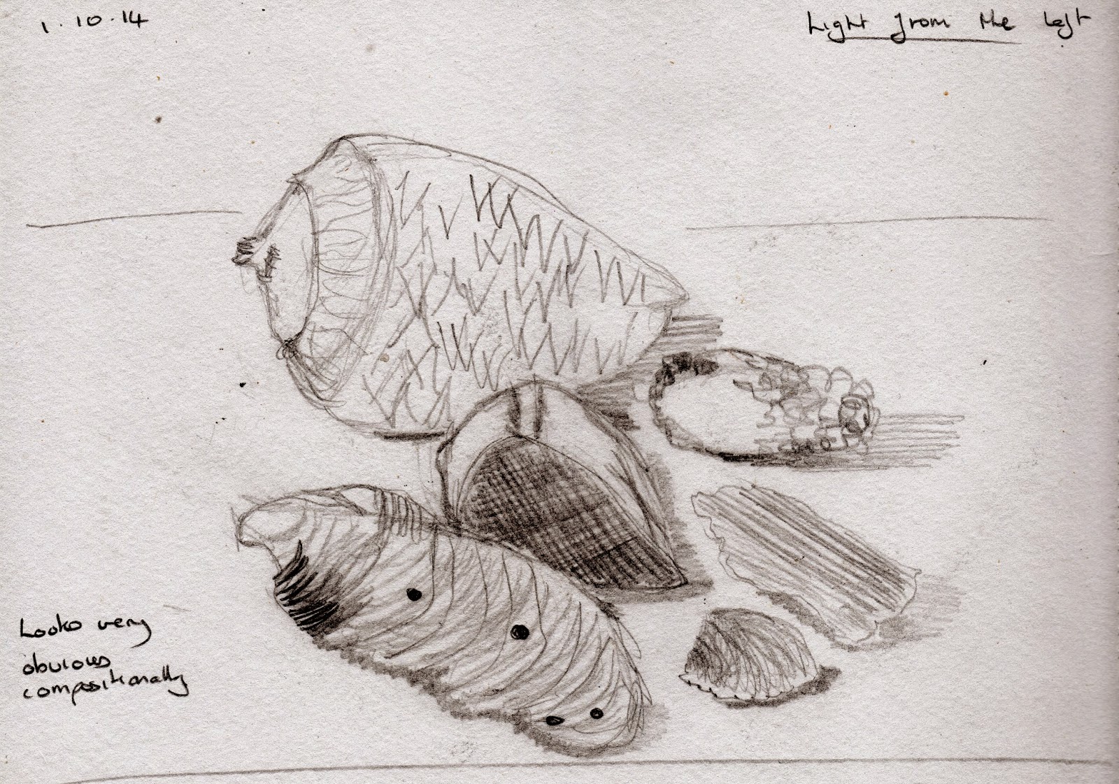
This first sketch looks unbalanced - I can't imagine why I didn't see it before I sketched. There's a problem with the mussel shell and the drift wood having similar lines. I think the internal shadow on the large shell might pose a problem with a line drawing.
The composition of this looks too obvious; just one thing behind another - largest at the back. I also think it has too many things in it.
 |
| Sketch 1 |
This first sketch looks unbalanced - I can't imagine why I didn't see it before I sketched. There's a problem with the mussel shell and the drift wood having similar lines. I think the internal shadow on the large shell might pose a problem with a line drawing.
 |
| Sketch 2 |
The composition of this looks too obvious; just one thing behind another - largest at the back. I also think it has too many things in it.
 |
| Sketch 3 |
The table top sketches somehow looked very contrived so I thought laterally and decided that the the floor (aka the beach) was worth a try. I've never made a drawing from this viewpoint and it felt mighty strange. However, although it wasn't right first time I pursued it and produced sketch 3. At first the mussel shell was too far to the right so I nudged it towards the large shell and I was happier.
Thinking about the beach I put a colour wash on the paper and using my brushpens did this:
 |
| Shells and a stone using brushpens |
For the large shell I held two pens together and the effect does seem to give a good round shape but I really don't like this - the colours are too vibrant. I wasn't at all certain whether I should be using an outline and when I did (on the large shell) it just wasn't right.
LATER
I was feeling pretty disappointed with my efforts but then I stood the image against a wall and viewed it from about 2.5 metres and my goodness what a difference! It seemed to come alive. The best bits were the two shells at the top but the razor shell was OK as well. This is a very good learning point - always try looking from a distance before you screw work up and throw it away!
I tried again and decided to take all the colour away from the items. I used a wash again and this time I lightly stippled it. I used a .7 fine liner throughout. Initially I liked this much better although the large shell doesn't look quite so well shaped. I didn't use any pre drawn shapes here and everything felt a bit uncontrolled. I used a technique that I have used before - each shell is drawn without taking the pen from the paper.
 |
| Shells using a .7 fine liner |
I'm not entirely sure about this (except that it's better than the first one).
The focus is certainly the large shell and then my eye follows round through the mussel to the other things at the bottom. Is it balanced? I think the pivot is the cockle shell at the front but I think it is OK. The stone is quite different to the other items and is drawn with hundreds of dots. Some can be seen through the swirly stuff.
When I realised how much difference distance can make I propped this one up as well and it didn't sing like the first one and that gave me a surprise.
I feel that I'm on shaky ground here and look forward to some tutor feedback. Part 2 is starting to feel very long when my L plates are so new.
No comments:
Post a Comment