Search This Blog

Tuesday 26 August 2014

Part 1 reflections

I tend to reflect as I go so I'll not repeat myself but there are one or two things that really stand out for me now that I'm at the end of Part 1.


  • I'd read that anyone can draw given the right "vocabulary" and a few rules.  Maslen and Southern (2014) liken it to learning to write.  Having gained a few skills during the course of Part 1 I'm thinking that they are right.  I'm using what I've learnt and finding myself more comfortable.
  • Like personal handwriting style I find that drawing is just as individual.  Having looked at the work of a variety of artists I'm staggered at the range of interpretations people put on "drawing". It puts the work of Alice Kettle into a different focus for me. 
  •  It's surprised me that I enjoy working on large (A2) paper.

Demonstration of technical and visual skills

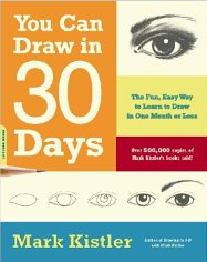
My base line was pretty rudimentary but over the weeks I've have worked hard to improve my technical abilities.  This extends in two directions; using the workshops of Maslen and Southern (2014) to free myself from a very cramped, linear way of working and looking at some basic rules from a sort of drawing for dummies book by Kistler (2011).  Combining the learning from these sources has taken away some of the fear and uncertainty I felt right at the start.

Some of the materials I'm using lead away from the neat, contained style I might have anticipated was mine and I'm not entirely comfortable with them yet.  At the moment I'm defaulting to pencil but trying to expand my repertoire each time I draw.

I have become much more aware of the effect of light and shade simply by looking at things more closely. Assignment 1, where I made a big observational error with the box lid, highlights how much I take for granted.

Quality of outcome

I was very hesitant at first but now that I have some fundamental information I have been able to apply it in later work.  The quality has therefore improved (although I'm probably not in the best position to judge).

I found the first still life quite daunting but worked my way round it by drawing single objects until I felt more secure.  

Demonstration of creativity

Using the Maslen and Southern (2014) workshops has been instrumental in getting me to experiment with methods that I previously would have considered bizarre; two pencils taped together for instance. The hat I drew using this technique is one of my favourite images from Part 1.

As I've said elsewhere I think my style is potentially loose (which I love) but I find myself tightening up when I need to do a finished piece of work (whatever that is).

Context reflection

I have looked at a variety of sources in an effort to get up to speed.
I reflect as I go and try to learn from each exercise so that I can carry the learning forward.
I keep my learning log (blog) up to date.  Everything goes into it, even the embarrassing because only then do I have a true record of achievement.


I have thoroughly enjoyed Part 1, even out of my comfort zone.  I love learning and I'm excited about Part 2 which I'm sure will bring its own set of challenges.


Kistler. M. 2011. You can draw in 30 days.  De Capo Press. Cambridge, MA 02142

Maslen M & Southern J. 2014.  Drawing Projects.  An exploration of the language of drawing.  Black Dog Publishing.  London.

Assignment 1

I've been aware of this assignment since the start of the course and it's led me to ponder exactly what is important to me or has significance.  I've found myself  thinking that material possessions don't fit the bill but relationships and memories are the most important things to me.  With that in mind I've selected some things that symbolise my thinking.


  • A box that my father kept important documents in. It's still used for the same purpose symbolising continuity.  Inside the box is a school photo from 1962.
  • My eldest son's first shoes (he's now size 11 and nearing forty) - to denote the importance of my family
  • My camera - a constant aid to memory


Precious things
I think this is a bit ambitious - the complex shapes of the shoes and the depth of the box are slightly worrying.  I think I'll do a preliminary sketch before I commit myself too deeply.

I began by drawing the box but soon realised that because the box was on the right of my vision I'd started on the right side of my paper and it threw everything awry.  Because this was just a test I carried on to practise the placement of the items in relation to the box.  This is what I drew (all in pencil):

Preliminary sketch showing the inappropriate
placement of the box

On the whole I was satisfied with this (unfinished) drawing as a starting point.  The box looks solid and the shoes that were troubling me look OK and in proportion.  This work felt as though I was using some of my burgeoning skills like perspective and shading.

When I felt ready I began my drawing proper paying particular attention to the placement of the box on the paper.  I did outline sketching in 4B pencil starting by holding the pencil at the end and working at arms length.  I find this allows me a lot of freedom to make several shapes without committing myself to any.  

Precious things - pencil, conte crayon, charcoal, fine liner and stumping


I drew mainly in pencil except for the camera (pencil and conte) which then stood out too much - it felt unbalanced.  To redress this I put in some deep shadows and shading; then I used a combination of conte crayon and charcoal to define parts of the shoes and it looked better.  I have yet to master the use of materials without a point (conte and charcoal) as I'm never quite sure where my mark is going to emerge! I found myself reluctant to use materials which are hard to remove for fear of spoiling my image.

I think the composition works well and I'm pleased with how it looks "real" and proportionate.  I find I don't want to be too critical because I've come so far in such a short time I think it's nothing short of miraculous.

One thing that surprised me is when I compared the photo to the drawing the box lids were so different.  On the photo it looks huge and I didn't transfer this to my drawing.  If I had done I may have thought it looked "wrong".  When I look at my drawing now the lid looks too small.  It's a good learning point about observation.


Being able to draw like this is really exciting.


Sunday 24 August 2014

Expressive Drawing

I've really enjoyed looking at Steven Aimone's book Expressive Drawing (2009).  It is a book full of workshops designed to liberate the artist so that drawing becomes more spontaneous.  The bonus is that there are vignettes of many artists and many of them are new to me.  I've chosen one or two to include in my blog - the reasons for the selection are explained under each heading.

Elizabeth Layton 1910-1983

Elizabeth Layton
elizabethlayton.com


I've chosen Layton because although she was a successful career woman, wife and mother she suffered severe bouts of manic depression for many years.  When her youngest son died in 1976 she fell victim to debilitating despair.  Art saved her and she went on the become nationally recognised. 

Layton said of herself
 "I was deeply depressed, but that was inside me....I started drawing, and started liking myself better."
I worked with adults with severe mental health problems for over 30 years and I saw art transform the sense of self and turn lives around.

In her work Layton addressed social issues with a sense of the absurd.  Many of her images are of herself in various guises.

Buttons 1982 - Elizabeth Layton
Crayons and coloured pencils 55.9 x 76.2 cm
elizabethlayton.com


Buttons shows Layton as a social activist.  In an article in the Washington Post she was nicknamed "Grandma Moses on Tabasco sauce"


I'm into Art Therapy - Elizabeth Layton. 1987
elizabethlayton.com


I think she must have been quite a woman.


Bill Traylor 1854 - 1949


Bill Traylor was born a slave on a plantation in Alabama.  He gained freedom at the end of the Civil War but continued to live in the place he grew up.  He married and raised a family and eventually when all those close to him had died or left he moved away from the familiar surroundings to Montgomery. Traylor was illiterate but when he was 83 he took up drawing with minimal equipment and produced a body of work that most artists couldn't fulfil in a lifetime.  Whilst segregation was still a factor in American life Traylor was discovered by Charles Shannon who organised an exhibition of his work and it met with acclaim.

I love the fact that Traylor began his artistic career so late in life and that he was able to communicate so much with his symbolic figures and shapes.  There's lots of movement and action and they rather remind me of Egyptian hieroglyphs.


Walnettos Figures Construction - Bill Traynor. 1939
Poster paint on cardboard


Brown Mule - Bill Traylor. 1939 
pencil, crayon and gouache on board

petulloartcollection.org

From disadvantaged beginnings and entirely self taught Traylor is now hailed as one of America's foremost folk artists.


Will Barnet 1911 - 2012

Barnet gets just a brief mention in Expressive Drawing but it's very relevant to me because it features a representational portrait in charcoal.  Having just had my first real experience of working in that particular medium I can only be amazed at what Barnet produced.


Portrait of Carole - Will Barnet. 1982
Charcoal on paper
Aimone (2009)

This is a salutary lesson in using light and shade to define the image.  I love it.


Aimone S. (2009)  Expressive Drawing.  Lark Crafts.  New York.


Part 1 - Project 2 - Ex 4

This exercise will be a challenge.  I have to draw a still life where one item is shiny and the other slightly less so.  Interpreting shadows and reflected light is the point of the exercise.  My drawing media is to be charcoal - not something I'm familiar with.

I chose a stainless steel teapot and a china mug - two items I turn to many times a day.  The first drawing was done early in the afternoon with light coming from the left.


The items were arranged slightly differently to the photo but this is what I did.


Tea break - charcoal with some stumping


I found charcoal very unforgiving - once it's on the page that's pretty much it.  I began by lightly sketching with pencil.  The light shifted as I drew and there came a point where I had to stop fiddling. I'm pleased the perspective looks right and this is entirely due to the learning I've done recently. I noticed that when I stood well back from my image I liked it more.  Whilst I'm sure with experience I will get better. I'm pleased with this.

I decided to try the same exercise using my new conte crayons - another unknown.

More tea - conte crayon and stumping


This was later in the afternoon and the shadows were quite different.  I found the conte crayon less messy but also less dense - there was a slightly scratchy feel to them.  The teapot handle looked almost striped with light and dark and it was reflected in the teapot itself.  Again I'm quite pleased with the outcome - I wouldn't have stood a chance a month ago.


Saturday 23 August 2014

Part 1 - Project 2 - Ex 3


This exercise is about creating the relationship between light and dark that gives drawing contrasts and makes the subject substantial.  This contrast is called tone.  It is essential in all drawings but in monochromatic work it is absolutely vital to the integrity of the piece.

I have a book called Expressive Drawing by Steven Aimone (2009) and he suggests various ways of creating tone;


  • varying the pressure of the drawing tool
  • controlling the amount of ink or paint applied
  • the density of the marks
  • hatching
  • crosshatching


Aimone illustrates his points by using the Study of Leon Kroll, 1915 - 16 by George Wesley Bellows.


A Study of Leon Kroll, 1915-16 by George Wesley Burrows
Crayon on wove paper  (26.7 x 22.2 cm)


The artist uses hatching and crosshatching of various intensities to create a feeling of substance and depth.

I am required to make four quick studies of a simple object using different media in the creation of tone.  I chose a bowl.


Pen and ink gave a very oriental feel


6B pencil  and stumping gives the most representational look


Edding 1340 brushpen gave lots of opportunity to use strokes
With the .1  Staedtler pigment liner I wanted to scribble


Each study is very different but I don't think one is any better than the others.  As I worked the light changed and as the bowl was shiny this made an enormous difference.

My next task was to use three or four objects and concentrate on tone.  I continued with the theme of bowls and stacked them.  My challenge was to differentiate one from the other.


Three stacked bowls - 4B, 6B, 8B pencil with stumping


There were shadows all over the place that confused me at first but I think this is quite successful.
One thing that Aimone is quite insistent on is not to be too negatively critical and I will try to run with the idea.


Aimone S. (2009)  Expressive Drawing.  Lark Crafts.  New York.


Friday 22 August 2014

Research point - Odilon Redon 1840 - 1916

Odilon Redon 1840 - 1916


Bertrand- Jean Redon was born in Bordeaux to affluent parents in 1840. He became known as Odilon which was a derivative of his mother's name, Odile. He started drawing in his childhood and by the age of 15 began formal art education.  His father tried to steer him towards a career as an architect but Odilon failed the exams.3

His training  was diverse.  He studied with Jean-Leon Gerome learnt engraving from Rodolphe Bresdin and lithography from Henri Fantin-Latour.1

His career seems to have two distinct phases.  His early work was in almost monochrome but through the 1890's he introduced colour in the form of pastels and eventually used them almost exclusively. Redon's work was admired by Mattisse.

For the purposes of this investigation I'm most interested in the early work known as the noirs. My primary source for this piece of work is an article I found from 1995 which describes in some detail the way the artist achieved such a wide range of effects with so little colour.2  Redon rarely dated his work and the researchers set about trying to create a framework for dating by looking to see if there was a technical pattern that would show the evolution (and therefore the dates) of his work. They were able to take samples of the media and fixative used as well as fibres from paper from works spanning the artist's entire career. The results of the investigation gave new insights into Redon's choice of paper, media and fixative.

Redon developed many techniques to get a huge variety of textures and effects and experimented with ways of stabilising the surface of his work.2  The first noirs were created using a combinations of vine and oiled charcoal with a little compressed charcoal.  He used black crayon (probably conte) very cautiously.  In the mid to late 1870's Redon began to use other media like fabricated black chalk which was a much denser and harder medium.  He introduced compressed charcoal to outline tonal parts of his work and later still black pastel appears.  He used this in the final stages of his work for it's colour and velvety texture.

Along with the variety of materials Redon used there was also a wide range of papers and each one was carefully chosen for what it can add to both texture and colour.  The researchers found the papers imbued Redons work with pale pinks and blues and the artist himself said that his noirs were all drawn on coloured paper.  Redon changed the surface of his paper in his Landscape (1868) by preparing it with a base coat of powdered charcoal and one of his favourite ways of working was to lift images out of a tonal base.


Landscape (1868) Odilon Redon
Various charcoals with black chalk and black conte crayon, wiping, stumping and erasing.
  On cream paper altered to a golden tone.  53.6 x 75.5 cm.  The Art Institute of Chicago. 2

Here he stumped and erased charcoal from the back and middle ground to establish the distant vistas and to provide the recession into a deep panoramic space.  In the foreground he combined stumping and erasing with the darkest application of various charcoals and black conte crayon to set apart the monumental tree and isolate two figures in the vast setting.  He ground the coarsest charcoal and applied it with a brush in an impasto like manner that suitably describes the uncultivated terrain surrounding the figures.2

I find the atmosphere created by Redon in the Landscape quite overwhelming.  Where another artist might have made the subject pastoral or even romantic Redon creates something dark, forbidding and even sinister.

Many of Redon's drawing have a disturbing aspect.  He draws demons and fantastical creatures and many of his pieces are from his imagination.

...he remembered himself as a "sad and weak" child who through ill health led a solitary existence.  Advised against physical or mental exertion he "sought out the shadows."  This had a huge effect on his early artistic output with its often sombre, melancholic appearance and it stirred Redon's interest in nature and imagination 3


The Marsh Flower, a Sad and Human Face seems to symbolise this lonely, sad childhood. (Redon became known as a Symbolic artist). It is a lithograph from 1885.

The Marsh Flower, a Sad and Human Face (1885) Odilon Redon

The Marsh Flower, a Sad and Human Face is a lithograph and consists of a lonely little plant, with a very human face, just as the title infers.  It may represent the idea that society shuns those who are different, or just doesn't care to shed light on the unnatural and absurd.  It is a sad and lonely existence for the bizarre and outlandish.  But in the artwork the marsh flower-face creates its own light, and maybe Redon is telling the world that even thought the rebel being may be alone and ostracised, it still has its own beliefs and power in itself. 4

In order to achieve even more tones and textures Redon developed his drawing techniques to include charcoal applied on its side and the use of fixative throughout the drawing so that he could remove elements with hard, pointed tools, sponges or his hands to give a different effect.  He even reworked drawings before the fixative was dry.  Redon developed what the article calls "an extraordinary range of manipulations". 2


Redon experimented with fixative as well and the drawings have become a golden yellow through age. Unlike his contemporaries Redon welcomed this change and built it into his thinking.


During the 1890's Redon completed the shift to pastels.  Initially he used pastel over charcoal and many of his noir techniques were in evidence.  Sometimes Redon would pick up an old noir drawing and rework it in pastel but by the late 1890's he was working entirely in pastel.  The old resin fixative wasn't really suitable for pastels and by the end of his career he had abandoned fixative almost completely.


Redon is new to me and looking at his work has been eye opening.  I love colour and in a strange way I see it in the monochrome images of Redon.  This must be because of the textures and tones he manages to introduce into his drawings.  It has encouraged me look anew at my drawings and be more bolder and exploratory in what I try.


1   http://www.britannica.com/EBchecked/topic/494732/Odilon-Redon

2   http://cool.conservation-us.org/coolaic/sg/bpg/annual/v14/bp14-08.html

3   http://www.fitzmuseum.cam.ac.uk/gallery/redon/about/childhood.html

4    https://apah.wikispaces.com/Dark+Side+of+Human+Nature


Part 1 - Project 2 - Ex 1

It seems a long time ago that I was completely fazed by this task.  Since I began I've learnt so much and whilst it's far from perfect in many respects I'm pleased with the outcome.


Items in a shopping bag - pencil

I found perspective and placement the most difficult tasks and at one point I abandoned this work. However when I re-visited it I thought it met the criteria for the exercise so I pursued it.

I was surprised that I drew in the way I did and felt comfortable.  My work from the Maslen and Southern book has freed me up a lot and my outlines are no longer continuous lines but many short ones.  My confidence has increased now that I finally realise I'm drawing not taking a photograph.


Part 1 - Project 2 - Ex 2

This follows on naturally from the last work I did and introduces the idea of tone.  I wasn't entirely happy with the placement of the items in the bag last time so I decided to use the same items and try to do better.


Items in a shopping bag - pencil


I managed to get the items in more accurate positions this time probably because I was much more aware from the very beginning and not constantly trying to correct myself.  I'm happy with the range of tones I could achieve but not so happy with the box above the jam jar - a perspective problem again.

I'm fairly happy with my progress from what was a standing start.


Monday 11 August 2014

Part 1 - Project 2 - Ex 1e

For this piece of work I'm going right back to the initial task of drawing a group of objects.  I feel a little more confident than previously although I'm still limiting the number of items.


I had some trouble with the sun tan lotion but I was happy with my sunglasses.  I think the work I've been doing to improve my skills base is paying off.  I'm working in a much looser way and managing to get a bit of a 3D feel into the drawing.  I looked again at my earlier drawings and I'm much happier with this one.

I wasn't sure at exactly what point to stop drawing - I'm rather afraid of over working it and losing the spontaneity.


Sunday 10 August 2014

Part 1 - Project 2 - Ex 1d

You can draw in 30 days
Mark Kistler


I can't remember a time when I have felt so adrift in learning a new skill - I simply have no points of reference.  I found this book had good reviews when I was searching for a quick fix to my feelings of inadequacy.  It is the absolute opposite to Maslen and Southern - very directive and formulaic but packed full of the answers to some of my questions about positioning and perspective.  Like many other authors I have read Kistler says that drawing is an acquired skill and not a talent.

The writing style is pretty hard to take but if you can overlook it there's a lot of good advice upon which to build.  I'm hoping that between the two books I can find a middle road that supports my learning and bolsters me up a bit.

Kistler starts with a section on spheres.  At the end of the section I understood about size influencing how close objects look, the effect of overlapping, graduated shading and drawing objects higher in the picture to make them look further away.

I've followed the instructions to the letter and these are some of my sketches.


I feel this has moved me on and given me some much needed reference points.  My tutor may well have something to say about this way of learning but I liken it to learning times tables by rote in order to make life easier later on.  

Kistler. M. 2011. You can draw in 30 days.  De Capo Press. Cambridge, MA 02142

Wednesday 6 August 2014

Part 1 - Project 2 - Ex 1c

Drawing projects - an exploration of the language of drawing
Mick Maslen and Jack Southern


This is on the book list and is a buy I'll not regret.  I'm selective in what I buy but I got this because it seemed to present an accessible way to practice.


The text is based around the teaching notes of Maslen developed over many years.  He and Southern came together in a project on drawing supported by the Guardian.  The collaboration in involved the workshops which form the basis of this book.

I read the book from cover to cover and decided that I'd try Project 1.  The aim is to challenge the habit of holding a drawing implement as if it was a writing tool.

Materials
white paper
B, 2B, 3B and 4B pecils
two sticks one about 6m and the other .3m

Although I've included photos they are very hard to see because the pencil marks are so light in the early drawings.

Drawing 1
I was asked to arrange a few items near a wall covered in white paper....


.......attach the longer stick to a sharp B pencil and at arms length draw my objects.  I used A2 paper, stood at my easel and my arm soon ached.  It was hard not to hold the stick like a pen and it was so difficult to make many sort of mark that I had to start thinking about what would work and it seemed to be that various marks would have to represent what I saw.  This is my first drawing:


Drawing 1


Drawing 2
Next I attached the 3B to the shorter stick and repeated the process.  This time I tried A3 but I ran out of space.  I tried to hold the stick between my thumb and forefinger and it was so difficult - I kept finding myself using a completely different hold ie pen hold.  I had little control.  The only way to get an image is to forget what the object looks like and go for marks.  The petals show this best if you can see them.


Drawing 2

Drawing 3
This required me to hold a 2B at the very tip between my thumb and forefinger.  this time I was able to do it and I had much better control.  I also had more confidence with making marks and used feather strokes for the parrot.


Drawing 3


Drawing 4
In my drawing generally I've found the placement of objects on the page very tricky.  Amazingly I hadn't thought of putting in the line (which in this instance was made by the joining point of the wall and the worktop) onto my page.  This time I did and it made such a difference.
For drawing 4 I used a 2B again but this time held like a knife with thumb and four fingers.  This was comfortable and I found myself altering the movement of my wrist and shoulder to get the marks I wanted.


Drawing 4


Drawing 5
This was a repeat from the beginning but superimposing the drawing on each other and making changes as the drawing developed.  An eraser was allowed but the history of the drawing had to remain.  This was a revelation.  I could see the development as I drew got an image and the marks got more precise.  there's movement and feeling in it but it's certainly not a photograph.


Drawing 5


I've learned so much from this exercise most of it to do with getting some confidence and not being afraid to take a risk.  There's a freedom to working with marks that I've not felt before.   In my textiles work I'm generally improving skills I already have but when I'm drawing like this I feel very vulnerable putting it out on my blog.  However,  I've really, really enjoyed it and I'm going back for more.


The following day....

I've gone back to my easel with a different set of items but following the same five stage process.  My items were a turned wooden piece that had warped over time and two shells of different shapes and sizes.  I didn't take photos of the initial stages because they were so poor last time.


My items


My drawing - from a slightly different angle to the photo

Once again I used A2 paper but I managed to scan it for a clearer image.  Working in this way somehow it is easier to make the items look shapely.  The final stage (holding the pencil like a knife) seems to bring everything together.  Whilst there's still a long way to go I feel as though I'm making some progress.


One more try....

This time I used a large shell, a brush and my camera although of course it's missing from the photo.


My drawing

The next task in Maslen and Southern involves drawing a single object with two pencils taped together.   The aim is to "produce a range of dense and sometimes unpredictable marks that will provide you with a surface to adjust, re-structure, and work, both with, and against". p 73.

This may well be beyond me but I'll give it a try.

Materials
White paper
B, 2B,  3B, 4B pencils

I taped together my pencils (B and 2B) (3B and 4B) and decided to draw my sun hat.


One of the stated aims is to work inside the form and break the habit of drawing a contour edge.  I was apprehensive.  This is what happened ......

My sunhat drawn with two pencils


.... and I was amazed.  What is basically scribble is also very definitely my hat and not an outline in sight!

My hat is striped so my marks were lateral but certainly not linear.  I needed to define where the brim starts so I darkened my marks. It was the strangest feeling imaginable but the pencils seemed to take off on their own and the drawing was done in less than a minute.

Maslen and Southern suggest working for 10 minutes and then separating the pencils and making the drawing more focused.  I may well do this sometime but for the moment I'm going to leave it as it is because I think it's lovely. 


Maslen M & Southern J. 2014.  Drawing Projects.  An exploration of the language of drawing.  Black Dog Publishing.  London.


Monday 4 August 2014

Part 1 - Project 2 - Ex 1b

Retford Art Society


http://www.retford-art-society.co.uk/

I made my first foray to Retford Art Society last Friday and I was made so welcome that I'll be paying my annual membership and going regularly.  There's a real variety of events over and above the regular meetings and I'm bound to learn lots more about technique and materials as time goes on.

I took my A3 sketchpad and gathered some bits and bobs that were on their worktop.  There was a wicker basket, a jug and a cup.


I think from the lightness of the pencil you can see how tentative I was in the presence of people who have been producing there own art for years.  I struggled with the jug handle and once again found it hard to represent what I was seeing.  It's very strange that the brain and the eye are so out of synch.

I have some reflections that might be important

  • I like working on A3 or A2
  • Pencil is easy because corrections are only an eraser away
  • This can make my work seem lifeless and without expression
As far as the brief for the course is concerned I'm going to wander a bit until I build up some confidence.  First I'm going to try other media and see what happens.  This is a selection of many attempts I've made - I've used cheap lining paper and brown paper.  It leaves me free to use lots.


The model


I used this jug and turned it around several times.


Pencil - 7B

Graphite stick - 9B


I covered my paper with light charcoal then drew into it.


Watercolour

Water colour wasn't nearly as forgiving as graphite and charcoal. Lines are painted and that's that!  In some ways I think it might be liberating but when confidence is an issue it can just get to look a mess. In the above example I tried to use as few lines as possible and I'm quite pleased with the result particularly with the spout.  I refrained from altering the base of the jug and the handle leaves something to be desired but stuck to my self imposed rule of few lines.

During my two textiles courses I've become much more free in my style and I don't want to tighten up again.


I tried again with with the books and masking tape and this time I used charcoal on charcoal.  I think the perpective's getting a bit better - there's certainly less erasing.

Books on a charcoal ground

I've plenty of time to practice so I think I'll use it then go back to the brief and try it all over again.