Search This Blog

Thursday 28 May 2015

Assignment 4b Tonal study intro


The second part of Assignment 4 is a tonal study of a reclining figure paying particular attention to creating mood.  I find tone very hard so I anticipate a real challenge.

In 1908, in his A Painter's Notes, Henri Matisse wrote: "When I have found the relationship of all the tones the result must be a living harmony of all the tones, a harmony not unlike that of a musical composition". (1)

The way I handle tone is, I think,  too arbitrary, it's not that I don't care, I just find it hard to get the differentiation I need, particularly if I'm working fast.  It might help if I look at some experts.


James Abbott McNeill Whistler (1834-1903)


I love the way that Whistler can evoke atmosphere with his use of tone.  This painting seems to capture the lovely ethereal feeling of a river at night.  It is in fact the Thames and the secret is in the title "Nocturn: Blue and Silver".  (1)


Nocturn: Blue and Silver Cremorne Lights - Whistler (1872) (2)


The range of colour is so very subtle and the tones lend a shimmer so necessary when rendering water.

Whistler also brought his superb use of tone to portraiture as well and this interests me because I will be drawing a figure.


Harmony in Grey and Green: Miss Cicely Alexander
 Whistler - 1872-4  (3)

Whistler planned this painting meticulously even to the extent of having the carpet specially made. (3)

I would love to see this painting up close - I find it hard to believe in the limited palette I think Whistler used.

Henri Matisse (1869-1954)

I've never been more aware of tone than when I look at the work of Matisse.  This painting was completed in 1912 and exaggerated the use of colour.  It shows the use of blue in many tones:


The Blue Window - Matisse (1912) (4)


Matisse was one of those artists who painted himself many times and in this context I particularly like this one.  The style is spare but the combination of line and tone are so well balanced that I feel as though I know the man.


Self portrait - Henri Matisse (1937) (6)

This portrait is very different to Face (Claude) and yet the artist uses line and tone just the same. This makes me want to experiment with these different styles.


Face (Claude) Matisse - 1946 (6)


I may well get the opportunity in the final part of this Assignment.

A tonal drawing it seems to me can be what you want it to be - it can be meticulous like Whistler or more minimalist like Matisse.


(1) http://www.tate.org.uk/learn/online-resources/glossary/t/tone

(2) http://www.tate.org.uk/art/artworks/whistler-nocturne-blue-and-silver-cremorne-lights-n03420

(3) http://www.tate.org.uk/art/artworks/whistler-harmony-in-grey-and-green-miss-cicely-alexander-n04622

(4) http://www.artyfactory.com/art_appreciation/still_life/henri_matisse.htm

(5) http://www.nga.gov/content/ngaweb/Collection/art-object-page.66505.html

(6) http://www.henri-matisse.net/drawings.html

Assignment 4b Reclining figure

A figure study using tone (A1)


My husband is a keen cyclist and usually comes home in need of five minutes rest.  I started with my A3 sketchbook because I wanted to use charcoal and it works better big.  I put a tonal range down the side of the page just to remind me just what charcoal can do.

I had to be quick and I didn't get torso right.  In reality he was laying much flatter with his head on a cushion on the sofa arm.  I'm pleased with the legs.  The dense black lycra was hard to capture but when I really looked there were many shades of black (and white).

I drew the figure and then put the sofa around it but I'm not really sure if this is the right way to do it. This pose would benefit from a second try.


Recovering from a ride.


I had a bit more time to do this drawing as it captures the inevitable snooze.


Ten minutes later


I'm happier with this because the figure really looks relaxed and sleepy.  The torso is better and the head rests comfortably on the cushion.  This is on A3 using a mixture of charcoal and graphite.


I had the idea that I'd like to create the sofa from newspaper then charcoal over the top.  I cut out the shape and stuck it onto my A3 sketchbook paper.  I used my sketches as my reference.  I struggled from the start because the newsprint didn't accept the charcoal very well and I could see the newsprint through it.  Additionally I couldn't get any enough tones and definitely no highlights.  I found it very confusing to draw on newsprint and I think it is too busy.  It was also hard to get the top of the head (where the papers join) to look anything like it should.

The figure is not properly proportioned and I think this is due to having to fit the figure onto the precut sofa.  The hand really did drift off the page. it's not a photographic accident. 

Having said all that the sketch captures post exertion fatigue.


All in


I've fixed the charcoal so I  can't change what I've done but I'm wondering if I could use graphite to get more definition.  May try.


I'm attempting to use materials I've not tried before although an assignment may be a risky place to to do so.  This is my big A1 drawing.   

I put some guide marks in so my proportions didn't go awry and laid down big strokes of Quink ink. I have ready mixed small bottles of different dilutions and used them all.


Just black ink


Putting in darker tones


A well deserved rest


The ink gave me a whole range of not just tones but colours as well and did a lot of the work for me. I used a little graphite and some white chalk.  The chalk was useful for toning down some unwanted inky darkness. I still have to do some work on the legs but I'll have to wait until the light is the same as it was today.

I was surprised that my big strokes worked out so well - the foot for instance it in just the right position; maybe the earlier practise helped.

The proportions are OK (ish) but the head may be a bit on the small side.  I like the way the settee disappears.


Wednesday 20 May 2015

Assignment 4a Seated Figure

A seated figure on an upright chair

I've never used A1 paper before so there's some uncertainty about this piece of work.  I found it hard to source paper that wasn't too expensive and ended up buying Frisk cartridge paper at 110 gsm  from the SAA.  I'm hoping it's going to be OK although it will influence what materials I use.

My husband wasn't happy to be a nude model but thankfully he is very patient when clothed.  He sat in a chair for half an hour while I did some quick sketches in my A3 sketchbook.  I've become reluctant to use this because I can never scan a whole page and this work is no exception.


The first four sketches are using my brush pen which is pretty unforgiving and gives me no opportunity to erase (which with only a minute is essential).


1 minute sketches

1 minute sketches


I changed to my new fountain pen and got these images which I'm quite pleased with.  As Richard sat down I became aware of how involved the process of sitting is so I tried to capture it.


1 minute sketches showing the process of sitting

There are one or two of these I would like to pursue and do more detailed drawings but I'm trying to concoct a way to show the sitting process in my finished work.  Thinking cap firmly on!

I'm going to spend about five minutes on a couple of these poses to try to get a more accurate feel of the figure on the chair and how the two connect.

I'm going to stick with my fountain pen because it's working well for me.


Five minute sketch


Five minute sketch


I've been able to get a little more detail into these and consider the proportions more carefully.  I'm reasonably happy with the first one but the arms in the second one look very flat.  In fact it looks very cartoon like.  I'm missing the spontaneity of the 1 minute drawings but maybe that's inevitable.

I'm going to explore the possibilities of the "sitting process" series of sketches and see if I can somehow use them all.

I have an idea that I can present the first three of the series as ethereal background sketches with the seated figure taking the prominence the task requires.  I used A4 copy paper covered in  charcoal to draw the figures with my putty rubber.


The sitting process


Once again these were very quick 1 minute sketches just to see how it would work.  The copy paper was lovely to use because it was so smooth and the charcoal lifted easily.

I have an A2 sketchpad which is also very smooth and will be perfect for trying out my idea.

What I plan to do is replicate the charcoal and putty rubber work for the first 3 images and the fourth one I'll maybe use my conte crayons.


Playing with the idea


This is very hard to reproduce for my blog.  First, because of its size I have to photograph it (and I think scanning gives a better result) and second because it's covered in charcoal and very dark.

Does the idea work?  In part yes; I like the hint of an image that the putty rubber gives.  I used a rust coloured conte crayon over the big figure and I'm happy that it shows over the charcoal.  The figure looks three dimensional and that is the object of the exercise.

What isn't so satisfactory is the composition of the idea.  On a large sheet (A2) I've got three smallish figures that have no context.  I may have to save the idea for another time because I still like it. Unless something occurs to me over the next day or so I'll develop another sketch.

At the moment I'm thinking that I will stick with the charcoal, putty rubber, conte mix because it's quite effective but because the paper is so big and the drawing will demand detail I may have to re-evaluate.


I decided overnight that I ought to experiment with my materials a bit more.  I used an A4 sheet of copy paper and laid charcoal down trying to get a graduated effect to resemble a horizon line without it being too obvious.  I pulled out some quick chair shapes and tried ink (applied with a brush), water colour paint and wax crayon to the white marks left by the eraser.  Lastly I put some textural marks in the lower, darker part of the charcoal.

Trying things out
Out of these I like

  • the graduated charcoal
  • the wax crayon because of the texture
  • the long marks made by the card I picked up from John Twiss (5) important because it left a sharp mark

but I prefer the original conte because it made use of the white underneath it.

That has helped me to think about where I'm going and what I'm using and this is the outcome

A1 paper
single image of seated model in an upright chair
graduated charcoal
shapes lifted with my putty rubber
white shapes touched with conte
contextual marks made with the card

I'm going to use the cross legged sketch as a basis but I'll need to bear in mind that on A1 my marks will need to be bigger and bolder, possibly gestural.

KEEP  IT  SIMPLE.


I put my plan into action on some A2 paper and as I thought everything needed beefing up a bit.  I had to lift out wider lines and use more conte.


Lifted out with putty rubber


 Because the charcoal was two tone with the top of the figure on the lighter part it seemed to lose some definition. This was because I had used the same colour as previously and hadn't made it a heavier colour to accommodate the larger size.


Using the original conte


I took a darker conte crayon and gave the top half of my drawing a bit more clarity:


...I decided it was much better so went the whole hog.


I'm fairly happy with this although I think the figure could do with a bit more grounding on the chair. No shadows makes it so much harder.

My aim was to keep it simple and I think I have.

My next challenge is to see however I'm going to support A1 on my easel.

A daunting prospect


I put my charcoal on the paper and left it much less smooth than previously because I thought it would add extra interest.  If it doesn't work I can always smooth it off.


The charcoal

My completed drawing

The light on the left is from the door.

I'm pleased I built up to using this A1 paper because it looked just huge but I remembered feeling that way about A3 the first time I used it.  In the end it felt comfortable and I managed to scale up.

Once again I had to make sure my lines were strong enough for the size of the paper but I generally followed the same process as before  The foreshortening of the right leg gave me problems throughout and still isn't wonderful. My idea and my materials performed well.  Compositionally I think there's something missing.  I put some marks in for floorboards to ground the figure and indicated the corner of the room but maybe it's not enough.  My "horizon" is very vague as well.  I've put fixative on it but if I have a flash of inspiration I may add to this.  I often find that a bit of space to think works wonders.

Tuesday 19 May 2015

Assignment 4a Line drawing Intro


I have three tasks to complete for Assignment 4:

  • a seated figure - a line drawing (A1)
  • a figure study using tone (A1)
  • a portrait or self portrait combining line and tone

First I want to take a look at how other artists make line drawings.  Because I like his drawings I began with Matisse.  I found that Matisse regarded drawing very highly

I have always considered drawing not as an exercise of particular dexterity...but as a means deliberately simplified so as to give simplicity and spontaneity to the expression, which should speak without clumsiness, directly to the mind of the spectator (1)

These words are worth printing and sticking on the wall.  They are very direct and quite inspirational. 

Here are a few drawings by Matisse in which he clearly takes these words seriously.  I looked particularly at drawings of people because that is what I'm doing.


Face (Claude) Matisse - 1946
Charcoal on paper (1)


Nude from the back by Matisse - 1950
Brush and ink on paper (1)


Study for "Pink Nude) Matisse - 1935
Charcoal on paper (1)


These lines are very spare yet speak volumes.  I need to try to simplify my lines to create "spontaneity without clumsiness".

Henry Moore

Moores' style is so different to that of Matisse.  Moore uses lines to emphasise the roundness of the limbs.  With my work in mind I should take note of the foreshortening on the left arm in this drawing.


Seated figure - Henry Moore - 1954
Graphite on paper  (2)


Man and Woman Seated at Table - Henry Moore - (1984)
Charcoal and pencil on paper  (3)

Moore used drawings to plan his sculptures:


Studies for Sculpture - Henry Moore (1931) (3)


By chance on the internet I found the work of Alan Brown (4)   He seems to create work in a multitude of ways but I concentrated on his drawings.  I find them very accessible and I can understand them in terms of what I have been learning to do.


Back nude drawing - Alan Brown  (4)


Nude pose charcoal - Alan Brown  (4)


Head study 1 - Alan Brown (4)

These examples of drawing are all very different but if there is one common theme for me to take away from them it has to be


KEEP  IT  SIMPLE.

I'm going to document my own work in the next posting the current company seems rather overwhelming!

Sunday 17 May 2015

Part 4 Project 6 Ex 3 Portrait with no reference

A portrait without a reference.


I haven't been looking forward to this exercise so my mindset wasn't good even before I picked up my pencils.  I didn't see how I could conjure up a portrait from either my memory or my imagination.

I made a dreadful attempt with my pens and it is the first time I have not published a piece of work.

To cut a sad story short this is the drawing I did.


I had no reference to look at so where is the light coming from?  The portrait seems to have no bone structure - no wonder it didn't exist.  The eyes are without soul.  And the awful thing is I don't know what I could have done differently.

What I wrote in my sketchbook is

I've hated every minute of this - it looks completely dead.  The references I usually use didn't exist so nothing hangs together.  It means nothing - and means nothing to me.  I spent as little time on it as I could manage.  It is the hardest thing I have done on this course.  I think it's a well made point!

Not very positive and I don't usually back off if something is tough.

It is however, very thought provoking:

  • I had to rely on my new gained knowledge without any aide memoire
  • I had to imagine where the light source was coming from then interpret it
  • I had no sign posts - I couldn't see the bone structure
  • the eyes are so vital to personality 
  • artists tend to work from life for a very good reason
  • does an artist need to know who is being drawn or just see them?  The latter I think.

I know I should try again and maybe make a plan of what I want to do rather than let it just happen. Right now I don't have the will to tackle it but if i change my mine I'll be back.

10 days later.....

I'm not sure whether it's in the spirit of the exercise but I decided to have someone I love in mind when I drew another portrait without a reference.  I drew my happy go lucky granddaughter, Esme. First I looked at some photos of her and tried to capture her fundamental spirit in my mind before I drew.  What I've ended up with is someone who could be Esme in a year or two but with her current zest for life (she's 4)


I did this drawing again a week or so later (after using pastels for my Assignment).  I used my usual selection of pastels on water colour paper beginning with a light sketch to position things.  I was disappointed with the way the pastel seemed to "clump" when I blended it so I won't be using it again.

Esme in pastel

This is a better likeness but it doesn't quite capture the mischief that is essentially Esme.

Saturday 16 May 2015

Part 4 Project 6 Research point 2


Famous artist self portraits


Most artists seem to use themselves as models and many like Picasso and Rembrandt do so throughout their lives. 

Rembrandt (1606-1669)

It is thought that Rembrandt completed almost a hundred self portraits.  Some show him at his easel, some at leisure and others dressed in theatrical costume.  In fact they document his life.

It is thought that Rembrandt painted this self portrait as an exercise.  It shows a very diffident young man as yet unsure of his skill.  He is looking directly at the viewer with his mouth slightly open. There is intense light that seems to come from below.


Self portriat by Rembrandt at 22
Oil on oak panel (1628) (1)


In most of the self portraits Rembrandt looks pretty sombre but this lovely image shows a happy, smiling young man:


Rembrandt laughing - self portrait - 1628 (1)

In the year of his death Rembrandt was still painting himself and this is a most familiar image.  In most of the portraits I've looked at there is very little context.


Self portrait at the age of 63 - (1669) (1)

van Gogh (1853-1890)


van Gogh also painted many self portraits but over a much shorter space of time.  I can't find a single one where he looks happy.  There seem to be none of him as a really young man either.  Here he is 33 but I think he looks much older.  In all but his final self portrait he is bearded.


Self portrait with pipe - van Gogh - Spring 1886 (2)


Over a period of just over three years van Gogh produced many paintings of himself and they show a rapid change in his mental state.

His last self portrait was given by him to his mother on her birthday.  It is in a very different style to the one above - much lighter both in colour and feel.


Self portrait - van Gogh - September 1889 (2)

The diagonal marks typical of van Gogh give this haunting portrait a sense of immediacy.  van Gogh was plagued by mental illness throughout his life and some of his most sympathetic work was completed in his last few months.


Picasso (1881-1873)

I think this self portrait resonates with me because I have used charcoal recently although with less effect.  It is very early figurative work.


Pablo Picasso self portrait 1900
Charcoal (3)


I think is a very assured drawing for such a young man.  The structure of the skull is indicated very clearly through the tones and the eyes seem to follow you wherever you are.

By 1907 the style is beginning to change and become much more expressionistic.  It still has the dark spaces and highlights needed to create a portrait with depth.  The eyes still have great presence.


Self portrait by Pablo Picasso - 1907
Oil on canvas (3)


As he neared the end of his life Picasso painted himself in a self portrait that took several months to complete.


Self portrait facing death - Pablo Picasso - 1972 (4)
Crayon on paper

This time the eyes look just as large as before but they look somewhat fearful.

It is interesting to see the portraits arranged chronologically and compare the developing techniques and the changes to the individual style.


Not quite on task but there is a self portrait of Norman Rockwell that is great fun:


Triple portrait by Norman Rockwell, 1960 (5)


My main task here is to look at the self portrait in contemporary art and it's suggested that I start with Tracey Emin.

Tracey Emin

Emin is controversial and provocative and her self portraits are no exception.  However as I am supposed to be dealing with the face some of the most explicit can be put to one side.  Emin says that she often doesn't remember making a drawing and that it "comes from her inner self" (2). This one was a portrait done looking through the bathroom mirror and is one of her favourites.


Self Portrait in Mirror by Tracey Emin (6)


This is far less about the image but much more about "trying to capture the fleeting instant of my naked core" (6).  I don't know for sure but I think that Emin looked through the mirror not at her paper to do this.

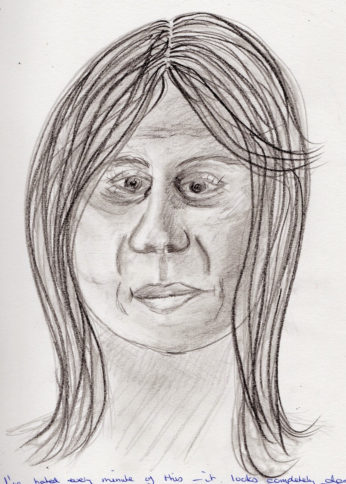
It is this that prompted me to draw my portrait without looking:


Not in the same league but I think  I should have pushed on a bit probably with a heavier pen.

Emin has done more conventional portraits as well:


Tracey Emin self portrait
Ink and wash on paper (7)


This is a more considered and conscious piece of work but for me it lacks the life of the previous one. I feel, however that it is still a very introspective drawing.

I have to be honest and say that I'm not a total devotee of Emin although I've said that of artists before and as my understanding has grown I've changed my mind.


Lucien Freud (1922-2011)

Lucien Freud is one of the most prominent contemporary portrait artists of recent years.  This portrait is one he drew as a young man.  It is in a style that I recognise from my own learning, with hatching used to create tones and expressive marks to indicate the movement in the hair.  Freud is almost glaring at the viewer.


Lucien Freud self portrait - 1939
Pencil  (8)

Almost half a century later he painted this characterful image.  The mature artist has produced a mature painting and the tones (in oil) are used to indicate the handsome, aging face very dramatically. I can't get close up enough to see how the paint is applied but I feel it isn't as subtle as the finished work suggests.  This time the eyes are more downcast and reflective.  This painting touches a nerve and is full of  deep emotion.  Freud seems undeterred by growing older - rather he grows stronger.


Reflection (Self Portrait)  by Lucien Freud - 1985
Oil on canvas (9)

Andrew Salgardo (1982-)

I love the work of Salgardo because of it's apparent chaos.


Trust (self portrait) - Andrew Saldardo
Oil on canvas  (10)


The artist creates the image with small slabs of colour that combine and fool the eye into seeing tone. There are numerous drips and runs and that just adds to the power of the work.  Salgardo often uses an arm and in this way introduces another element to convey emotion.

I wondered what the portrait would be like without the arm so I cropped and straightened the image:


and immediately the context is gone and the emotional impact so much less.  Masterly.

I'm not sure whether this is a self portrait but I love it so I'll include it anyway.


The Opposite of Intention - Andrew Salgardo
Oil on canvas (10)

I thought this reminded me of the work of Jenny Saville (b1970) but when I checked it out Salgardo's work seemed much more flamboyant.


Self portrait by Jenny Saville (11)


Saville's self portrait is from a most unusual angle and the foreshortening makes her head look almost triangular and her shoulders very prominent.

In conclusion it's probably worth a thought about the purpose of a self portrait.

In the days before photography the drawing or painting was the only way of portraying an image.  An image of the face of the artist could be interpreted as publicity material so it was usually a realistic portrayal.  Now there is no such need so contemporary artists are much more free to be inventive or controversial.

I've really enjoyed this little excursion into contemporary self portraiture.  It's very inventive, provocative and lively.  I love it.


(1) http://en.wikipedia.org/wiki/Self-portraits_by_Rembrandt

(2) http://www.wga.hu/html_m/g/gogh_van/16/

(3) http://www.wikiart.org/en/pablo-picasso/self-portrait

(4) http://arts.pallimed.org/2010/07/pablo-picasso-self-portrait-facing.html

(5) http://www.nrm.org/MT/text/TripleSelf.html

(6) http://artofericwayne.com/2014/02/13/

(7) http://www.artvalue.com/auctionresult--emin-tracey-1963-united-kingdo-self-portrait-1972226.htm

(8) http://www.wikiart.org/en/lucian-freud/self-portrait-1940

(9) http://www.wikiart.org/en/tag/lucian-freud

(10) http://www.andrewsalgado.com/work

(11) http://www.christies.com/lotfinder/paintings/jenny-saville-self-portrait-4976449-details.aspx