Search This Blog

Sunday, 12 July 2015

Lots of Prep


I located part of the garden that I thought would work for the frottage project I have in mind.


I sketched it roughly with the main shapes at the forefront of my mind.  I labelled the plants and then (on the right) highlighted the shapes that need to be included as frottage.

I have an idea that I will start at the back and work forward layering as I go.

I like the shape indicated by the black line and the balance created by the spots of yellow plants (ignore the practice printing).

I will draw into my work to indicate flowers and other detail.

It all looks a bit messy but it makes sense to me.  Just in case here's a photo to help.


I'm going to experiment with some leaves to see what would suit my purpose best.


I put a light blue wash on my sketchbook page but when I laid on the "trees" it had no impact so I deepened it.

First layer

Second layer

So far so good - I was getting what I wanted.

Next I moved to the willow with some heavier paper and colour and this is where things started to go wrong.


I used heuchera leaves and because the willow weeps I placed them downwards.  From there it went downhill fast.


Because my wax crayons were handy I used them to put in some flowers.


It wasn't my intention to produce a piece of work but rather to try out to see what might work so I'll log what I think works and what doesn't and look for alternatives because I still think the frottage idea has mileage.

What works:

  • the frottage trees give a sense of distance and the tissue and graphite allow for plenty of detail
  • the darkening of the foreground is necessary (but too dark)


What needs some thought:

  • the whole thing looks too busy but it's hard to know where to edit
  • using colour is where I start to lose it - should I try monochrome?
  • the paper I use to create my "plants"is crucial to the effect as I've found out before and the viburnum and the spirea suffer - should I try a print directly onto my carrier?
  • the central flower bed needs to sing and it doesn't in this image
  • the thuja needs to be more hidden
  • when I think back to Facinating Cypress by Ernst I am reminded that LESS IS MORE.
  • chop, chop, chop.


More experimentation needed and more to add to this post later.

Later....

I have found it impossible to edit my image and retain the integrity and interest of the viewpoint so I have looked for another perspective which offers interest and the more minimalist content I feel I need.

I have it in mind to draw the Dawn Redwood which is a particular favourite of mine - the first plant we put in our new garden 16 years ago.

For this work I need to give it a context so I went to see what surrounded it with an eye open for frottage possibilities.


Friday, 10 July 2015

Drawing in the Garden


I finally took my sketchbook out into the garden.


The shed bed (10 mins)


This is a quick sketch of what we call the "shed bed" but it lacks focus and definition.  The sun was high in the sky so shadows were almost non existent.  I put some colour on to try to rectify things but I'm not impressed.


Mark making for specific flowers - water colour


Bugs eye view of daisies in the meadow - pastel pencil


Bugs eye view was an idea I had after seeing the work of  Anthony Pegg (1) artist in residence at Gunby Hall in Lincolnshire. Pegg works in oils but I used pastel pencil with very few colours.  It would have been more successful if my stems and grasses followed a more diagonal line - there would have been more movement.

I'll have to have another try but I feel the beginnings of an idea for a collograph print.  First though I'll try a similar thing using collage.


Possible materials - old card envelope and a variety of papers

My idea is to use what is basically rubbish to make my collage.  I have assembled a variety of papers including the backing from some Bondaweb which gives a lot of texture.  I plan to use this to turn my old envelope into an earthy background.


Labels from clothes


I keep lots of things that might be useful one day and clothing labels come into this category.  I have cut off the knots from the ribbons and strings and think they might make "flowers".


My carrier


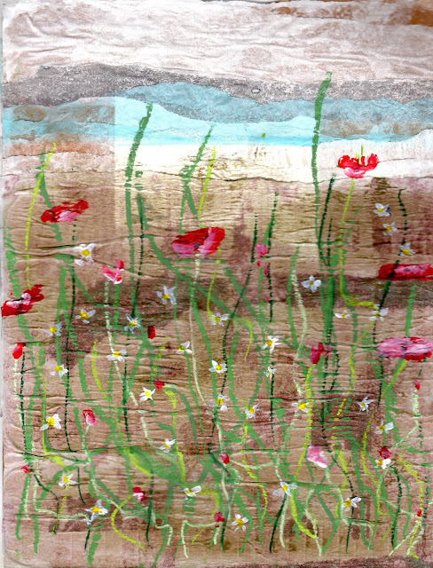
I used blue tissue and white Bondaweb backing paper for the "sky" and a single sheet of Bondaweb backing for the "ground".The label on the envelope showed through but I didn't think it mattered too much.  

I practised flowers with a Q tip in my sketchbook and decided on just a swirl of red with a touch of white to suggest poppies.  The stems worked best in pastel stick. The daisies I anticipate will be the knots I've cut off.  


Daisies and Poppies in the Garden


What I didn't count on was the bumpiness of the moistened background paper which interfered with the smooth running of the pastel.  I thought the knots would look too insignificant so decided to paint them in. From a distance the lightness of the label on the envelope looks like light on the horizon - a happy accident.


This is a style I rather like.  Angie Lewin (2) is a popular textile designer and artist whose work appeals to me and I realise how influenced I am by such people.


Coneflower with Spanish Seedheads - Angie Lewin - watercolour

These aren't exactly botanical studies but they are accurate representations offered in a highly stylised way.


Some time ago I did a day long collograph workshop with Carole Eason (3).  I developed this a little after the workshop and it formed the basis of my work for Part 5 of Exploring Ideas.  I'll have to revisit how to do it but I'm going to try again (4).

I made my collograph plate with an off cut of mounting card and built up the layers with odds and ends.


My collograph plate

The plate is well covered in PVA so that more than one print can be taken.  My only suitable printing ink is a water based one.  I followed my previous instructions and damped my paper but when I pulled off the print everything began to disintegrate; both my plate and my paper.


A less than impressive print.

The damp paper had made the printing ink run.  I think my plate was too fussy and too much in relief. I tried another two prints in desperation and then decided to call it a day.


The used plate

My first reaction was to throw this work away but experience tells me that sometimes the strangest things come out of a flop.

If I'm to pursue this idea I need to buy some oil based ink like I used with Carole.  


(1) http://www.anthonypeggartgallery.com/page3.htm
(2) http://www.angielewin.co.uk/collections/my-work
(3) http://carolaeason.bigcartel.com/
(4http://iburkitt.blogspot.co.uk/2013/06/collograph-workshop.html


Printing


I wanted to try printing after a long absence.  I've not done much before but I've enjoyed it.  My previous experience has been with fabrics so I thought I'd try some batik dye mixed with manutex as a thickener.  It was a bit too squishy and went all over the place.  I found I was wanting my screen printing gear out but that's another course!

Having said that there are some attractive parts of what I did.

I used heuchera leaves because I love the shape


Printing with manutex

Printing with manutex


Detail
Detail


I need to try this again probably with extra thickener.


I already had my printing ink out so I decided to try that.  The ink is ancient and the really hot weather didn't help; it just dried so quickly on my glass.  I resorted to spraying it with water which made it a little better but I am not happy with what I did and need to return to it on a cooler day.  I think I need to choose my material more carefully as well.


I'm quite enjoying playing around in this unusual way in my garden but I need to ask myself where I'm going.

Part 5 Research


As someone studying textiles I was amazed by the work of Anna Atkins. Born in 1799 some say she took the first photograph. Whether that is true or not her botanists eye reveals much about her love of nature.
In her books on British algae and her later work on plants and ferns, Atkins worked by contact-printing cyanotype photograms, and by “photogenic drawing,” the process by which light-sensitive paper is exposed to the sun.  (1)
The results are truly modern looking and I itch to try some of the ideas as machine embroidery.

Photographs of British Algae by Anna Atkins  (1)


Anna Atkins (1)


Taking the idea of early photography a bit further I have found the work of Henry Fox Talbot (1800-1877). He was a pioneering photographer and like Atkins he produced images that look contemporary and offer us new ways to look at the familiar even today.

Photogenic Drawing of a leaf - Henry Fox Talbot (2)


Lucian Freud drew plants in a way that I like.  They aren't botanical studies in the accepted sense but they evoke the feeling of tropical climes, the heat, sultriness and exuberance.  I get no feeling of being able to wander through these plants.


Plants in Jamaica - Lucian Freud (1953)
Oil on canvas (3)

I have looked at the drawings of Antony Gormley (4).  He drew whilst he was travelling and took only pigment with him.  I like the philosophy that one thing flows into another as the idea develops
Creating one drawing after another, he develops an idea and keeps it going through the momentum of the flow of making in a single intense session of activity.
Although plants are not really the focus of these drawings I particularly like these images because they remind me of plants. They are from the Bermuda drawings 1998


The Bermuda drawings - Anthony Gormley (1998)


(1) 


It seems as though plants can be depicted in a infinite number of ways.  They can rely on reality (as in botanical drawings) or become abstract and excite the viewers imagination.  I like the power of suggestion in the abstract.


(1) http://www.theparisreview.org/blog/2015/03/16/impressions/

Sunday, 28 June 2015

Part 5 Petal colours

The garden is full of colour at the moment with lots of purple, pink and blue.  I wondered about trying to capture the colour just by using the petals of some of the flowers.

I have a lovely old rose that really needed dead heading


so I gathered some petals and liquidised them.


It took this amount of petals


to get this amount of colour


It took a while and a bit of water but I got a lovely (if pale) lilac colour.  My first sample was with the inclusions but then I sieved it and took some of them out.

I used this as a wash and then tried scrunched up peony petals using one of my spiky leaves as a stencil. 

Pink peony


 The colour was more vibrant than the liquidised rose petals.  I did the same with delphinium petals.


Blue delphinium


Petal colours - showing inclusions

I scanned it immediately because I anticipate it going brown pretty soon.

I subsequently tried scrunched up rose petals but they were just as pale as the liquidised variety.

I like the idea of using not only plant material but plant colours as well.

Inspired by this success I took my sketchbook round the garden and tried some further samples.


My paper is absorbent and soon roughed up when I applied pressure - the more watery the material I used the less that happened.  Most samples stayed true to colour but the bright orange of the alstromera and the day lilies went a brown and a pink respectively.  Th purples are stable and the snapdragon is brilliant, Quite literally. Predictably the tomato and the salad leaf gave lovely greens although not vibrant.

I'm going to try some smooth watercolour paper to see if it stays intact.

I began by using the sedum over the whole page and then adding salad and tomato leaf.  I found with the darker colour of the salad and tomato I was able to make more controlled marks.


Getting a decent image to put on my blog was a very different task and neither of these are anything like the real thing.  It is not bright green but neither is it washed out but I hope you get the idea.

I'm going to introduce some flower colours without any knowledge of what will happen when these are combined!

Scary.  But this is what turned out.

Garden flowers 

I used the auto adjust on the computer and this gives me the best representation.  It's not far off this time.  I'm quite pleased with this but I've got my fingers crossed for stability.

Thursday, 18 June 2015

Part 5 Early thinking

The final part of Drawing 1 demands that I invent my own project and work through to a conclusion.

I have decided to re visit Part 2 "Your Own Environment" and work in my garden.  It is always accessible (unlike life models) and can offer something come rain or shine.  In 1998 we were lucky enough to buy an acre of land.  We took a year to build our house and then set about the garden which was just rough ground.  Sixteen years on it is our pride and joy.  Hard work aside it is now a lovely, comfortable place to be all through the year.  It has a bit of everything.

But where to start?

The manual gives me some points to consider


  • subject - my garden
  • format - landscape
  • support - Japanese paper (became lining paper)
  • medium - mixed
  • line, tone - combination (became line)
  • composition -experimental
  • mood, story -  the excitement of texture and form
  • abstract or realist - abstract
  • light - natural light - natural
  • size - less than A3 (became almost A2)


Not many items filled in there!  As I make my decisions I'll come back to this list and fill in the blanks with red


Maybe a little look at what I'm working with will help.


Views ....


.... tranquillity .....

and a bit of bling


The garden is exciting and it is this that I want to work on in Part 5.

I took my camera out to see if I could capture "exciting".  What I found surprised me with its variety; sometimes it was colour, sometimes form and sometimes exciting combinations.


Super combinations

The beautiful heuchera

The weird bearded iris

Orchids that arrived unbidden

Majestic foxgloves

Acanthus

Dawn redwood bark


Exciting leaves


The leaves in the last photo are very curved and I wondered how they would flatten with a view to printing.  To test this I scanned one and it flattened really well.  

The leaf scanned well enough to see the veins


I'm a bit stuck because my printing equipment is behind a heavy wardrobe awaiting collection. While I wait I decided on frottage to see what would show up.  I used copy paper and a chunky graphite stick.

Grey scale

Black and white

I was surprised that so much came through as the leaf is quite thin.  The sharp spikes are very obvious particularly on the black and white version.  There is potential for interesting mark making here.  Here are a couple of crops:


From grey scale

From B & W


I took another leaf, this time a softer one (heuchera)

Heuchera

and tried several combinations of paper and rubbing media:


The purple was wax crayon on cheap tissue and gave an indistinct impression probably because if I pressed hard the paper tore.  The mid pink was also wax crayon but on tracing paper - this too was fuzzy but in a more "foggy"way.  The red was wax on copy paper and was much more literal.  Finally I used my chunky graphite stick on tissue - a delicate manoeuvre.  This gave a very clear impression with each part of the leaf looking tree like.


I was going to try some coloured paper but I got waylaid by some blue foil.  I tried rubbing on both sides and whilst at the moment I can't see where it might go the effect was interesting.  It reminded me of blowing ink in an earlier part of the course.  It fits with the spikiness of the previous leaf.  One to bear in mind I think.


I repeated the grey scale and black and white experiment again and this is what turned up.

Grey scale

Black and white

A crop of the lower black and white scan makes an interesting image.


It looks like a mountain range from Google earth and it makes me want to stitch.

At this point I have decided to concentrate on texture.  This is no great surprise as I am enrolled on the Textiles degree.  This means that I will probably be focusing on the minutiae of the garden as I have today.


These are a couple of promising websites that I've earmarked for further investigation later on.

http://tondro.com/blog/category/leaf-monoprint-process/

http://blog.heathertelford.com/tag/art/