Search This Blog

Thursday, 11 December 2014

Part 3 Project 3 Research Point 1

In this section I have to look at various theories of composition.  In a previous post (Part 2 Project 1 Composition 1)  I unwittingly jumped the gun and looked at this subject.  I covered the drawing position of the artist, the Golden Triangle, vectors and balance. What I didn't cover was the Rule of Thirds and one or two others I've found.

I've used this website because its examples are very good:


The Rule of Thirds

Basically this theory divides the page into thirds both horizontally and vertically.  

The Biglen Brothers Racing - Thomas Eakins, 1873 (1)

The Biglen Brothers Racing shows this rule very well.  The action is all on the grid lines, the treeline, the boat and the positioning of the rowers.  The points of intersection are particularly good places to position items of importance.

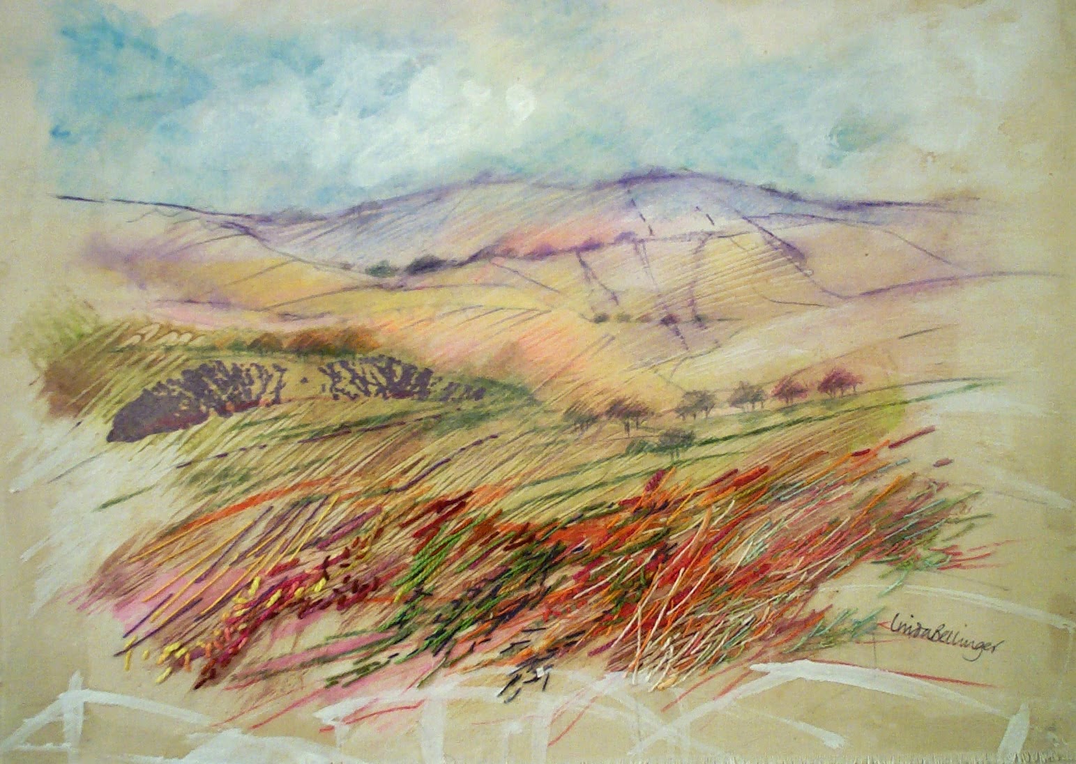
This left me wondering how my work fits in with this rule.  I took a sketch that I was pleased with and worked well compositionally and drew grid lines on it.


The Rule of Thirds
This isn't as obvious as the Biglin Brothers.  I can see that the centre of the upper window is bisected as is the top of the lower window.  The lower window also aligns with the right hand line.  The centre sector holds equal parts of the sail and the brickwork which I think is a sort of mini balance.  I'm not sure how the sail stacks up with the theory but for me it works on an intuitive basis.

Rule of Odds

This is a rule that works for flower arranging, interior decor and all manner of arrangements.  If there are three (or any odd number) of items the eye cannot settle into grouping so it continues to rove around the picture.

King Charles I of England - 1635-36 Anthony van Dyck (1)

This is an interesting picture in several ways.  First the Rule of Odds clearly applies and I can see the Rule of Three as well.  The painting is actually three portraits of the King in three different profiles. In each one he is dressed differently but with the same collar.  I wonder if he was unhappy with the profile on the right or whether it was van Dyke's artistry that put him slightly off square?


Rule of Odds

Although this is by no means the same sort of image I can see that it is based on groups of three; settee, table, curtain.  And taken a further step; table top, tissues, vase.  Once again this is intuitive rather than deliberate and I suppose the skill is in the recognition and then the application of the theory.


The website I have used for this work also talks of "leading lines" and "diagonal lines".  This is where the eye is guided by what is on the image.  This is what is my previous work I learnt were called "vectors". Whatever name they go by the effect is one of distance.

Provencher's  Mill at Moret - 1883 Alfred Sisley. 

Sisley's work has several strong leads towards the horizon; the buildings, the bank, the river bed and the bank on the right of the picture.  Everything leads to the tall tree on the horizon.

I haven't done many landscapes but I've done a bit of a search for vectors in some recent ones:


Leading lines

I'm not arrogant enough to compare myself to Sisley but this image also has many leading lines to take the eye into the distance.  There is a very clear point at which they converge and that is indicated by the diminishing height of the trees and the tapering of the road.


Leading lines
This works in the same way with lots of indicators pointing to distance although this one takes the viewer round a bend rather than to the horizon.


Leading lines

The windmill is a different proposition entirely although I can see leading lines in the way the black building takes us upwards to the sails.  The sails are on the diagonal and are all at different angles.  I think this gives a feeling of movement.

Lines of sight

Lines of sight are when the painter has the subject looking at something in the distance arousing the viewers curiosity to look as well.


Christina's World, 1948 - Andrew Wyeth

I know nothing about this painting but I feel a tension created by the way the artist has the subject almost prone looking apprehensively (?) at the house.  There is the option to follow the paler line and go to the barn but the focus is very clearly on the house.  There is a feeling of being adrift in a large space and what lies beyond?  Sea, sky, who knows?  It's very unsettling.

I was moved to look up some information about the painting:
The woman in the painting is Anna Christina Olson (3 May 1893 – 27 January 1968). She is known to have suffered from polio, a muscular deterioration that paralysed her lower body. Wyeth was inspired to create the painting when he saw her crawling across a field while watching from a window in the house. (2) 
As something of an afterthought the Rule of Odds applies here.
I have no drawings that use this device but I can see the dramatic potential.

Simplify

This idea as a compositional device is new to me but very appealing.  The example the website uses is by Turner and just stunning.  It's hard to believe it was painted nearly 200 years ago.

Colour Beginning 1819 - J M W Turner.
The Tate was left this work in the Turner bequest and has several similar which seem to be underwashes.  I have asked people what they see in Colour Beginnings and each one sees something different. I think it's dawn but maybe Turner intended to be non specific.

The Rule of Thirds is evident but only in the horizontal plane.

I know how hard it can be to get water colour to blend just right but a painting I did with Stephen Coates emphasises simplicity:  

Simplicity - colour wash and red sail


Here there is no horizon just a graduated wash.  The side ripples in Payne's Grey give the picture some depth.

The learning from this additional work is important not only for its intrinsic merit but for the confidence boosting value as well.  Whilst my academic learning no doubt filters in I find that I have been using these principles intuitively rather than by design.  I need to pay much more heed when I set up a drawing and consciously think about what I'm doing not just "allow" it to happen.

(1) http://www.slideshare.net/mrsbauerart/theories-of-composition

(2) http://en.wikipedia.org/wiki/Christina%27s_World


Tuesday, 9 December 2014

Part 3 Project 2 Research Point 3

This work is about artists who work in series with landscape as the focus.  I have already looked at some of the work of Turner, van Gogh, Cezanne, Monet and Hockney in my work on trees.  My manual suggests that I look at the work of Peter Doig, John Virtue and Nicholas Herbert. To that list I would like to add Deborah Phillips because I like the way she takes what might be the boringly familiar and gives it a twist.

Peter Doig b 1959 - 

Peter Doig


This artist is one of the most respected alive today and his work sells for vast sums of money.  Most of Doig's work is based on the landscape of the area he happens to be living in at the time.  He came to prominence in 1993 with his painting Blotter and then as a Turner Prize nominee in 1994.


Blotter by Peter Doig, 1993
Oil on canvas (1)

Blotter was based on a photograph of his brother during their time living in Canada.  It is still considered to be one of his best paintings.  Most of Doig's paintings use photographs as a reference although there is no intention to make a photographic copy.  Photographs are photocopied, cut up, repeated and collaged (2).  The idea of copying from photographs is almost like plagiarism, certainly cheating, but taking them and developing ideas from them in other media offers lots of creative possibilities.

There is a very interesting video clip of Doig talking about his work and his source material before the opening of his exhibition at the Tate in 2008.

http://art-landscape.blogspot.co.uk/2010/11/peter-doigs-landscapes-and-painting.html

Canoes are a regular feature of Doig's work and are presented in a variety of colours.  This one has elements of (almost) realism in the reeds but mainly it is surreal.  The repeating shape of the reflection and the figure could easily be missed as it blends effortlessly into the water.  The image is broken into five horizontal bands which I find very unusual.  The black band is quite unsettling but I'm unsure why.

Canoe Lake - Peter Doig, 1997.  Oil on canvas (3)


I find the wide range of Doig's work intriguing and it leaves me with the feeling that you can use anything in any way as long as you can justify it.


John Virtue b 1947 -

John Virtue
www.artistsonfilm.co.uk


John Virtue paints landscapes working only in monochrome.  He paints on canvas with white acrylic paint, black ink and shellac. He sees colour as an "unnecessary distraction"  (4)


Landscape no 507 - John Virtue (5)


Virtue is "interested in making exciting abstractions from what he perceives" around him in London (5) 
and is very influenced by both Turner and Constable.  He finds inspiration in the Dutch landscapes as well.

I'm not sure why but I don't warm to this work.  This happens sometimes then later, when I'm better informed, things change and I come to understand more of what the artist has to say.

However, I can relate to Virtue's preparatory sketches done on the roof of Somerset House.  They are quite spare and very evocative.  They give an unusual view of a familiar scene.


Preparatory work - Somerset House - John Virtue (6)

Virtue acknowledged that it was this unusual aspect that caught his attention.  This is a panoramic view expressed with a line drawing.  There is some hatching but not much.  There is some distance indicated as the building appear smaller in the background.  The whole sketch is done from a distance.


Nicholas Herbert b ?

Drawing and mark making is fundamental to this artists' work.  During 2013 Nicholas Herbert chose to make a series of drawings of the Chiltern Hills.  When I read about his work I get the very strong feeling that Herbert is less focused on what he sees and more concerned with what he feels. On his website he talks about atmosphere, permanence/impermanence, decay, resonance and the collective memory of our ancestors.  There's not a lot about trees and other features of the landscape. 


Landscape Drawing near Ashridge Estate, Chiltern Hills.  Nicholas Herbert. June 2013
27 x 18cm Mixed media (7)

Although the palette is similar to that of John Virtue I find myself liking this very much more. I think that it is probably because of the lighter tones (although that isn't always so).


Landscape Drawing L797, The Chiltern Hills. Feb 2014 - Nicholas Herbert
18 x 14 cm Mixed Media. (8)

In some ways his work reminds me of the embroidery of Linda Bellinger - there is a freedom and sense of movement that is very evocative of wide open spaces.


Autumn by Linda Bellinger - paint and stitch on calico
from my photo collection

Both artists use marks that show their love for what they draw.

Herbert also uses the iPad:

Image using an iPad - Nicholas Herbert (9)

Herbert questions the use of the iPad as an artists tool.  At the moment his thinking is that it is useful as a development tool but has little place in finished pieces. (9)

Deborah Phillips b 1965-

Deborah Phillips is a Scottish born artist who paints familiar landscapes but in surprising ways. (10)


Heathery Ben - Deborah Phillips (10)


Turquoise Dusk - Deborah Phillips (11)

This artist works in acrylics and says she loves the way the paint glistens as she squeezes it from the tube. I like Phillips choice of colours but after the monochrome of the previous two artists this is quite a shock.  I enjoy the way the foreground is really close up and detailed.  This work is much easier for me to understand but doesn't make me think or feel as much.


(1) http://www.liverpoolmuseums.org.uk/walker/johnmoores/history/prizewinners-exhibition/paintings/peter_doig.aspx

(2) http://www.tate.org.uk/art/artworks/doig-blotter-p11478

(3)  http://www.saatchigallery.com/artists/artpages/doig_Canoe-Lake.htm

(4) http://www.nationalgallery.org.uk/artist-john-virtue/scheme/why_john.htm

(5) http://www.nationalgallery.org.uk/artist-john-virtue/default.htm 

(6) http://www.nationalgallery.org.uk/artist-john-virtue/studies/somerset_acc_2.htm

(7)  https://nicholasherbert.wordpress.com/

(8) http://www.nicholasherbert-drawings.co.uk/drawings-2014.html

(9)https://nicholasherbert.wordpress.com/2013/03/15/landscape-drawing-on-a-ipad/

(10) https://the-leith-gallery.co.uk/artist-a-z/deborah-phillips

(11) http://macmillanartshow.org/index.php/deborah-phillips/


Part 3 Project 2 Ex 3

360 deg Studies


The land around me is very flat and dominated by power stations.  If the stations aren't in view, pylons generally are.

It is December and sunless, grey and bleak with a cold north wind. It is the worst possible time to be working outdoors so I took the cowards way out and sat in the car with the heater on.  I parked  on the grass verge on a country lane and began by looking at the dominant power station.  I was concerned because I didn't know what most of the component buildings did but then realised that I didn't have to.  All I had to do was draw what I saw.

I took fine liners with me as well as pencils and pencil crayons.  I also took charcoal but I didn't really want to use it in the car because it's so messy.


1. Looking south towards the power station
1.
I've not sketched in this sort of wide open space before.  I had my viewfinder and it helped to cut out most of the scenery and give me focus.  I found it hard to use thereafter as it interrupted my work.  I just made a mental snapshot of the view I had chosen.

I didn't want the huge cooling towers to take over the sketch so they are just a hint on the left.  They had to be there in some way because they define what the sketch is about.  The large building is grey and brick red but my pen gives me no information about that.

I began by drawing the chimney to give me a height guide.  I now think this was a mistake because in the end it was way too short.  A few general marks to guide me might have been more useful.


2. North towards the next power station
2.
This was the hardest view to sketch because everything was made insignificant by the pylons.  I wanted to get the feeling of them striding across the landscape but I didn't get the perspective right.  I need to observe them more closely and give them a better shape.  The one on the foreground is pretty inaccurate.


3. East towards the river
3.
Here I'm parked on the verge with the hedge on my left and the lane on my right.  I found the power lines here difficult so rather than make lots of marks I left them.  If I should return to this sketch I'll have to sort it out.


West down the lane
4.
This view shows that I was parked on the wide grass verge with the narrow lane to my left.  In the distance there is the only hill for miles and to my right a hedge.  The lane goes round a bend and I struggled to get the hedge to make the same sweep.  I thought this was perhaps because I was using pen so I got my charcoal and put in the sweep with one stroke.  I'm learning to love this stuff.  In the foreground is something in a blue plastic wrapping.  I found I'd done the multi stemmed hawthorn near it far too big.

The poles that carry the electricity wires worked better than I thought and they give the sketch a feeling of depth.

Each of these sketches took about 15 minutes and I'm reasonably happy with them.  There are clearly issues to get to grips with but that's why I'm doing this course.


Sunday, 7 December 2014

Part 3 Project 2 Ex 2

This exercise should take me into the countryside but I have been unwell and it is bitterly cold so I am going to rely on photographs I have taken over a period of time.

I live in rural Nottinghamshire and take lots of walks in the area.  One of my regular routes takes me past a 200 year old windmill that has been grinding ever since it was built.  Locally it is frequently photographed because from certain angles the huge cooling towers of the power station dwarf it.  Beside the Mill is a small brick building that now houses a museum that I suppose was once used for storage.


North Leverton Windmill (1)

My idea is to use photographs that get closer to the Mill; as though I was walking towards it.


1. North Leverton Windmill approaching from the east

1. This is standing facing the mill with the museum to the right.  I did this in pencil and it felt very ponderous and it looks half hearted.  I didn't get the Mill tall enough.  I couldn't get the windmill the dense black it really is with the sketching time I had allocated.  The horizon was the fence just behind the Mill so there was lots of blue cloudless sky.


2. North Leverton Windmill looking towards the power station


2. This image didn't scan well so I photographed it and it's not much better.

This is view that encompasses the power station cooling towers.   Because of the difficulty I had with pencils I changed to charcoal and got a better result. It was easier to make the Mill look dense black. I tried to use tone to indicate what an ominous presence the cooling towers are.  I wasn't sure how all the mill machinery (called the fantail) fitted together so I just drew a few lines as indicators.  

In the distance the towers have trees in front of them and then a field with trees in the foreground. The light is coming from the right of the drawing.


3. North Leverton Windmill standing close looking up


3. I like this sketch much better because it has some character.  Once again I used charcoal and managed to make marks that covered the Mill area quickly and then change to using it on its sharpened side to make the sails.  I think the sails work well.  The light is coming from the right of the image and there is just sky in the background.


4. North Leverton Windmill standing close looking up (cropped)


4. This is a crop from a photograph and looks almost abstract.  Much of the paper is covered in black but it isn't the intense black I used previously because the light is reflected off the paint just off centre and this somehow gives it depth.  This close up the slats on the sails look triangular with light reflected off the top edge.  This is my favourite drawing because I think the composition is good and it is less literal.

The amount of tone I can get with charcoal is amazing now that I've got the hang of it.  The top windows in the Mill are really intense and I feel I can look right inside.

Some days later....

I made some small tiles from this image and played about making patterns.


I don't think this is going anywhere but it was fun.


(1)  http://www.north-leverton-windmill.co.uk/Home.html


Friday, 5 December 2014

Part 3 Project 2 Ex 1


For the first time in ages I got up to a lovely morning and I thought I ought to take advantage of the clouds while they were there.  It's a good job I did because by early afternoon we were back to the dull, grey skies.

8.00 am


8.00 am

Midday

Midday

Midday

Midday


This is not really a cloud but spectacular:

Vapour trail

I am a Textiles student and have chosen Drawing as an option.  In my Textiles courses I have used a book by Francoise Tellier-Loumagne.  Essentially it is a book using clouds as inspiration for her lovely felting.  I had intended to scan an example but whatever I tried I got a Moire pattern on the image. Instead I have photographed my book cover.  It shows a cloud at the top and the artist's depiction in felt at the bottom.


The  Art of Felt by Francoise Tellier- Loumagne

I'm ready to draw but....


it's wall to wall grey skies so at the moment it looks like I'll have to use my photographs.

I've found one or two on line tutorials and I'm keen to draw.

This site gave me some ideas about using pencil:
http://www.artinstructionblog.com/how-to-draw-clouds-skies-landscape-drawing-tutorial

Graphite - too pale to show up

I used my 8 am photo for this image.
I hatched horizontally with a F pencil then cross hatched on the diagonal.  I blended it with kitchen paper then cross hatched and blended again using a 2H.  These are pencils I rarely use.

I lifted out the graphite with a rubber and a putty rubber and put darker tones next to where I wanted it to appear most highlighted.  I couldn't get the graphite dark enough to get the right amount of contrast to make the clouds stand out.  Neither could I get enough out of my eraser to get a good white.  When I looked really carefully my paper had a grey tone. In spite of making adjustment to the scanner it's hardly worth putting in my blog.

I'll have another try but start with darker cross hatching.  This time I used much softer pencils 5B and 7B which unfortunately showed the cross hatching when it was scanned.


Using softer pencil
This worked better but I found my plastic rubber wasn't fine enough to get the swishy marks I wanted.

I'm going to try charcoal using the same technique.

Using charcoal
This is probably getting a bit better - it seems to give some movement in the clouds.

Generally I'm pretty disappointed with these.


This tutorial was helpful on using pastels:
https://www.youtube.com/watch?v=OfifPf55Mns

I used a blue pastel paper and graduated from dark blue to white with my pastels. I used this as my base and because the weather was brighter I went outside.  The only thing I could do was try to capture the feeling of the clouds because to actually draw what I saw was impossible - it changed so fast.

Soft pastel on blue Ingress paper
The vapour trails look like a bit of a mistake but they were there and very prominent.  The blue paper made everything look a bit dense so I used some white watercolour paper and repeated the process.

Soft pastel on white watercolour paper
I'm happier with the pastel work.  I think I've managed to get some frothy clouds but maybe they could do with being a bit more dense.


Water colour skies are also an option but not quite as predictable as my other examples.  I have completed a few sessions of tuition with Stephen Coates  http://www.coatesart.co.uk/about/. I painted these examples in session 3. First I did a plan of my painting:


My plan

The darker sky is shown with the darker tone, in the centre it is lighter and lighter still on the horizon. The rocks are cross hatched.  I tried this twice and the sky was different on both ocassions.


On the beach 1 

On the beach 2 

I think these are effective skies because they are so blended and therefore atmospheric.  Although there is no obvious sun there is clearly sun shining through the clouds - it's a bright day.


Monday, 1 December 2014

Part 3 Project 2 Research Point 2

Vija Celmins b 1938


Vija Celmins (1)


Celmins became a painter in 1962 after several years of exposure to various sorts of art. By 1965 she had developed a way of working from photographs and layering her work until there was some considerable distance from the original photograph and the work was independent. (2)

Sources of inspiration are the natural world; the sea, the sky, stones and even spiders webs.  Her style seems to be to "copy" but she defends this by saying that she "re-describes the object imperfectly" (3)

The Tate has the artist's proof of a work called Sky.


Sky - Viga Celmins, 1975
Lithograph on paper  (4)

The Tate webpage

http://www.tate.org.uk/art/artworks/celmins-sky-p78334/text-summary

gives lots of interesting information about the series of four works that Sky belong to.  It refers to her almost exclusive use of grey and her "meticulous and time consuming technique, depicting the surface texture of areas of sky and desert ground which completely fill the picture plane, unbroken by horizon, building or any form of life".

I find skies fascinating and there is always something to look at that doesn't need anything to support it.
Perhaps that is in Celmins mind.


To Fix the Image in Memory - Vija Celmins, 1977-82 (5)

In a Vimeo interview (3) Celmis talks about her work To Fix the Image in Memory.  She made bronze casts of rocks found on walks in North Mexico and then painted them to resemble the original rock. She calls them "imperfect".

Celmis understands the challenge her work poses and in the interview she defends her position.


(1) http://www.usafellows.org/fellow/vija_celmins

(2) http://www.tate.org.uk/art/artists/vija-celmins-2731

(3)  http://vimeo.com/22299024

(4)  http://www.tate.org.uk/art/artworks/celmins-sky-p78334/text-summary

(5)  http://www.moma.org/collection/object.php?object_id=100210