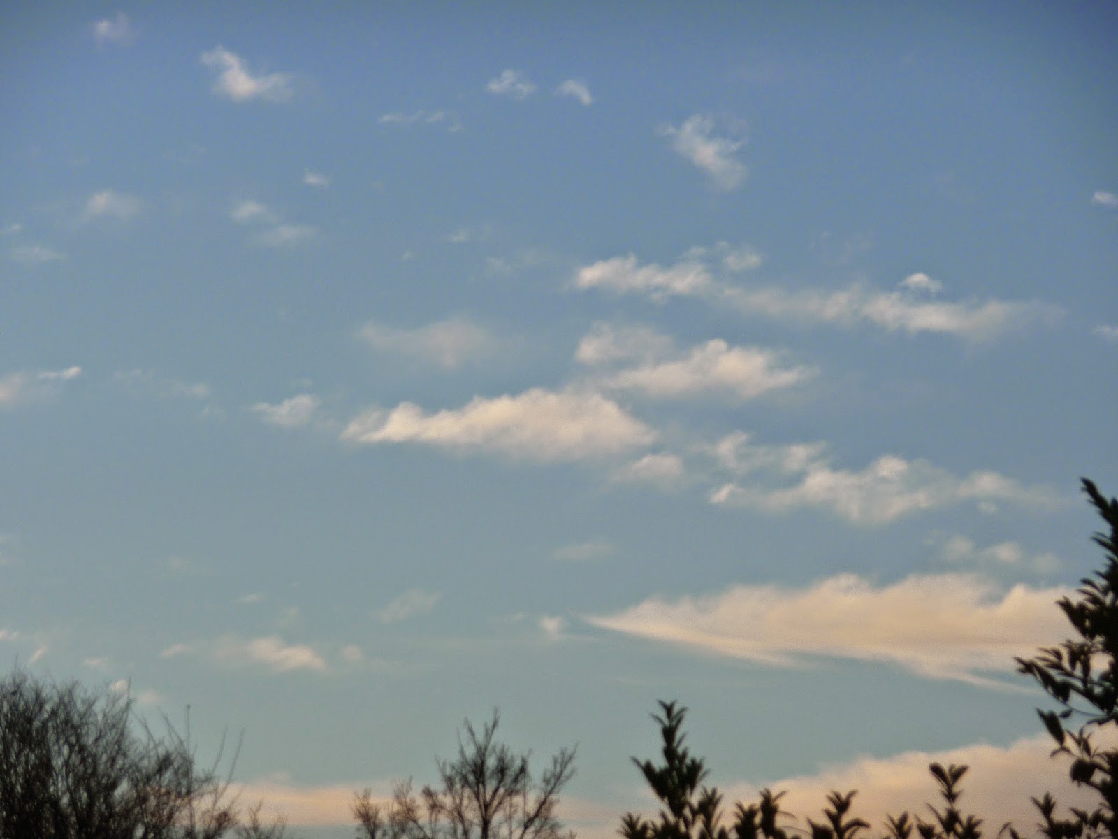
For the first time in ages I got up to a lovely morning and I thought I ought to take advantage of the clouds while they were there. It's a good job I did because by early afternoon we were back to the dull, grey skies.
 |
| 8.00 am |
 |
| 8.00 am |
 |
| Midday |
 |
| Midday |
 |
| Midday |
 |
| Midday |
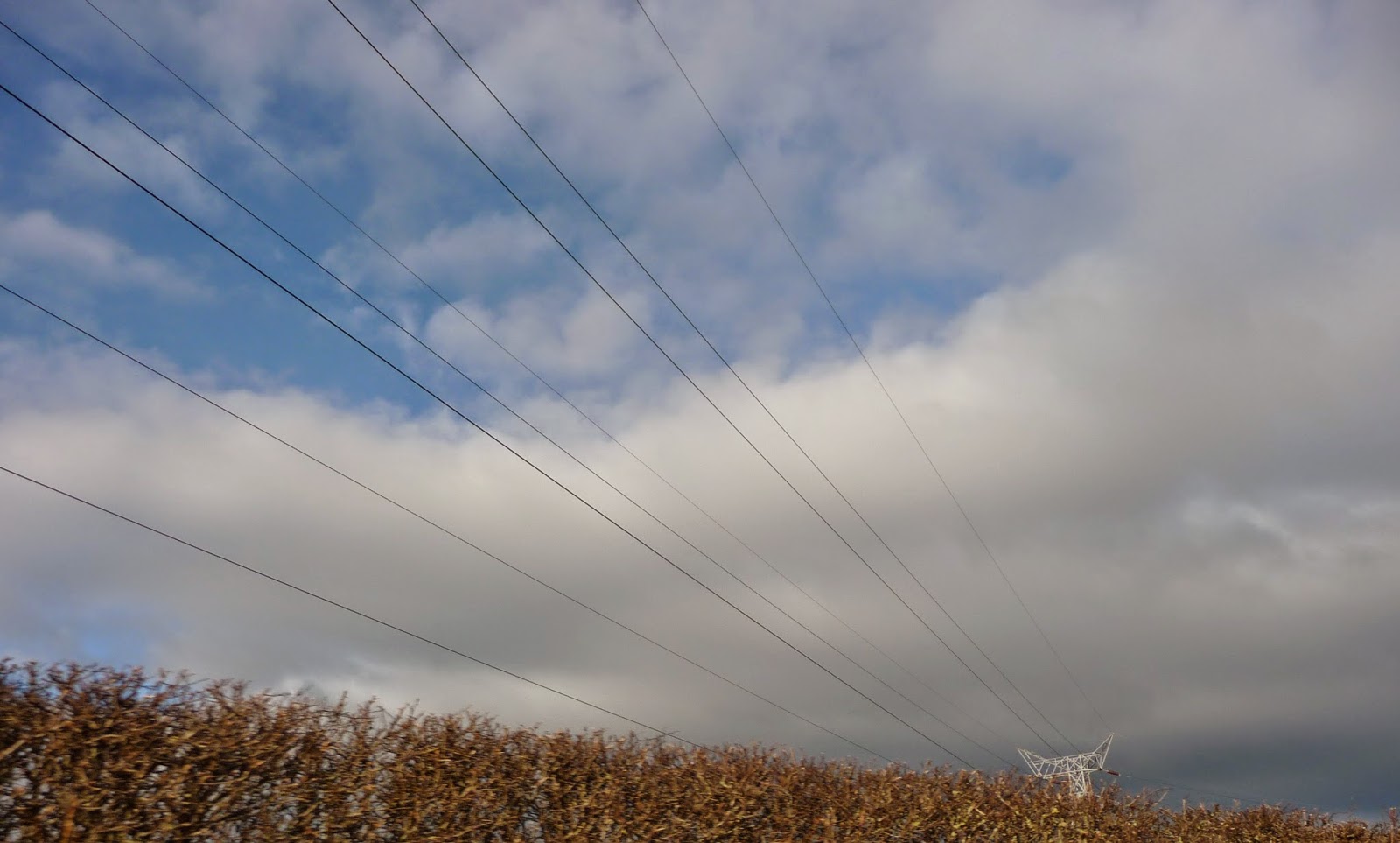
This is not really a cloud but spectacular:
 |
| Vapour trail |
I am a Textiles student and have chosen Drawing as an option. In my Textiles courses I have used a book by Francoise Tellier-Loumagne. Essentially it is a book using clouds as inspiration for her lovely felting. I had intended to scan an example but whatever I tried I got a Moire pattern on the image. Instead I have photographed my book cover. It shows a cloud at the top and the artist's depiction in felt at the bottom.
 |
| The Art of Felt by Francoise Tellier- Loumagne |
I'm ready to draw but....

it's wall to wall grey skies so at the moment it looks like I'll have to use my photographs.
I've found one or two on line tutorials and I'm keen to draw.
This site gave me some ideas about using pencil:
http://www.artinstructionblog.com/how-to-draw-clouds-skies-landscape-drawing-tutorial
 |
| Graphite - too pale to show up |
I used my 8 am photo for this image.
I hatched horizontally with a F pencil then cross hatched on the diagonal. I blended it with kitchen paper then cross hatched and blended again using a 2H. These are pencils I rarely use.
I lifted out the graphite with a rubber and a putty rubber and put darker tones next to where I wanted it to appear most highlighted. I couldn't get the graphite dark enough to get the right amount of contrast to make the clouds stand out. Neither could I get enough out of my eraser to get a good white. When I looked really carefully my paper had a grey tone. In spite of making adjustment to the scanner it's hardly worth putting in my blog.
I'll have another try but start with darker cross hatching. This time I used much softer pencils 5B and 7B which unfortunately showed the cross hatching when it was scanned.
 |
| Using softer pencil |
I'm going to try charcoal using the same technique.
 |
| Using charcoal |
Generally I'm pretty disappointed with these.
This tutorial was helpful on using pastels:
https://www.youtube.com/watch?v=OfifPf55Mns
I used a blue pastel paper and graduated from dark blue to white with my pastels. I used this as my base and because the weather was brighter I went outside. The only thing I could do was try to capture the feeling of the clouds because to actually draw what I saw was impossible - it changed so fast.
 |
| Soft pastel on blue Ingress paper |
 |
| Soft pastel on white watercolour paper |
Water colour skies are also an option but not quite as predictable as my other examples. I have completed a few sessions of tuition with Stephen Coates http://www.coatesart.co.uk/about/. I painted these examples in session 3. First I did a plan of my painting:
 |
| My plan |
The darker sky is shown with the darker tone, in the centre it is lighter and lighter still on the horizon. The rocks are cross hatched. I tried this twice and the sky was different on both ocassions.
 |
| On the beach 1 |
 |
| On the beach 2 |
I think these are effective skies because they are so blended and therefore atmospheric. Although there is no obvious sun there is clearly sun shining through the clouds - it's a bright day.
No comments:
Post a Comment