Search This Blog

Sunday 26 July 2015

Henry Moore at the Yorkshire Sculpture Park

I'm a regular visitor to the Yorkshire Sculpture Park because their exhibitions are second to none.   Henry Moore was the founding patron and was influential in making it the great place it is today. I went specifically to see the drawings of Henry Moore but there was also a large exhibition of the work of Sir Anthony Caro.

I'd not known of Moore's skill as a artist until my tutor drew my attention to the Shelter drawings done during the war.  I was keen to see more.

The exhibition is called "Back to Land" and demonstrates the effect a Yorkshire upbringing had on Moore's life.

The land of Moore's Yorkshire childhood was one of revealing contrasts: the industrial, smog laden town of Castleford and the clean air and dramatic beauty of the surrounding countryside .... (1)


As usual the exhibition was well curated and my focus was on the drawings.  I immediately picked out some that I could learn a lot from and the main ones were the Stonehenge drawings from 1973.


Stonehenge A - Henry Moore.  1973.

Stonehenge B - Henry Moore.  1973.

Stonehenge B - Henry Moore.  1973.

These images impressed me because they take my understanding of mark making to an entirely new level .  Moore manages to get shape, form, perspective and tone with (apparently) very simple lines.  

Moore himself seemed quite overwhelmed by Stonehenge and appreciated it for its current presentation rather than historical significance.

I began the Stonehenge series with etching in mind, but as I looked at, and drew, and thought about Stonehenge, I found that what interested me most was not its history, nor its original purpose – whether chronological or religious – or even its architectural arrangement, but its present-day appearance. I was above all excited by the monumental power and stoniness of the massive man-worked blocks and by the effect of time on them. Some 4000 years of weathering has produced an extraordinary variety of interesting textures; but to express these with an etching needle was very laborious, and after making two or three etchings I changed to lithography which I found more in sympathy with the subject – lithography, after all, is drawing on stone. (2)

The work itself is quite small but there is a feeling of Moore's experience of "monumental power" about them.

There was also some of Moore's Shelter Drawings in the exhibition.  One of the reasons Study for Grey Tube Shelter (1940) was interesting to me was the use of wax as a resist.  Many of the important parts of the work like heads and limbs are drawn using wax.


 Study for "Grey Tube Shelter - Henry Moore 1940 (1)

Another image that impressed me was "Women Winding Wool" because of its very human subject and personal feel.  It's amazing that Moore could work on the huge scale of his sculptures and such a small scale on his drawings and retain sensitivity in both.


Women Winding Wool - Henry Moore 1948 (1)
In the exhibition this work was accompanied by a poem by Simon Armitage which details the everyday life of women like those in the drawing.  Very powerful.

This is a wonderful exhibition and I feel lucky to have been bought the catalogue as a long lasting resource.


(1) YSP (2015) Henry Moore Back to Land,  p13

Thursday 23 July 2015

The Real Thing

I've become a bit wary of analysing this work to death in an attempt to do my best so now I'm going to go for the final image.

I have a sample pack of Japanese paper from Lawrences and for my carrier I've selected Hosho paper which is 77gsm.  My frottage will be on Imitation No 3 which is 31gsm.  I'm hoping that the final work can be back lit but at the moment I've no way to tell whether that will work or not.

There is a rough and a smooth side to each of the sheets and I plan to use the rough one.

I have chosen the best ideas from the work I've done to date.

Working on Japanese paper

The same piece back lit

It looks OK but it doesn't feel resolved.  I think the move to smaller paper was a retrograde step because it seems cramped.

Back lighting made a huge difference especially to the frottaged "tree".

I've decided that I need to go bigger not smaller,  I'm making another change as well - using only black and white.

First I had a try in my sketchbook.  I had a go at blowing ink for the climbing plant but it didn't work well.


Monochrome 1

In my next attempt I introduced a newspaper "lawn" with good results.


Monochrome 2


My final piece

My only large paper is my A1 pad and I don't think it's substantial enough so I've selected some heavy lining paper to work on.  I used Quink for the sprayed background. The Dawn Redwood, Coffee tree trunk, the plants and foreground shrub are largely in loose acrylic paint.  The fence is graphite. I've intensified some of the ink spots for the climbing plants. Following pretty much the same routine as before I drew this:


I found I was much more free with the larger paper and its texture was just right for the feeling I wanted to get.  The perspective works alright although maybe the Dawn Redwood could be a little more imposing.  I used a dark grey to keep it back in the picture and this is OK - maybe the fern needed to be a little broader.  The frottaged tree is quite convincing and the foreground shrub looks almost like a cotinus.  I like the newspaper "grass" because it gives lots of texture.

Earlier in Part 5 I gave myself some targets and I'm wondering if I've met them (in my opinion). Let's see.

  • I used frottage and printing 
  • I have created something with impact
  • I have been adventurous 
  • I have been surprising
  • I'm not sure how competent my work is.  I feel too inexperienced to make that judgement.
At this point I contacted my tutor who made some suggestions about how I could push this a bit further.

Wednesday 22 July 2015

Exhibition - Voices from the Inside


A clever logo


I've been to two wonderful exhibitions recently and the first was Voices from the Inside at Doddington Hall (1).  Each summer the Hall has an exhibition and this year showed the way that the dedication a a relatively few number of people can turn lives around.

Fine Cell Work is a social enterprise that trains prisoners in paid, skilled, creative needlework undertaken in the long hours spent in their cells to foster hope, discipline and self esteem. (2)

The work shown was from all skill levels - the less skilled learn by making small things like lavender bags.  The more experienced produce amazing, very varied work and take commissions from the likes of English Heritage.


Fine Cell Work (1)

Fine Cell Work (2)

A look at the website is hard evidence of the impact this initiative has had.


Alongside this work was a range of quilts both ancient and modern a list of which is available on the Doddington Hall website (2).  Many have been made by Fine Cell Work.

My favourite of these is The Cell Quilt (3).  This is a quilt that shows a birds eye view of a two man cell (life size) with all the items that constitute daily living even down to correspondence.  The men planned, drew and stitched the quilt over a period of period of a year.  At first the group was stable but a sudden change of stitchers meant that less experienced men took over.  The website tells us that "the varying quality of the applique and quilting stitches reads like the signatures of the men working on the project at different stages". (3)

It is a very sobering and moving piece of work.

The Cell Quilt - Fine Cell Work


I saw famous quilts like Grayson Perry's controversial "Right to Life" quilt.  The colours are amazing and it is well sited in the Hall. 

Right to Life Quilt - Grayson Perry

It's really well worth a look at the website - there are some amazing works by Stella McCartney and The Sleep Quilt commissioned from Fine Cell work by Tracey Chevalier.


(2) Fine Cell Work brochure


Tuesday 14 July 2015

Finding my way

My focus now is on a Dawn Redwood tree that I drew in ink way back in Part 3 when it had no leaves.

The Dawn Redwood

The plants surrounding the Redwood are mainly trees and shrubs and in my minimalist plan many will disappear.


As well as the Dawn Redwood there is a Kentucky Coffee tree in the foreground.

Using this image owes a lot to my finding Fascinating Cypress by Max Ernst.

Although the tree is huge the leaves are small and delicate:


They are soft and didn't lend themselves to rubbing.  The single leaf is strangely like the shape of the whole tree.


Plan 1.

I began with a quick sketch....


then asked myself some serious questions.

What exactly do I want?
  • to use frottage and printing
  • create something with impact
  • to be adventurous
  • to be surprising
  • to complete a competent piece of work


What do I need to do?
  • make a plan
  • consider and then source materials
  • think about colour versus monochrome
  • consider the background
  • realist or abstract?
  • experiment


What I have decided.
  • use graphite for the frottage so I can get good definition
  • spray the background - the only colour I'll use
  • semi abstract
  • look at Japanese papers because they are more robust than tissue paper

Plan 2

I selected leaves for the frottage - it was important to get the scale right. I used my A3 sketchbook and sprayed with fabric dye.  Then I tried my leaves:


I did the rubbing on cream tissue and repeated the process:


I think the coffee tree could do with two geranium leaves.

I lightly sketched in a few lines to guide me and put in the fence.  I did this with a piece of string coated in charcoal then pinged on the page.  this was very successful as it gave a rather smudgy impression of the fence


I added tree trunks and the shrub in the foreground was printed with acrylic paint using the same geranium leaf I used for the Coffee tree.

The finishing touches involved a few extra plants in front of the fence and climbing up it.  I put a light grey wash on the "grass".

Plan 2


Have I got what I want?

  • I'm not entirely happy with the insignificance of the Dawn Redwood
  • I have colour that shows through the tissue paper which is what I wanted
  • the trees are suitable but not dark enough.  I think slightly heavier paper will allow a bit more pressure and therefore more definition.
  • this will add to the impact which at the moment is not great
  • I'm not sure about "surprising" but it is unusual.
  • the image has depth with the fence receding
What I need to do now:
  • make a decision about background colour.  I used orange and blue in Plan 2 and got a fair amount of green as the colours mixed.
  • consider intensifying the colour towards the bottom of the page.
  • consider my Japanese paper.  I have a sample pack with several weights of paper.  I am wondering if I could rub my leaves directly on to the paper.  It's too expensive to mess up.
At last I feel I'm making some headway.

Plan 3

I have made some changes to both my method and my materials for Plan 3.  To beef up my trees I'm going to try baking parchment (I'm not prepared to use my Japanese paper yet).  I'm going to under print the trees with grey paint using the same leaves as before and use fingerprints for the foreground shrub to try to get more tones.

My background will remain the same colours but I'll wait for the first one to dry before I spray the second one.  I will intensify in colour towards the bottom of the paper.


My sprayed page

I followed pretty much the same procedures as in Plan 2 except for the under printing of the Kentucky Coffee tree.  I had planned to under print the Dawn Redwood as well but the print was so successful and gave the impact I wanted that I decided to leave it be.

Unfortunately I got son engrossed in my work I forgot to take pictures.


Plan 3


This time I used some small pieces of paper with wood inclusions for the planting at the front of the fence and this gives added texture.

I'm not sure about the fingerprint shrub but I didn't want to repeat the print used on the Coffee tree.

After a day I returned I my work>  I find a bit of time distance works wonders.  What I saw was


  • the fence looks too regular
  • the fingerprints aren't as anywhere near as effective as the shrub made from geranium leaves in Plan 2
  • the Coffee Tree needs some context for the base of the trunk
  • the trunk for the Dawn Redwood needs to be lighter than the Coffee Tree trunk

I acted on these observations and got a better image:


This is generally more successful that Plan 2 and is the plan I will run with.  I want to retain some spontaneity in this final piece of work and I feel ready to go.

Monday 13 July 2015

Artist's statement


Combining vegetation and mixed media to portray a spot in my garden in a new, dynamic way.


For many years my garden has been my way of expressing myself creatively; colour, composition and mood all being important.  It is a dynamic and ever changing space that always offers something new.  It is natural for me to combine it with art for this piece of work and provides a new garden challenge.

I want to present the garden in a new way, keeping the atmosphere but being bold with my ideas.  I would like to use specific plant material as my starting point. Ultimately the material need not represent itself.

I am a Textiles student so my inclination is to use texture. I enjoy experimenting and my garden offers opportunities for techniques like frottage and printing and using a variety of media.  I have a notion to use vegetation to make shapes. I may then draw into my image.

Experience tells me that my thoughts and ideas will evolve if I immerse myself in my task.  I like to explore my subject and gradually come to a resolution – it’s about the process.  I want to incorporate some of my new learning but also feel free to take risks.  As I work and ideas suggest themselves I expect to change my mind particularly with reference to materials.

My garden is  huge space and to try to capture the excitement of it in a new way offers its challenges. I found looking at the work of Anna Atkins (1) was a great way to understand the beauty that is generally hidden from us.  Amongst his many skills Henry Fox Talbot (2) was a pioneer of early photography and he created some wonderful organic images with his photogenic drawings.  They lead me to a new way of thinking.

I found inspiration too in the frottage work of Max Ernst (3) who taught me that less is certainly more.   Roger Miller (4) gives a different, surrealist way to use frottage.

A contemporary artist called Joanne Proctor (5) offers an organic approach to her drawing that I find interesting and sometimes uncomfortable.  

One of my favourite materials is graphite and this is fortunate because it lends itself to frottage very well.  I plan to experiment with carriers to see what gives the best result for my particular purpose.  It is important to me that I have some colour because that is what my garden is about so I will experiment to see how I can do this but keep the integrity of the graphite.

I would like to use Japanese paper for my final work.  What I have in mind  is somewhere between tissue and heavier paper.  Because it is expensive I’ll look for alternatives to use in my experiments probably something like tissue or baking parchment.

When I have finished I want to be able to recognise my reference but I don’t expect or desire a realistic rendering.  I want to be inventive and inquisitive and combine the best of what my experiments show me.

Postscript
I realise now that my Artist Statement was more a statement of intent and that I used it as a sort of project plan.  It was a very useful thing to do but probably not quite what I was meant to do.

Ultimately my work has been on a macro scale and I have drawn on ideas developed throughout my textiles work.  The project leaves lots of room for development in that area and I'm happy with that.  


Pursuing frottage

I've been feeling quite without focus and getting worried about it.  I contacted my tutor who pointed out what she thought was working well and artists who might inspire me.  It was a very useful contact and as a result I've decided to look more closely at the idea of frottage.

Roger Miller is an artist who found frottage "makes the world easier to project meaning onto".
(1)
Frottage is about the organisation of chance elements.......causing the materials to interact in a cohesive fashion (1)

It's often hard to find where Miller's starting point is and I find the work very sinister but it appeals in a strange sort of way.  Much of his work is coloured.

Helsinki Botanical Gardens  - Roger Miller (2013) (1)

Miller's hero is the frottage artist Max Ernst (1891-1976).  Ernst had a wide ranging artistic career that included frottage.  He used natural and man made objects superimposed one on the other to create textural images.


The Fascinating Cypress - Max Ernst
(Histoire Naturelle) (2)
I like this image very much; it is clean and has lots of textural interest


I don't like working on white paper so I began by experimenting with spraying on some colour.  First I used my sketchbook to practice.  I used Procion fabric dyes well diluted because I wanted some subtle colour.  I began with magenta and golden yellow because I wanted to capture my current garden colours.

I damped down half of my page and left the other half dry.  The effect was slightly different but not markedly so,  I sprayed my second colour again varying the dampness but there was little discernible difference.

Next I tried the same process on other sorts of paper.  The water colour paper worked best because the colour settled attractively in the small depressions.  Copy paper was OK but its whiteness shone through.  Tissue and tracing paper were very much also ran.

As a comparison I spotted the page with concentrated magenta and golden yellow just to remind me how intense they can be.  On the different papers I got different effects - some contained the spots and others allowed some spreading.


Playing with Procion on different papers at varying strengths


Next I took a large piece of lining paper and sprayed up as before, wet on wet.  I laid some leaves on the page 


and sprayed again with a more intense magenta.


I took the same leaves and did some rubbings on tissue paper with a 9B chunky graphite pencil.  I cut them out quite roughly and glued them on to the paper slightly offset from the stencil shapes.


The colour of the tissue made a big difference to how the frottage looks and I prefer the subtlety of the cream.  I sprayed with fixative so the graphite didn't smudge and in some places it took the colour from the tissue but not unattractively.

I wanted a bit more zing so I printed on some leaves using a light yellow acrylic paint.


What I learnt:

  • the initial stencil was a good starting point
  • it's not always the most obvious leaves that work best
  • colour has a place but the delicacy of the marks on the leaves looks best on white paper
  • the long fern didn't work well

What I'm going to try next:

  • use parts of leaves to work up into trees and plants 
  • look for leaves that suggest items in the landscape like the geranium leaf 
  • it might be possible to make a landscape like this
  • use some wax resist to make abstract images


Geranium leaf  "tree"


but I'll have to experiment a lot first.


Sunday 12 July 2015

Lots of Prep


I located part of the garden that I thought would work for the frottage project I have in mind.


I sketched it roughly with the main shapes at the forefront of my mind.  I labelled the plants and then (on the right) highlighted the shapes that need to be included as frottage.

I have an idea that I will start at the back and work forward layering as I go.

I like the shape indicated by the black line and the balance created by the spots of yellow plants (ignore the practice printing).

I will draw into my work to indicate flowers and other detail.

It all looks a bit messy but it makes sense to me.  Just in case here's a photo to help.


I'm going to experiment with some leaves to see what would suit my purpose best.


I put a light blue wash on my sketchbook page but when I laid on the "trees" it had no impact so I deepened it.

First layer

Second layer

So far so good - I was getting what I wanted.

Next I moved to the willow with some heavier paper and colour and this is where things started to go wrong.


I used heuchera leaves and because the willow weeps I placed them downwards.  From there it went downhill fast.


Because my wax crayons were handy I used them to put in some flowers.


It wasn't my intention to produce a piece of work but rather to try out to see what might work so I'll log what I think works and what doesn't and look for alternatives because I still think the frottage idea has mileage.

What works:

  • the frottage trees give a sense of distance and the tissue and graphite allow for plenty of detail
  • the darkening of the foreground is necessary (but too dark)


What needs some thought:

  • the whole thing looks too busy but it's hard to know where to edit
  • using colour is where I start to lose it - should I try monochrome?
  • the paper I use to create my "plants"is crucial to the effect as I've found out before and the viburnum and the spirea suffer - should I try a print directly onto my carrier?
  • the central flower bed needs to sing and it doesn't in this image
  • the thuja needs to be more hidden
  • when I think back to Facinating Cypress by Ernst I am reminded that LESS IS MORE.
  • chop, chop, chop.


More experimentation needed and more to add to this post later.

Later....

I have found it impossible to edit my image and retain the integrity and interest of the viewpoint so I have looked for another perspective which offers interest and the more minimalist content I feel I need.

I have it in mind to draw the Dawn Redwood which is a particular favourite of mine - the first plant we put in our new garden 16 years ago.

For this work I need to give it a context so I went to see what surrounded it with an eye open for frottage possibilities.


Friday 10 July 2015

Drawing in the Garden


I finally took my sketchbook out into the garden.


The shed bed (10 mins)


This is a quick sketch of what we call the "shed bed" but it lacks focus and definition.  The sun was high in the sky so shadows were almost non existent.  I put some colour on to try to rectify things but I'm not impressed.


Mark making for specific flowers - water colour


Bugs eye view of daisies in the meadow - pastel pencil


Bugs eye view was an idea I had after seeing the work of  Anthony Pegg (1) artist in residence at Gunby Hall in Lincolnshire. Pegg works in oils but I used pastel pencil with very few colours.  It would have been more successful if my stems and grasses followed a more diagonal line - there would have been more movement.

I'll have to have another try but I feel the beginnings of an idea for a collograph print.  First though I'll try a similar thing using collage.


Possible materials - old card envelope and a variety of papers

My idea is to use what is basically rubbish to make my collage.  I have assembled a variety of papers including the backing from some Bondaweb which gives a lot of texture.  I plan to use this to turn my old envelope into an earthy background.


Labels from clothes


I keep lots of things that might be useful one day and clothing labels come into this category.  I have cut off the knots from the ribbons and strings and think they might make "flowers".


My carrier


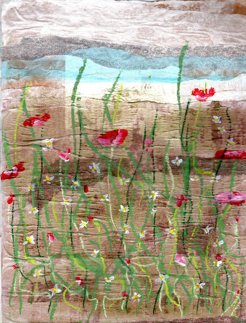
I used blue tissue and white Bondaweb backing paper for the "sky" and a single sheet of Bondaweb backing for the "ground".The label on the envelope showed through but I didn't think it mattered too much.  

I practised flowers with a Q tip in my sketchbook and decided on just a swirl of red with a touch of white to suggest poppies.  The stems worked best in pastel stick. The daisies I anticipate will be the knots I've cut off.  


Daisies and Poppies in the Garden


What I didn't count on was the bumpiness of the moistened background paper which interfered with the smooth running of the pastel.  I thought the knots would look too insignificant so decided to paint them in. From a distance the lightness of the label on the envelope looks like light on the horizon - a happy accident.


This is a style I rather like.  Angie Lewin (2) is a popular textile designer and artist whose work appeals to me and I realise how influenced I am by such people.


Coneflower with Spanish Seedheads - Angie Lewin - watercolour

These aren't exactly botanical studies but they are accurate representations offered in a highly stylised way.


Some time ago I did a day long collograph workshop with Carole Eason (3).  I developed this a little after the workshop and it formed the basis of my work for Part 5 of Exploring Ideas.  I'll have to revisit how to do it but I'm going to try again (4).

I made my collograph plate with an off cut of mounting card and built up the layers with odds and ends.


My collograph plate

The plate is well covered in PVA so that more than one print can be taken.  My only suitable printing ink is a water based one.  I followed my previous instructions and damped my paper but when I pulled off the print everything began to disintegrate; both my plate and my paper.


A less than impressive print.

The damp paper had made the printing ink run.  I think my plate was too fussy and too much in relief. I tried another two prints in desperation and then decided to call it a day.


The used plate

My first reaction was to throw this work away but experience tells me that sometimes the strangest things come out of a flop.

If I'm to pursue this idea I need to buy some oil based ink like I used with Carole.  


(1) http://www.anthonypeggartgallery.com/page3.htm
(2) http://www.angielewin.co.uk/collections/my-work
(3) http://carolaeason.bigcartel.com/
(4http://iburkitt.blogspot.co.uk/2013/06/collograph-workshop.html