In this final part of my Assignment I have freedom to choose my size of paper which is a relief. Although the A1 experience wasn't as daunting as I thought at first. I was doing full size figures and this made it easier. A1 for a portrait would, I feel be way too big for me.
I have decided to do a portrait of my husband and as I have done in the other work for my Assignment, play about a bit first to see what happens. I liked the work I did without looking and I plan to pursue this. I also enjoyed looking at the work of portrait artists and appreciating their differing styles and techniques. Some styles may be easier for a beginner to have a go at than others.
It might be a good idea to show a photo of my model.
There are always surprises when you look only at the model. In this first image I used a white pencil crayon on Ingres paper. I began at the top of the head and worked towards the left as far as the glasses then I went back towards the ear. After that I got a bit lost and when I got to the mouth everything got jumbled. It makes no difference because I just love it - in a strange way it it looks just like my model.
I liked the blue paper but had no more so I turned over and this time used a white pastel pencil. This time the image was a bit more consistent but towards the chin it went awry again.
This is much better but it's all relative!
I think these are fun but they have a serious side in that I'm getting more certain of where I am.
Once again my darks aren't dark enough and I found it hard to stick to less rather than more. I need to check out how to draw eyes behind glasses. The likeness isn't brilliant but the essence of my husband is certainly there.
I tried try similar with ink but I think I'll have to chalk it up to experience. I know the effects I want but can't seem to get there. This image is far too long in the face and I found it hard to get a graduated tone.
I do however like the way the ear has turned out.
I feel that I'm floundering around without focus. Although I'm enjoying what I'm doing nothing is seeming to lead me towards my assignment piece. My model is very patient but I don't want to push my luck.
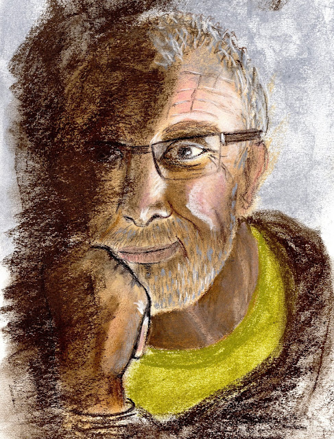
Maybe pastels is a thing to try although I've little experience and not had any tuition. This is what I did in my sketchbook and I wish now that it had been on better paper. I may have been happy to call it my assignment piece if I had.
I managed to get the dark tones better than in the past and the texture of the hair and beard worked well. It is a good likeness and I have captured the gentleness of the model particularly around the mouth.
There are some things I need to take note of:
I often find these peripheral, but very important bits difficult; maybe there's a case for abstracting them.
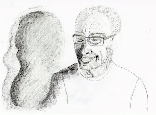
Rather than try this again and probably be disappointed with it I'm going to do another sketch then develop it in pastel on Ingres paper. I'm going to try to get some shadows by using strong lighting.
I thought these shadows were interesting and they give me the opportunity to do a landscape format portrait which is unusual. Now that I've drawn them I'm not so sure but I'll think about it.
(1) http://www.henri-matisse.net/drawings.html
It might be a good idea to show a photo of my model.
 |
| Richard |
Drawing without looking
There are always surprises when you look only at the model. In this first image I used a white pencil crayon on Ingres paper. I began at the top of the head and worked towards the left as far as the glasses then I went back towards the ear. After that I got a bit lost and when I got to the mouth everything got jumbled. It makes no difference because I just love it - in a strange way it it looks just like my model.
 |
| White pencil crayon on Ingres paper (1 minute) |
I liked the blue paper but had no more so I turned over and this time used a white pastel pencil. This time the image was a bit more consistent but towards the chin it went awry again.
 |
| White pastel on Ingres paper (1 minute) |
 |
| Blue ink on cartridge paper 2/3 minutes |
This is much better but it's all relative!
Working like Matisse
 |
| Self portrait - Henri Matisse (1937) (1) |
This self portrait of Matisse is one I really like but I know its apparent simplicity hides a wealth of skill. Nevertheless I asked my model to try to position himself as Matisse did so that I could work in this way. I used Ingres paper in a pale colour and my charcoal pencil. I anticipated that Matisse would have dashed this off quite quickly so I allowed myself 5 minutes.
 |
| Richard (5 minutes) |
Once again my darks aren't dark enough and I found it hard to stick to less rather than more. I need to check out how to draw eyes behind glasses. The likeness isn't brilliant but the essence of my husband is certainly there.
I tried try similar with ink but I think I'll have to chalk it up to experience. I know the effects I want but can't seem to get there. This image is far too long in the face and I found it hard to get a graduated tone.
I do however like the way the ear has turned out.
I feel that I'm floundering around without focus. Although I'm enjoying what I'm doing nothing is seeming to lead me towards my assignment piece. My model is very patient but I don't want to push my luck.
Maybe pastels is a thing to try although I've little experience and not had any tuition. This is what I did in my sketchbook and I wish now that it had been on better paper. I may have been happy to call it my assignment piece if I had.
 |
| The thinker |
I managed to get the dark tones better than in the past and the texture of the hair and beard worked well. It is a good likeness and I have captured the gentleness of the model particularly around the mouth.
There are some things I need to take note of:
- the neck isn't good and when I started messing about with it it began to get worse.
- the hand is in the same league but it did improve with dabbling.
I often find these peripheral, but very important bits difficult; maybe there's a case for abstracting them.
Rather than try this again and probably be disappointed with it I'm going to do another sketch then develop it in pastel on Ingres paper. I'm going to try to get some shadows by using strong lighting.
 |
| Richard and his shadow x 2 |
I thought these shadows were interesting and they give me the opportunity to do a landscape format portrait which is unusual. Now that I've drawn them I'm not so sure but I'll think about it.
I need to look more carefully at the eyes.
I decided to go for it and play with the shadow idea. I photocopied my drawing and fiddled a bit. On my original drawing I was a bit worried that the shadow didn't look as though it was in the background so I darkened the tee shirt and it seemed to do the trick.
Then I went back to the original.
I worked on a dark beige Ingres paper with my soft pastels (various brands). First I did a light pencil drawing to make sure things were in the right place. Because of the size (A3) I couldn't scan it to show the whole so I took a photo as well. As usual there is a big difference in the quality.
As I usually do I'll let the dust settle before I make any comments and subsequent alterations.
Twenty four hours and looking at my image upside down makes a bit of difference. I thought the face looked a little skewed so I darkened the right cheek and it seemed to recede enough to change it for the better. I also darkened the shoulder for the same reason.
I darkened the teeth to get rid of the tombstone effect.
This is the outcome.
I think there is still a bit of twist to the face but to mess about too much risks getting rid of what is OK.
What is OK?
I'm happy.
I decided to go for it and play with the shadow idea. I photocopied my drawing and fiddled a bit. On my original drawing I was a bit worried that the shadow didn't look as though it was in the background so I darkened the tee shirt and it seemed to do the trick.
 |
| Darkening the tee shirt made the shadow recede |
 |
| I semi abstracted the shadow |
 |
| I fully abstracted it |
Then I went back to the original.
I worked on a dark beige Ingres paper with my soft pastels (various brands). First I did a light pencil drawing to make sure things were in the right place. Because of the size (A3) I couldn't scan it to show the whole so I took a photo as well. As usual there is a big difference in the quality.
 |
| Richard and his shadow (scanned) |
 |
| Richard and his shadow (photo showing the shadow of the shadow)) |
As I usually do I'll let the dust settle before I make any comments and subsequent alterations.
Twenty four hours and looking at my image upside down makes a bit of difference. I thought the face looked a little skewed so I darkened the right cheek and it seemed to recede enough to change it for the better. I also darkened the shoulder for the same reason.
I darkened the teeth to get rid of the tombstone effect.
This is the outcome.
I think there is still a bit of twist to the face but to mess about too much risks getting rid of what is OK.
What is OK?
- the highlights
- the proportions
- the likeness
- the neck is much better than the previous try
- the composition has atmosphere
- I'm getting better at tone - even the shadow has tone
I'm happy.


No comments:
Post a Comment