Search This Blog

Saturday, 25 April 2015

Part 4 Project 5 Ex 1 Single moving figure

Single moving figure


I spent some time watching my grandchildren as they played at the weekend.  They are at an age where they never stop and go from activity to activity at the speed of light.  A real test.

I tried to draw whilst looking at them and not the paper and that accounts for some of the weird and wonderful images.

These little sketches took no more than 10 seconds and I find it thrilling that so much can be captured in such a short time.


I particularly like the drawing of Max dancing - it has the energy that is his trade mark.  The two different positions on the bike worked better than I thought although the bikes are a bit suspect. There is weight on the arms in the lower image.


The see saw drawings are my favourites on this page because I have captured the motion of it.


It seems as though lines on the diagonal work for me - Lucy's leg as she swung it out for instance.

I sat in the car in the supermarkey car park and watched the shoppers as they walked into the shop. Most people were alone and in the position I was parked I usually got a back view.  These quick sketches are forcibly cropped as I scanned them rather than photographed as previously.


I found that it was best if I could find a certain something about the person.  For instance the hairstyle often depicts the sex or the way the arm is held (lower right pic 3) shows an arrogance I picked up.


I enjoyed doing this exercise - it's a good one for creating confidence.

Part 4 Project 5 Intro

The moving figure


There are lots of hints and tips in the course manual about the best way to tackle this section - none of them allay my fears about being able to capture movement!  I've looked at how artists depict movement in a previous post but then it seemed a long way off.  The course notes give me the work of Richard Hambleton to compare with that of David Haines.  Both show dynamic movement but in completely different ways.

Richard Hambleton  b1954

Hambleton's has been called the "godfather of street art"(1)  and his early work is considered by some to be graffiti.  The life size, black shadow figures were splashed and painted on buildings and it certainly looks like they were done quickly. I find them full of life but some of them are sinister and oppressive.  

Shadowman, Richard Hambleton (1982) (2)


This one is more fun  but somehow I'd rather avoid these men:

Double Jumpers, Richard Hambleton (1999)
Acrylic on canvas (3)


David Haines b1969

Haines makes images of movement in a completely different way.  His drawings are meticulous in detail and execution but no less worrying.  He gets his inspiration from the internet and the world around him.  It must be a scary place because the images he portrays are often shocking and violent in the extreme

???  by David Haines (4)

New Balance Sneakers vs KFC Bucket - David Haines (4)

The pencil work is amazing.  There is a surreal quality to it; it's in your face just as much as Hambleton's work but relies much more on the narrative and suggestion.  There is a lot to learn about stance from these images.


(3) http://www.woodwardgallery.net/hamb-doublejumpers.html

(4) http:// www.upstreamgallery.nl

Friday, 24 April 2015

Part 4 Project 4 Ex 2 Three poses


In this exercise I have to draw my model in three different poses; standing, sitting and laying down.  I need to be looking for interesting poses that challenge me and encourage me to use the knowledge I have gained in the last few weeks work.


Standing pose

I have never drawn a figure from the back before but I think it might prove interesting especially if I try to imagine what is going on under the skin.  In this pose I need to consider where the weight is and how it impacts on the skeleton.  There is some foreshortening of the left leg and a lovely twist to the spine giving a very definite slant to the pelvis.  I used some copy paper and a soft pencil to quickly practise getting the flow of the shapes and from a slow start I managed to improve.   Each sketch was about a minute.


I was happiest with the second sketch on the right hand side of the page so I tried again a bit bigger but still on copy paper.  This time I took 10 minutes.


I think my earlier sketches paid off.  There is the  twist in her spine that lends weight to the figure and shows that she is just touching the ground with her left toes.

The light and shade provided a lot of contrast so in my drawing I'm going to use charcoal on Derwent A3 water colour paper which is wonderfully smooth.


I'm reasonably pleased with this but I would have liked to see a bit more life in my drawing.  Maybe I overworked it.  A lesson learned I hope.

Sitting pose

The model leaned against a table covered with a cloth.  She leaned backwards a little distributing her weight between the table and her bottom.  If the table were removed she would topple over.  I did preliminary sketches again.


I wanted to try pastels for the final drawing of this pose so I took my pastels and pastel paper to my art group.  It was a bit of a disaster - the paper (A3) just wasn't big enough for the chunky pastels and I tied myself in knots. I had no other paper with me but I did have my pencil crayons so I decided to experiment and see what crayons looked like on paper with plenty of tooth.


Once again I find this a bit lifeless.   Maybe a better face would have helped but I really think it's to do with movement.  I'm hoping that a bit more experience will help with this.


I've not used crayons often and never used them in this blending sort of way.  The paper defied cross hatching so I just made marks with the shape of the limbs in mind.  I will try crayons again but on my smooth water colour paper.

Laying pose

The challenge here was to accommodate the angle of the pose - the head looks nearly twice the size of the foot.


The final drawing was done in pencil again on the smooth water colour paper.  It is quite a different effect than the charcoal - much more subtle.


There is much more movement in this drawing.  It's a good job I'll soon be doing portraits - the faces are just awful!

Wednesday, 15 April 2015

Part 4 Project 4 Ex 1 Structure

The structure of the human body


I have a copy of Anatomy for the Artist by Sarah Simblet.  This is a wonderful book for understanding how the body is put together and I've looked at it long and hard.  In a way it's been a bit of a hindrance because it's quite intimidating to be faced with such detailed and beautiful images knowing that I have to have a go!

I've felt completely stuck with this exercise for reasons given elsewhere so I've decided to go with what I've done and move on in an attempt to reignite my motivation.


My left hand


Foot on the fence and toe with plaster
From a photo

Shoulders

Male skeleton

Bones of the right hand


Simblet S.  (2001)  Anatomy for the Artist.  Dorling Kindersley.

Part 4 Project 4 Ex 1 Research point

Structure

Leonardo di Vinci (1452-1519) is obvious first port of call when looking for artists whose work involves the underlying structure of the human body.  It was di Vinci who made the first ever accurate studies of the body and many are as good as current imaging techniques (1).   As an anatomical artist di Vinci was able to bring engineering expertise alongside intense observational skills to produce work hundreds of years ahead of its time. He had intended to publish his work but on his death in 1519 the work was in disarray among his private papers and its significance was not recognised until hundreds of years later.  A big "what if" I think.

In 2012 the largest exhibition of di Vinci's work was held in The Queen's Gallery at Buckingham Palace (2).  There are many images on the link  but some of my favourites are these:


Study of a male nude - di Vinci (2)


This work is so much linked with what I'm doing it's impossible to ignore it. The figure looks relaxed and is distributing his weight evenly on his legs and the two sticks in his hands.  There is a light sketch of a flexed leg to the left.  It's a good drawing to look at to measure proportion.

Drawings of the skull - di Vinci (2)

Di Vinci's skull drawings are meticulous and are sometimes cut open to look inside.  The difficulty of doing this with the tools of the age was immense and demanded great care.  Di Vinci drew sketches of his equipment.


It is said (1) that di Vinci's drawings surpass some of those in Gray's Anatomy of the 19th century.


Michaelangelo (1475-1564) a great rival of di Vinci, also had an interest in anatomy and at various periods in his life did dissections. He too intended to publish his work.  As a basis for his sculptures Michaelangelo recognised the need for an accurate knowledge of what lay beneath the skin. The work is no less rigourous than that of di Vinci but in a different style - far less "engineering" and more gestural.  

Studies for the Libyan Sibyl - Michaelangelo (1508-1512) (3)


Rubens (1577-1640) was also an anatomical artist and drew this impressive grouping showing the mechanics of the hands.


Peter Paul Rubens  - A left forearm in two positions and a right forearm (1660-1668) (3)


I found it hard to find contemporary artwork that uses the skeleton as a basis for drawing - certainly nothing quite like that shown above.  Danny Quirk offers a surreal water colour take on it but if I'm honest it's not to my taste.

Self dissection - Danny Quirk (2012) (4)


Fernando Vincente (1977-) creates images on much the same lines as Quirk:


Fernando Vincente book published 2014 (5)

but doesn't always stick to the anatomical rules:

Fernando Vincente (5)

Quite different and rather less shocking is the work of Laura Ferguson (b1947) who draws from cadavers because it feels "real" and tells of a life lived (6).

Ferguson has spent time as artist in residence at the NYU School of Medicine and her work has a definite medical bias.


The Visible Skeleton - Laura Ferguson


Lumber vertebrae - Laura Ferguson


(1) http://www.bbc.co.uk/news/magazine-17907305
(2) http://www.royalcollection.org.uk/exhibitions/leonardo-da-vinci-anatomist
(3) http://www.metmuseum.org/toah/works-of-art/1996.75
(4) http://missmementomori.com/2012/10/01/surreal-watercolor-paintings-of-anatomical-self-dissections/
(5) http://fernandovicenteanatomias.blogspot.co.uk/
(6) http://www.lauraferguson.net/anatomy-process/

Part 4 Project 3 Ex 4 Energy

Energy

Whatever I do for the next few weeks will be from a very sedentary position as I am now post op. This will inevitably limit the size I can work to and the materials I can gather around me.  It's ironic that I now need to show energy!

My remit here is to use marks to show movement.  In anticipation of this exercise and my incapacity I drew this dynamic figure at my figure drawing group.


Sto reaching upwards  - about 7 minutes

Because time was short (5 minutes) I decided to concentrate just on the dynamism of the pose and merely indicate the head.  I thought at first that the movement was located almost entirely in the trunk so I did a crop to see what happened.


I think this shows that although the upper body is obviously stretched and taut there is a significant amount of power in the legs.

I think this works because of the long curves.

I am reminded of some drawings I saw of dancers by Karolina Szymkiewic in the Art Library in Leeds in August 2012.  


There's more to see here:

https://theyoungcreatives.wordpress.com/2011/11/29/karolina-szymkiewicz-2/

When I look really closely at these images there are countless fine lines that follow the same general direction.  The ones around the body cling to its shape.  Some marks extend beyond the body like this crop of the thigh from the first image.  This seems to give a feeling of speed and movement.


This way of mark making reminds me of Henry Moore's Shelter Drawings.

Quite the reverse but just as dynamic is Dance (1) by Matisse.  Here the figures are smooth and the movement is achieved by the direction and relationship of the figures.  The small one at the bottom leans markedly to reach the large figure on the left.  This figure is more upright and the movement is immediately slowed. 


Dance (1) -Henri Matisse (1909)
oil on canvas
http://www.moma.org/collection/object.php?object_id=79124

On BBC's Painting Challenge Lachlan Goudie demonstrated how the angle of presentation could show movement.  He used an image of a balloon to indicate this.


This is an important point to bear in mind.

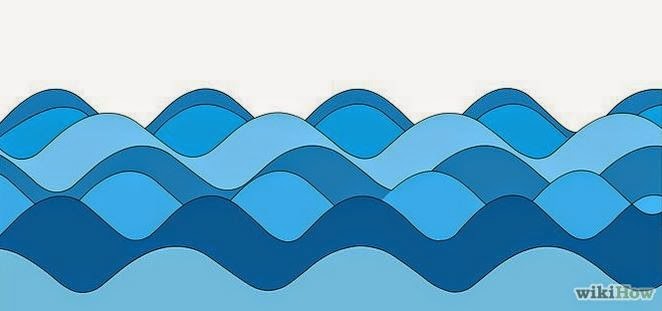
My manual suggests that I look at "waves" of various kinds and the way that repetition can create movement.

Whilst it might not be something I should follow too closely wikihow has an interesting article on how to draw waves


I think it is the apparently simple way that movement can be captured which impressed me here. There are several examples; here's one.

wikihow waves
http://www.wikihow.com/Draw-Waves


I made some marks in my sketchbook to depict movement - some were more successful than others.  I really think that I needed to make more gestural marks but at the moment it's not possible.


These were done on in an A3 sketchbook so they aren't very big.   I used graphite sticks and fine liners of various sorts and my basic conclusion is that straight lines make more active, aggressive marks and curved ones can lend a sensuous feeling.

Some other work I have done comes to  mind:

Blowing ink