Search This Blog

Saturday 24 January 2015

Part 3 - Assignment 3a


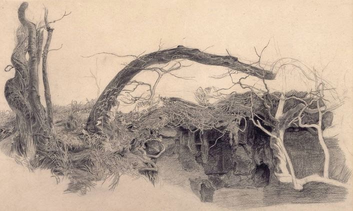
I've decided to make my final piece of work for Part 3 a development of the Open Shelter and Sheds drawing from the previous post.


I want to introduce some colour but I think that to try a water colour might be too complex for my skill level.  After drawing in my initial pencil shapes I'm going to try a mixture of techniques:


  1. water colour wash for the sky (raw sienna and aquamarine blue)
  2. stippled trees in background (pale payne's grey) wet on wet
  3. water colour wash for the ground
  4. removal of any unwanted colour inside sheds (should be minimal)
  5. more prominent trees water colour (payne's grey)
  6. card strips for the shed detail (peat brown Indian ink) 
  7. card strips for the logs in the undergrowth
  8. blown ink for the undergrowth
  9. swishy marks with filbert brush for the lane

Some of these things need a bit of sampling 2, 8 and 9 most definitely.  I would like to be a bit flamboyant with the undergrowth but it depends on how it looks when I get there.

I know my course notes say I should use A2 or A1 paper but as I want to use water colour as a way to indicate distance I'm using Bockingford paper that's A3 because that's what I have.  I began with my washes. 

  • Sky - I immediately knew that the sky needs less (if any) raw sienna.
  • Lane - I had a practice at the lane on scrap Bockingford and was happy but when I did it for real the paper was too wet and I didn't get the texture right.  Later I tried lifting out some paint but it didn't give me what I wanted either. 
  • Background - I didn't put in enough background bushes in the distance or the foreground.  


At this early stage I decided that this would be a trial.  

Assignment 3 (1)

Once I had decided this I did no more practice runs.


  • Sheds - I used ink for the sheds as planned but I think thick, dark payne's grey might be preferable.  
  • Trees - I like the foreground trees but with reservations.  They are well placed but I could do with another one above the long shed.  They are also a little on the yellow side.  I used raw sienna as the highlight and then introduced payne's grey but could have done with a little more.
  • I'm reasonably happy with the buildings except for the corrugated tin on the roof of the long shed - the angle is so wrong and I knew it was the minute I applied the ink.
  • I need to develop the undergrowth a bit but in principle it's done what I wanted.  I found the ink didn't travel as well on the bumpy paper, it dried quicker so it didn't mix as well as on my earlier trial. 


Next time:

  • Sky - blue only
  • Lane - more texture with drier paper
  • Background - more bushes
  • Sheds - payne's grey watercolour, watch the angles
  • Trees - more paynes grey on trunks, raw sienna for highlights only, additional tree
  • Undergrowth - try water colour


Assignment 3 (2)


The changes I made are largely for the better:


  • it's less yellow
  • there are more bushes
  • the grey sheds are a bit more definite and the corrugated roof looks better
  • the water colour undergrowth blew better but is more effective on the right than the left.
  • the background trees


There are things I could change:

  • the additional tree is too chunky and probably too central
  • the lane is now a bit wishy washy
  • work the middle ground trees up a bit


I'm going to live with it for a day or two before I commit myself to it being fully fledged Assignment 3.

I returned to this and thought it was awful.  This happens sometimes - I get so tied up in what I'm doing I lose objectivity and it takes some time before I regain it.  What's wrong?  Lots.

  • the style of the foreground trees is wrong for the style of the sheds and undergrowth
  • the sheds don't look an intrinsic part of the scene
  • the background trees look like sticks because of my technique (card)
  • my perspective just isn't right.


Considering how exasperated I feel about this work I'm going leave it and relook at the Tumbledown Shed drawing and hope it poses less problems and that this experience will be a learning point.

Sunday 18 January 2015

Part 3 - Assignment 3 - Drawing undergrowth


I'm going to look at how established artists have rendered undergrowth so that I can think about it in the context of Treswell Wood.

Nicholas Herbert


Herbert draws landscapes of the Chiltern Hills.  I'm unfamiliar with this part of the country but initially my feeling was that undergrowth is undergrowth.  How wrong can you be?  When I looked at Herbert's work it was so very different to what I need.


From the Chiltern Hills series - Nicholas Herbert  (1)


Here I see swaying grass but what I need is bramble, scrubby hawthorn, honeysuckle and clematis, all of which is looking pretty dead at the moment.


Treswell undergrowth


Frederick Sandys 1829-1904


Sandys did a very detailed study of tree roots and undergrowth but it's too grassy for me.


Study of Trees and Undergrowth - Frederick Sandys. 1855?
Graphite on paper (2)

Vincent van Gogh


Wild Vegetation in the Mountains - van Gogh 1889
Reed pen, brown ink  (3)


This is getting closer to what I'm trying to achieve.  There are lots of different marks; small round ones, dashes and different groupings of the marks.  Nothing is really identifiable but but the effect is random and disordered.  If I was to try something like this I'd need to draw less round marks and introduce some longer ones.


Lesley Hicks


Hicks work is getting closer to what I want.  It has the feeling of interlocking vegetation of lots of different kinds.


Undergrowth Campsite Porto - Lesley Hicks. 2009
Pencil on paper (4)


Close up it looks almost like stitches (4)


I'll be trying to figure out a way to amalgamate some of these styles and integrate some of the work I tried with unusual materials in the last post.


This is a sample up of the undergrowth I need to achieve:


I need to identify the colours


It's difficult to sort out the colours in this photo as at first glance they appear neutral with pale and green highlights. On closer inspection the colours I think I can see are dark purple, several shades of green, blue, white, yellow and grey.  It looks as though Lesley Hicks drew what she saw but it makes me think that there's a fair degree of license to be creative here.

I think the packaging (last post) for long grass might be really useful and, although I didn't try it, wool dipped in ink might make good trailing plants.  I'm also going to try blowing some ink and see if that trails.


I just chose colours at random but with hindsight I should have used the ones I identified from my photo.

Blowing Indian ink - black, peat brown and purple
Greyscale


I found I could influence the way the ink flowed considerably so it's feasible to use this method as undergrowth.  It has a lovely tangled feel.  I used black, peat brown and purple so that I could see how well they mixed.


Inky undergrowth detail showing considerable mixing


I tried ink soaked wool with less success:


Double knitting wool
Quink ink

Throwing the yarn at the paper


I tried adding this technique to the blown ink:


It made quite large marks that were very different to the drops I applied before.  They had very little movement so I blew them.  There was no mixing because the first 3 colours were already dry. This adds another dimension but there's too much green. I found the Quink and the green Indian ink worked differently when applied in this way.  The Quink made much more dynamic marks.


Unfortunately this looks rather like Treswell Wood at the height of summer - it's the purple that does it aided and abetted by the very bright green.


(1)  https://nicholasherbert.wordpress.com/

(2) http://www.tate.org.uk/art/artworks/sandys-study-of-trees-and-undergrowth-t00685

(3) http://www.vangoghgallery.com/catalog/Drawing/1727/Wild-Vegetation-in-the-Mountains.html

(4) http://www.lesleyhicks.com/Individual/Drawings/Undergrowth_Campsite_Porto.htm


Saturday 17 January 2015

Part 3 - Assignment 3

I have some freedom to decide what to do for this assignment but there is some guidance.


  • an outdoor scene that includes natural vegetation
  • use linear perspective
  • take the opportunity to draw straight line objects like fences or buildings


I have to make preliminary sketches and experiment with composition and then try out a variety of media to check out what suits the subject best considering atmosphere and energy.

I feel drawn back to the countryside in particular to Treswell Wood.  Tomorrow I will take a walk and look for possible subjects.

For once the weather was good.  Although it was very cold the harsh wind had gone, the sun was out and the Wood was peaceful.  In the Wood there are a range of wooden sheds and shelters - none in the first flush of youth.  They are used for storing products of the Wood, like bean poles and for the volunteers who manage the Wood to take a break.  I wandered around these buildings with my camera and absorbed the atmosphere.  There were lots of birds, I saw a fox and best of all three roe deer.

Here are some of my photos:


A range of sheds and shelters for the woodsmen
showing linear and aerial perpective

Treswell Wood is very atmospheric

Bean poles under cover in the open shelter


The door of a tumbledown shed with green mould
It was a quite magical morning and I want to capture some of the magic.


As a little additional bit of atmospheric information this lovely, but complex, photo is one my husband took last week while he was working in the wood:

Treswell on a sunny winter morning
The trees in the background look hazy and almost pink and the trunks are really dark in contrast.   It was almost midday but the shadows are long and show the bumpy terrain where the earth has been moved to create the new track.  There are icy puddles in the foreground.


I used charcoal (made in the Wood) to make some very quick sketches.


Sketch 1 - The open shelter straight on, looking to the far wall


Sketch 2 - the open shelter

Sketch 3 - The open shelter from the other end

Sketch 4 - The tumbledown shed

These sketches were rapid and they have a rusticity that fits with the Wood very well.  I will use these to make some more detailed drawings and then select the best to develop for my assignment.  I think I will need to refer to my photos for detail.

Because I liked it best I drew Sketch 4.  The shed is slowly falling into disrepair and will soon be just a pile of wood on the floor. Using pencil, a little charcoal and very little white soft pastel I tried to get this feeling of the shed being at one with the Wood.


The tumbledown shed
(from Sketch 4)


I think the composition works: the shed is the focus but there is interest elsewhere.  The eye is led around with the gate and the logs against the tree trunk. Maybe the fallen branches on the right emphasise the tree rather too  much.  The undergrowth is dense and crackly underfoot and there are spindly trees right in the foreground.  I need to look at ways to depict the undergrowth because whichever sketch I pursue I'm going to need it.  I'm pleased with this but it doesn't fulfil the perspective criteria all that well.  I think it is a very traditional sort of drawing offering nothing of the unexpected.
.


I think Sketch 3 will offer me what I need perspective wise but I'll not be able to do it for a couple of days.  In the meantime I'll give some thought to trying something a little more adventurous.

What I decided to do was use black ink and try to get a variety of tones to indicate distance.  The "adventurous" bit is in the equipment I chose to use.

Equipment for my drawing


I chose

  • Seawhite 150 gsm paper
  • Quink black ink in a variety of strengths
  • pieces of corrugated card - various lengths - foreground trees and shed roof
  • pieces of flat card - various lengths - all lines for buildings and logs in foreground
  • a cocktail stick - good for fine grass
  • a cotton bud - long smooth lines - for path and trees
  • a piece of packaging - made good lines and stippled well - really useful


I was amazed that I could get such a wide variety of marks and that I could render my scene quite accurately.  I wish that I had started with a pale ink wash because the white particularly in the sheds looks very stark.


Open shelter and sheds


The tones could have been better distinguished.  I must remember that like water colour diluted ink dries paler.  The lane goes uphill and I'm pleased that I managed to make it look as though it does.  I think there's a little work to do on shadows across the lane and some highlights on the side of the trees.

With some highlights and shadows

I used soft pastels to put in some highlights on the trees and shadows on the lane.  I think they perhaps look a bit heavy handed. I may smudge them.  I'm not sure how the ink will react to fixative so I won't bother with it.  As my finger was a bit black with pastel I rubbed it into the doorways.


Thursday 15 January 2015

Part 3 Project 5 Ex 3

A limited palette study


One of the sketches I really liked was the one of The Old Nick Theatre in Gainsborough.  A black and white sketch cannot possibly show exactly how ornate this building is.


The Old Nick Theatre, Gainsborough

My sketch of the building:


It's a very complex building from the point of view of pillars and my sketch gets nowhere near the detail I need so I looked at my photos and zoomed in.  What I wanted was to see how the windows sat in their frames and what the fancy carving really looked like.


Acanthus carving on pillars

Complex arches above windows

Arch over door

How the window fits


I don't think these are very good sketches but they have done the job of making me more aware of the intricacies of the Old Nick.

I don't anticipate that my limited palette drawing will have this amount of detail but it's given me some practice as well as a good feel for the building.


Old Nick Theatre , Gainsborough


Because the brick is a honey colour I chose some A3 Ingress paper of the same colour.  The door and some of the infills are blue and the coloured brick is a bright rust colour so there are no real decisions to be made.

I sketched in 2B pencil and got some basic shapes.  I found that a drawing of this size couldn't support much detail so I drew in conte crayon.  The door and window infills are in water soluble pencil crayon.

I left out some of the ugly drainpipes as well as some of the detail I couldn't quite understand.

I had to photograph this as it's too big for my scanner and the brickwork looks rather too grey.

The focus of the drawing is the entrance to the theatre and that is where I have concentrated my work. I lightened the building in the background by smudging to get depth and keep it different and unobtrusive.  I purposely left the bay window on the right slightly unfinished.

It was a challenge to get the perspective right and then keep it right throughout all the convoluted pillars and porches.  There are bits that look a bit shaky but considering how I've struggled with 3 point perspective I think it's passable.

I've done something that I think is unforgivable.  I didn't think the roof on the far left looked right (see photo and sketch).  I added a roof and spoilt the character of the house.  A good lesson but maddening.

Conte crayons are a medium I've avoided because I don't like the texture - they feel a bit scratchy.  For this exercise I was instructed to use them.  I found they were quite good for the job I had to do but I prefer soft pastels.

Wednesday 14 January 2015

Part 3 Project 5 Ex 4

Statues

For this task I have to make a drawing of a statue. I am able to choose so I have selected one that might better be called sculpture.  The statue is part of the Sculpture Trail in Rufford Park (1) and I'm very fond of it because I've known it for a long time and it always makes me smile.  When they were small my children loved to pose with the statue.  My grandchildren now do the same thing. The piece invites involvement.

The sculpture, Young Girl, was created by John R Meikle but I can't find a date for it.  The artist took a plaster cast of his daughter and then re-modelled and carved it before casting it in aluminium.


Young Girl by John R Meikle
Rufford Park

The model is adolescent with a still quite boyish figure and casual clothes.  The texture is smooth and invites touch and has a freshness that goes well with the subject.  There are shiny parts and patches of oxidation with mould on.  I find it a very sensitive piece of sculpture.

This figure is just about the same height as me and it seemed a bit obvious to draw it standing directly in front of it.  I chose to draw a view from the side but as it was starting to rain I hurriedly took some more detailed photographs expecting to have to curtail my work.


Young Girl at the slight angle I wanted to use

The neck  (detail)

Folds of the tee shirt (detail)


I went round the back and it was almost as interesting as the front.


The back of Young Girl


I wanted to capture the smoothness and sensitivity of Young Girl.  I decided to use graphite stick because of the colour and the fact that I could shape it with tone.  I used a fine eraser as a tool to lift out light shades in very specific places.


Young Girl - graphite

I drew the bones of this outdoors and brought it home to complete.  There is no way that I could have spent this amount of time outside in the rain and made such a good job!  Although she seems to lean forward a bit I'm delighted with it.


(1) http://www.nottinghamshire.gov.uk/enjoying/countryside/countryparks/rufford/

Tuesday 13 January 2015

Part 3 Project 5 Ex 2

Study of a townscape using line


This will be a study using line and I'm going to use my sketches of Gainsborough Old Hall as my starting point.  I have to complete my work in pen and ink or something similar.  I chose the Old Hall because I now feel familar with it and am beginning to get to grips with its bumps and hollows.  I also think it lends itself well to line drawing and black ink in whatever form.

The work will be done at home working from my previous drawings and photos.

My instructions say to use a double page of my sketchbook but I'm using my A3 book and taking the centre point as my reference just as the centre of a double page would be.

I'm planning to use my fineliners and a brush pen and I'm terrified because once it's on the page there's no turning back.  Knowing the trouble I've had getting these town pictures right it feels very worrying.

When I faced my page I just froze (this is not new but it was worse than usual).  I wanted to feel free but somehow just couldn't get there.  I ended up standing at my easel just putting fine lines in that I could build on.

This seemed to work because once I got going things fell into place.

Gainsborough Old Hall
Fineliner and brushpen

I got in a mess with the pillar on the far right but decided wasn't worth making an issue of because the focus was on the central timbered part of the building.  I think the "wobbly" nature of the building looks OK - the way nothing is square.

The drawing lent itself to a linear way of working rather than something that flowed and I think not realising how important that was was part of my initial anxiety.

I indicated brick by small patches with brick like markings and it worked better than the conte crayon last time.  There is mown grass in the foreground that I should have somehow shown it would ground the building more (or would it?).  Maybe some stone slabs would do a better job.

There are obvious lines where I made mistakes but considering my initial fears I'm fairly comfortable with this.

I found that my sketches lacked enough detail for me to make the drawing I wanted.  For instance the window in the brick part of the building was very indistinct in my sketch and even in my photo it was just a black blob.  To get detail I had to zoom in and I wonder if that alters the reality of what I saw.  I would make more detailed sketches than I did but as ever it's weather dependent.

Sunday 11 January 2015

Part 3 Project 5 Ex 1b

Having had some success in Gainsborough I decided to return and see what else it could offer.  I need to make several small sketches then choose one to develop into a larger study covering two pages of my sketchbook. 

I drew myself some 10 cm squares to draw within and in retrospect this was foolish because it restricted my proportions too much.  My supporting photos are rectangular unless I crop them.

Once again the weather was cold, dull and overcast with the prospect of rain - fairly typical for mid January.  The weather is having a real impact on how much I'm enjoying this part of the course.

What I didn't anticipate is the wealth of things that interfere with drawing in a town setting.  If I find something I'd like to draw there's always an onstacle in the way; traffic maybe or brash signs.

I expected to do some industrial images so I parked in Tesco car park and looked at what was once Marshall's heavy engineering works.  I was well below the level of the building and if I had drawn what was in front of me it would have been a plain concrete wall.  I had to look upwards.


Marshall's (in the past)

Marshall's was founded in 1848 and by 1885 the works covered 16 acres.  The red bricks I drew were made on site.  The windows are long and thin but there are lots of them.  Where the roller shutter door has been inserted the windows have been reduced.  It is interesting to see how the building has been changed over time as its function has altered.

I looked to my left and drew Wefco.  They make double skinned fuel storage tanks for industrial use. Some of the tanks are in my drawing.

Wefco
The fuel tanks in my sketch look too skinny but the perspective isn't too bad..

I moved my car to look over the houses and was frustrated by the Tesco filling station sign being in the way.


I tried to filter it out.

Gainsborough rooftops


The perspective here isn't at all right and if I wanted to develop this I'd need to sort it out.  My focus was the chimney and I like the verticals when lots of other things are on the diagonal.

Next I had a bit of a drive around and I'm pleased I did because the Old Nick Theatre was there just waiting for me.

Old Nick Theatre, Gainsborough

This building is very ornate; it's built in a pale buff brick with lots of red brick laterals.  I've managed the perspective better here but I'm still very insecure about it.

My final sketch is of Gainsborough's most famous building, the Old Hall (1). This a a medieval manor house with a wealth of history and I had discounted sketching it because I thought it would be to involved.  It is built on a slight rise and nothing, but nothing, is square.  A nightmare for someone trying to get to grips with perspective!

Gainsborough Old Hall

I'm surprisingly pleased with this.  I selected a part that I felt was manageable but maybe I should try more as the building has long sides.  I think I have captured the feeling of  an ancient "all over the place" building.  There is a lovely chimney to the right of my picture which would add a lot but I was nervous about trying it.

I think that tomorrow I will try the Old Hall again without the restrictive frame I drew within today.


Gainsborough Old Hall
Graphite stick and conte crayon

I used a whole page of my A3 sketchbook for this and have a few concerns.  The chimney that I wanted to include because it was interesting looks flat and insubstantial but I'm happy with the timbered part which is in fact the focus.  Rather than mess with the chimney I decided to leave it alone. I wanted a way to indicate that some parts of the building are brick so I tried conte crayon rubbed on its side and wish I hadn't.  I would have been better off using a water colour wash or soft pastel.  The perspective of the far building is a bit awry but the work is teaching me so much about really, really, looking.


(1)  http://www.gainsborougholdhall.com/