Search This Blog

Monday 31 August 2015

My assessment selection


I began Drawing 1 knowing that I was embarking on a significant amount of learning and skills development.  In my selection for assessment I have shown that my anticipation was well founded and there has been a steady improvement in my work as my skills, knowledge and confidence have increased.  I have chosen a wide a range of work to demonstrate the extent of my progress.

I have used my immediate environment and that is the thread running through my submission.

I have a natural inquisitiveness and it shows in my assessment pieces. An example is my Part 1 selections where I tried to develop a freer way of working.  Experimentation is most apparent in Part 5 where I pursue ideas from earlier in the course but push harder.

I have embraced  resources new to me and experimented with wax, charcoal and a variety of paper just to see what happens.  I have included work that demonstrates the variety of materials and techniques I have taken advantage of.

Part 5 shows me pushing the boundaries of inexperience, celebrating challenge and being surprising. My work constantly evolves throughout the development of the piece.  There is a clear indication in Part 5 that I am a Textiles student and I can see exciting ways to develop this work.


Tuesday 4 August 2015

Part 5 Reflections

Part 5 has made new demands on me and I hope I have risen to them.  Each part of the course opened up not only new subject matter but challenging emotional experiences as well. I found the withdrawal of direction very difficult and waffled around for a long time trying to find my own way.

Whilst I was certain I wanted to take my garden as my focus it took a long time to realise that it is a rather large space and I could only deal with a small part of it.  Once that decision was finally arrived at (and with a bit of support from my tutor) I got on a bit better.

A tutor on another OCA course gave me some advice at a time when I was feeling unfocussed.  She sent me a link to a piece of work by Charlie Gilkey (1) and it made a lot of sense to me.  It's a bit of pop psychology and very American but it helped a lot.  I've drawn on it this time as well.  Basically it says that there is a creative process:


  • preparation
  • incubation
  • illumination
  • implementation

and I can identify wholeheartedly with that.


In the meantime I played around with various leaves and plants and made a resource that was ultimately useful and will continue to be so in the future.  I particularly liked the colours I obtained from plants and I need to do some testing around their stability.

I have borrowed printing skills from my Textiles course and made them work on paper.  I experimented with frottage and its application in a way I hope is inventive.  Ideas have been taken from a variety of artists not only in Part 5 Research but throughout the course.  The monochrome work of John Virtue has a particular appeal.

My work appeared in several guises before I finally got to where I wanted to be.  It was fairly repetitive but on each practice image I learned something new and was able to refine my ideas. I like to push and take risks and I'm beginning to be less anxious about whether of not my work is "right".

I was surprised to find that what I thought would be my final work felt so unresolved.  It's hard to pinpoint the feeling but it was unequivocal.  My original idea evolved and changed substantially but I'm happy to be fluid although it sometimes feels like rolling with the blows.


Demonstration of technical and visual skills

I am continuing to develop more ways representing my ideas and feeling less bothered by adopting the ideas of others. Plagiarism and recreating are a fine line apart. I am constantly trying new techniques and increasing my awareness of the possibilities. The frottage work of Max Ernst is a case in point.

I don't feel that I have become proficient in any particular technique or material but I have had lots of tasters and found what I want to do more of.


Quality of outcome

I find it hard to judge my own work.  I see so much that I revere that I'm constantly dis-satisfied with what I do.  However, I am learning all the time and constantly questioning my practice and that is a good place to be at my stage.


Demonstration of creativity


My life generally is pretty well ordered and tidy.  In my drawing I have found something hidden that I didn't know about.  I can be slapdash and untidy and rather like it.  It is part of the freeing up process but there's a long way to go.  I have become aware that things don't have to be perfect - out of apparent chaos lovely things can occur.

(I have no idea why the font here has changed - there must be something deeply Freudian going on considering content of the section!)

Context reflection

I enjoy looking at the art of the famous and influential but I have also found a wealth of talent closer to home.  I have included some local work in my blog because it has a real influence on me. It gives me hope.
  
I surprise myself at what I have grown to like now that I have more knowledge and experience. Initially I wasn't fond of John Virtue but the depth of his work I now find inspirational.

I am a very reflective person and tend to over analyse sometimes.  I could do with just letting things happen a little more but I'm working on it.

I treasure my three OCA blogs because they are a great way to record my work.  I find that I refer to them often.


Overview

When I began Drawing 1 it was with lots of trepidation; I was well out of my comfort zone.  I can't claim to be through that uncomfortable feeling but it's getting easier and I have a "can do" attitude to my drawing that is new.

There is no doubt I will continue to draw; I am totally hooked.  It will support my Textiles work but it will be a part of my life as an independent skill.  The people I have met this year are folk I don't want to leave behind just because I've finished Drawing 1.  

Monday 3 August 2015

Pushing a bit further

My tutor has encouraged me to continue working and see how much further I can take my work.

From a not very original idea of drawing a part of my garden I am now focusing on a very small part. I have taken the lower right corner of this image:


Geranium leaf print crop .....

.....turned through 90 degrees

I chose to turn it because it ceases to look so shrub like and takes a form of its own; it becomes more abstract.

On this course I haven't used technology for my images but I thought I might get some results with this if I did.  These are images I liked and that might offer some ideas.  I used Paint Net.

1. Effects - pencil sketch - pencil tip 4 - range default

2. Stylize - edge detect - angle 11.1 


3. Stylize - emboss - angle default
4. Stylize - outline - thickness 2 - intensity 73

I tried to print these images on various papers including tracing paper but it turned out blurred and I wasn't happy with it at all.  I spoke to a local printer who showed me a variety of papers that he could use with his graphic printer.  He printed my work and the outcome was quite remarkable.  The papers with texture gave an almost 3D effect and the shiny ones seemed to use the reflections in the same way.  The matt were least interesting.  Tinted paper introduced elements that seemed to alter the colour of the ink.  I found there was no "best" one, just a huge variety, each offering something different.  Sometimes it's hard to say exactly what the differences are; it's often revealed as a difference in atmosphere and feel.


This has thrown up one or two ideas.

First I'm going to try textures inspired by the manipulation of image 3.


This is what I did:

Texture with Kleenex tissue


I glued random splodges of Kleenex tissue on paper then coated the whole thing.  It looks quite soft and is very textured.


Drawing with ink

This is the veins and the spaces between them.  It's very arbitrary.

These next three are inspired by  manipulated image 1.

Wax as a resist ....
.... and with different colours

Mark making with hosta stems

Next I looked again at the geranium leaf crop and tried to recreate it another way.  I used two sorts of wire mesh to do rubbings on baking parchment.  I covered some copy paper with charcoal leaving just a couple of white spaces.  I stuck the parchment onto the paper.  It is clear where the white spaces are as they show through and it is also obvious where the leaf ends and the background begins.  It was an exercise but I'm not sure how useful it may be.

Charcoal on paper then glued baking parchment with
frottage of metal grid on it

I decided to use some wax as a resist for making the "veins" of the geranium leaf.  I used .5 fineliner pen, white and grey wax, half strength ink and full strength spray.

I drew the veins with my fineliner and waxed in.  I covered the watercolour paper with Quink ink and watched the colours of it separate.  I spoilt the effect by spraying with a stronger concentration of ink.


My next experiment was similar but without outlining the "veins" and using only white wax crayon and eighth strength ink.  The colours the ink split into were more marked than previously.


Unimpressed with not using colour I returned to the spraying I used earlier and tried some variation of strengths of my Procion dyes.


I selected some smooth A3 water colour paper, took my image and some of the ideas I had generated and made this:

Geranium leaf image (1)

I began by drawing the "veins" then waxing in the lines and shapes.  I sprayed up my paper and was alarmed at first that the dye seemed to penetrate the wax.  As it dried it became apparent that my fears were unfounded. At the top I used the baking parchment frottage with graphite lifted off with sellotape to give some extra texture and interest.  It didn't glue well and left texture of a sort I didn't like.

Although the two dyes had ten minutes between application they mixed rather a lot to create shades of green.  Not unpleasant but not what I had wanted.

I found the result rather bitty and insipid although I liked the composition.

I decided to have another try and darken my dyes.  Everything else remained pretty much the same:


Geranium leaf image (2)

This time the dyes seemed not to mix as much, Instead they create an optical effect where the colour appears to  move.  The photo doesn't show this at all.

It seems to work much better without the division of the edge of the leaf although I had a go and drew in an outline on a printed image.  I used ink but I think it's too harsh - graphite would be better.  I haven't put the division on my "real" piece.

Trying an outline


I plan to leave it here until my tutor has seen it.  I think it might benefit from cropping but I'll take advice.


Geranium leaf image (2) proposed crop

It's interesting to see that there is no right way up for this image now.

When I read my Artist's Statement now it seems a million miles from where I've ended up.   From my large garden I've taken the smallest sample and developed something a long way from what I had envisaged. However the title is still relevant.

Sunday 26 July 2015

Henry Moore at the Yorkshire Sculpture Park

I'm a regular visitor to the Yorkshire Sculpture Park because their exhibitions are second to none.   Henry Moore was the founding patron and was influential in making it the great place it is today. I went specifically to see the drawings of Henry Moore but there was also a large exhibition of the work of Sir Anthony Caro.

I'd not known of Moore's skill as a artist until my tutor drew my attention to the Shelter drawings done during the war.  I was keen to see more.

The exhibition is called "Back to Land" and demonstrates the effect a Yorkshire upbringing had on Moore's life.

The land of Moore's Yorkshire childhood was one of revealing contrasts: the industrial, smog laden town of Castleford and the clean air and dramatic beauty of the surrounding countryside .... (1)


As usual the exhibition was well curated and my focus was on the drawings.  I immediately picked out some that I could learn a lot from and the main ones were the Stonehenge drawings from 1973.


Stonehenge A - Henry Moore.  1973.

Stonehenge B - Henry Moore.  1973.

Stonehenge B - Henry Moore.  1973.

These images impressed me because they take my understanding of mark making to an entirely new level .  Moore manages to get shape, form, perspective and tone with (apparently) very simple lines.  

Moore himself seemed quite overwhelmed by Stonehenge and appreciated it for its current presentation rather than historical significance.

I began the Stonehenge series with etching in mind, but as I looked at, and drew, and thought about Stonehenge, I found that what interested me most was not its history, nor its original purpose – whether chronological or religious – or even its architectural arrangement, but its present-day appearance. I was above all excited by the monumental power and stoniness of the massive man-worked blocks and by the effect of time on them. Some 4000 years of weathering has produced an extraordinary variety of interesting textures; but to express these with an etching needle was very laborious, and after making two or three etchings I changed to lithography which I found more in sympathy with the subject – lithography, after all, is drawing on stone. (2)

The work itself is quite small but there is a feeling of Moore's experience of "monumental power" about them.

There was also some of Moore's Shelter Drawings in the exhibition.  One of the reasons Study for Grey Tube Shelter (1940) was interesting to me was the use of wax as a resist.  Many of the important parts of the work like heads and limbs are drawn using wax.


 Study for "Grey Tube Shelter - Henry Moore 1940 (1)

Another image that impressed me was "Women Winding Wool" because of its very human subject and personal feel.  It's amazing that Moore could work on the huge scale of his sculptures and such a small scale on his drawings and retain sensitivity in both.


Women Winding Wool - Henry Moore 1948 (1)
In the exhibition this work was accompanied by a poem by Simon Armitage which details the everyday life of women like those in the drawing.  Very powerful.

This is a wonderful exhibition and I feel lucky to have been bought the catalogue as a long lasting resource.


(1) YSP (2015) Henry Moore Back to Land,  p13

Thursday 23 July 2015

The Real Thing

I've become a bit wary of analysing this work to death in an attempt to do my best so now I'm going to go for the final image.

I have a sample pack of Japanese paper from Lawrences and for my carrier I've selected Hosho paper which is 77gsm.  My frottage will be on Imitation No 3 which is 31gsm.  I'm hoping that the final work can be back lit but at the moment I've no way to tell whether that will work or not.

There is a rough and a smooth side to each of the sheets and I plan to use the rough one.

I have chosen the best ideas from the work I've done to date.

Working on Japanese paper

The same piece back lit

It looks OK but it doesn't feel resolved.  I think the move to smaller paper was a retrograde step because it seems cramped.

Back lighting made a huge difference especially to the frottaged "tree".

I've decided that I need to go bigger not smaller,  I'm making another change as well - using only black and white.

First I had a try in my sketchbook.  I had a go at blowing ink for the climbing plant but it didn't work well.


Monochrome 1

In my next attempt I introduced a newspaper "lawn" with good results.


Monochrome 2


My final piece

My only large paper is my A1 pad and I don't think it's substantial enough so I've selected some heavy lining paper to work on.  I used Quink for the sprayed background. The Dawn Redwood, Coffee tree trunk, the plants and foreground shrub are largely in loose acrylic paint.  The fence is graphite. I've intensified some of the ink spots for the climbing plants. Following pretty much the same routine as before I drew this:


I found I was much more free with the larger paper and its texture was just right for the feeling I wanted to get.  The perspective works alright although maybe the Dawn Redwood could be a little more imposing.  I used a dark grey to keep it back in the picture and this is OK - maybe the fern needed to be a little broader.  The frottaged tree is quite convincing and the foreground shrub looks almost like a cotinus.  I like the newspaper "grass" because it gives lots of texture.

Earlier in Part 5 I gave myself some targets and I'm wondering if I've met them (in my opinion). Let's see.

  • I used frottage and printing 
  • I have created something with impact
  • I have been adventurous 
  • I have been surprising
  • I'm not sure how competent my work is.  I feel too inexperienced to make that judgement.
At this point I contacted my tutor who made some suggestions about how I could push this a bit further.

Wednesday 22 July 2015

Exhibition - Voices from the Inside


A clever logo


I've been to two wonderful exhibitions recently and the first was Voices from the Inside at Doddington Hall (1).  Each summer the Hall has an exhibition and this year showed the way that the dedication a a relatively few number of people can turn lives around.

Fine Cell Work is a social enterprise that trains prisoners in paid, skilled, creative needlework undertaken in the long hours spent in their cells to foster hope, discipline and self esteem. (2)

The work shown was from all skill levels - the less skilled learn by making small things like lavender bags.  The more experienced produce amazing, very varied work and take commissions from the likes of English Heritage.


Fine Cell Work (1)

Fine Cell Work (2)

A look at the website is hard evidence of the impact this initiative has had.


Alongside this work was a range of quilts both ancient and modern a list of which is available on the Doddington Hall website (2).  Many have been made by Fine Cell Work.

My favourite of these is The Cell Quilt (3).  This is a quilt that shows a birds eye view of a two man cell (life size) with all the items that constitute daily living even down to correspondence.  The men planned, drew and stitched the quilt over a period of period of a year.  At first the group was stable but a sudden change of stitchers meant that less experienced men took over.  The website tells us that "the varying quality of the applique and quilting stitches reads like the signatures of the men working on the project at different stages". (3)

It is a very sobering and moving piece of work.

The Cell Quilt - Fine Cell Work


I saw famous quilts like Grayson Perry's controversial "Right to Life" quilt.  The colours are amazing and it is well sited in the Hall. 

Right to Life Quilt - Grayson Perry

It's really well worth a look at the website - there are some amazing works by Stella McCartney and The Sleep Quilt commissioned from Fine Cell work by Tracey Chevalier.


(2) Fine Cell Work brochure


Tuesday 14 July 2015

Finding my way

My focus now is on a Dawn Redwood tree that I drew in ink way back in Part 3 when it had no leaves.

The Dawn Redwood

The plants surrounding the Redwood are mainly trees and shrubs and in my minimalist plan many will disappear.


As well as the Dawn Redwood there is a Kentucky Coffee tree in the foreground.

Using this image owes a lot to my finding Fascinating Cypress by Max Ernst.

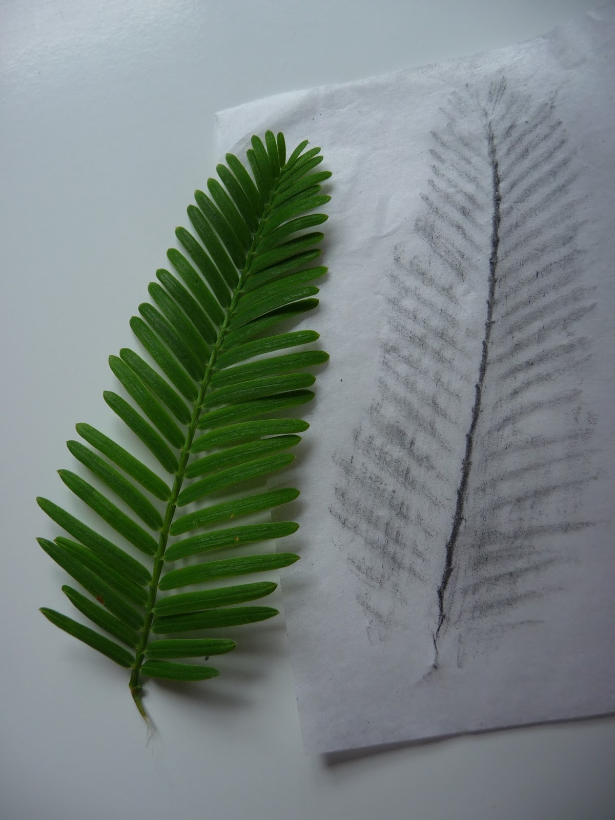
Although the tree is huge the leaves are small and delicate:


They are soft and didn't lend themselves to rubbing.  The single leaf is strangely like the shape of the whole tree.


Plan 1.

I began with a quick sketch....


then asked myself some serious questions.

What exactly do I want?
  • to use frottage and printing
  • create something with impact
  • to be adventurous
  • to be surprising
  • to complete a competent piece of work


What do I need to do?
  • make a plan
  • consider and then source materials
  • think about colour versus monochrome
  • consider the background
  • realist or abstract?
  • experiment


What I have decided.
  • use graphite for the frottage so I can get good definition
  • spray the background - the only colour I'll use
  • semi abstract
  • look at Japanese papers because they are more robust than tissue paper

Plan 2

I selected leaves for the frottage - it was important to get the scale right. I used my A3 sketchbook and sprayed with fabric dye.  Then I tried my leaves:


I did the rubbing on cream tissue and repeated the process:


I think the coffee tree could do with two geranium leaves.

I lightly sketched in a few lines to guide me and put in the fence.  I did this with a piece of string coated in charcoal then pinged on the page.  this was very successful as it gave a rather smudgy impression of the fence


I added tree trunks and the shrub in the foreground was printed with acrylic paint using the same geranium leaf I used for the Coffee tree.

The finishing touches involved a few extra plants in front of the fence and climbing up it.  I put a light grey wash on the "grass".

Plan 2


Have I got what I want?

  • I'm not entirely happy with the insignificance of the Dawn Redwood
  • I have colour that shows through the tissue paper which is what I wanted
  • the trees are suitable but not dark enough.  I think slightly heavier paper will allow a bit more pressure and therefore more definition.
  • this will add to the impact which at the moment is not great
  • I'm not sure about "surprising" but it is unusual.
  • the image has depth with the fence receding
What I need to do now:
  • make a decision about background colour.  I used orange and blue in Plan 2 and got a fair amount of green as the colours mixed.
  • consider intensifying the colour towards the bottom of the page.
  • consider my Japanese paper.  I have a sample pack with several weights of paper.  I am wondering if I could rub my leaves directly on to the paper.  It's too expensive to mess up.
At last I feel I'm making some headway.

Plan 3

I have made some changes to both my method and my materials for Plan 3.  To beef up my trees I'm going to try baking parchment (I'm not prepared to use my Japanese paper yet).  I'm going to under print the trees with grey paint using the same leaves as before and use fingerprints for the foreground shrub to try to get more tones.

My background will remain the same colours but I'll wait for the first one to dry before I spray the second one.  I will intensify in colour towards the bottom of the paper.


My sprayed page

I followed pretty much the same procedures as in Plan 2 except for the under printing of the Kentucky Coffee tree.  I had planned to under print the Dawn Redwood as well but the print was so successful and gave the impact I wanted that I decided to leave it be.

Unfortunately I got son engrossed in my work I forgot to take pictures.
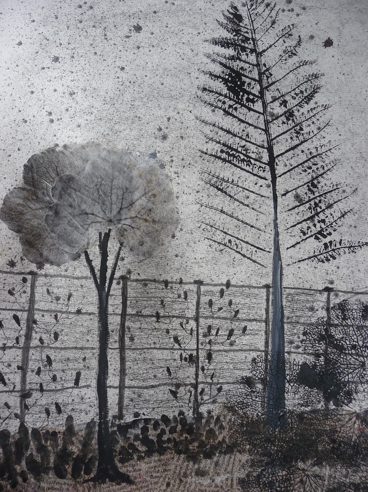

Plan 3


This time I used some small pieces of paper with wood inclusions for the planting at the front of the fence and this gives added texture.

I'm not sure about the fingerprint shrub but I didn't want to repeat the print used on the Coffee tree.

After a day I returned I my work>  I find a bit of time distance works wonders.  What I saw was


  • the fence looks too regular
  • the fingerprints aren't as anywhere near as effective as the shrub made from geranium leaves in Plan 2
  • the Coffee Tree needs some context for the base of the trunk
  • the trunk for the Dawn Redwood needs to be lighter than the Coffee Tree trunk

I acted on these observations and got a better image:


This is generally more successful that Plan 2 and is the plan I will run with.  I want to retain some spontaneity in this final piece of work and I feel ready to go.

Monday 13 July 2015

Artist's statement


Combining vegetation and mixed media to portray a spot in my garden in a new, dynamic way.


For many years my garden has been my way of expressing myself creatively; colour, composition and mood all being important.  It is a dynamic and ever changing space that always offers something new.  It is natural for me to combine it with art for this piece of work and provides a new garden challenge.

I want to present the garden in a new way, keeping the atmosphere but being bold with my ideas.  I would like to use specific plant material as my starting point. Ultimately the material need not represent itself.

I am a Textiles student so my inclination is to use texture. I enjoy experimenting and my garden offers opportunities for techniques like frottage and printing and using a variety of media.  I have a notion to use vegetation to make shapes. I may then draw into my image.

Experience tells me that my thoughts and ideas will evolve if I immerse myself in my task.  I like to explore my subject and gradually come to a resolution – it’s about the process.  I want to incorporate some of my new learning but also feel free to take risks.  As I work and ideas suggest themselves I expect to change my mind particularly with reference to materials.

My garden is  huge space and to try to capture the excitement of it in a new way offers its challenges. I found looking at the work of Anna Atkins (1) was a great way to understand the beauty that is generally hidden from us.  Amongst his many skills Henry Fox Talbot (2) was a pioneer of early photography and he created some wonderful organic images with his photogenic drawings.  They lead me to a new way of thinking.

I found inspiration too in the frottage work of Max Ernst (3) who taught me that less is certainly more.   Roger Miller (4) gives a different, surrealist way to use frottage.

A contemporary artist called Joanne Proctor (5) offers an organic approach to her drawing that I find interesting and sometimes uncomfortable.  

One of my favourite materials is graphite and this is fortunate because it lends itself to frottage very well.  I plan to experiment with carriers to see what gives the best result for my particular purpose.  It is important to me that I have some colour because that is what my garden is about so I will experiment to see how I can do this but keep the integrity of the graphite.

I would like to use Japanese paper for my final work.  What I have in mind  is somewhere between tissue and heavier paper.  Because it is expensive I’ll look for alternatives to use in my experiments probably something like tissue or baking parchment.

When I have finished I want to be able to recognise my reference but I don’t expect or desire a realistic rendering.  I want to be inventive and inquisitive and combine the best of what my experiments show me.

Postscript
I realise now that my Artist Statement was more a statement of intent and that I used it as a sort of project plan.  It was a very useful thing to do but probably not quite what I was meant to do.

Ultimately my work has been on a macro scale and I have drawn on ideas developed throughout my textiles work.  The project leaves lots of room for development in that area and I'm happy with that.  


Pursuing frottage

I've been feeling quite without focus and getting worried about it.  I contacted my tutor who pointed out what she thought was working well and artists who might inspire me.  It was a very useful contact and as a result I've decided to look more closely at the idea of frottage.

Roger Miller is an artist who found frottage "makes the world easier to project meaning onto".
(1)
Frottage is about the organisation of chance elements.......causing the materials to interact in a cohesive fashion (1)

It's often hard to find where Miller's starting point is and I find the work very sinister but it appeals in a strange sort of way.  Much of his work is coloured.

Helsinki Botanical Gardens  - Roger Miller (2013) (1)

Miller's hero is the frottage artist Max Ernst (1891-1976).  Ernst had a wide ranging artistic career that included frottage.  He used natural and man made objects superimposed one on the other to create textural images.


The Fascinating Cypress - Max Ernst
(Histoire Naturelle) (2)
I like this image very much; it is clean and has lots of textural interest


I don't like working on white paper so I began by experimenting with spraying on some colour.  First I used my sketchbook to practice.  I used Procion fabric dyes well diluted because I wanted some subtle colour.  I began with magenta and golden yellow because I wanted to capture my current garden colours.

I damped down half of my page and left the other half dry.  The effect was slightly different but not markedly so,  I sprayed my second colour again varying the dampness but there was little discernible difference.

Next I tried the same process on other sorts of paper.  The water colour paper worked best because the colour settled attractively in the small depressions.  Copy paper was OK but its whiteness shone through.  Tissue and tracing paper were very much also ran.

As a comparison I spotted the page with concentrated magenta and golden yellow just to remind me how intense they can be.  On the different papers I got different effects - some contained the spots and others allowed some spreading.


Playing with Procion on different papers at varying strengths


Next I took a large piece of lining paper and sprayed up as before, wet on wet.  I laid some leaves on the page 


and sprayed again with a more intense magenta.


I took the same leaves and did some rubbings on tissue paper with a 9B chunky graphite pencil.  I cut them out quite roughly and glued them on to the paper slightly offset from the stencil shapes.


The colour of the tissue made a big difference to how the frottage looks and I prefer the subtlety of the cream.  I sprayed with fixative so the graphite didn't smudge and in some places it took the colour from the tissue but not unattractively.

I wanted a bit more zing so I printed on some leaves using a light yellow acrylic paint.


What I learnt:

  • the initial stencil was a good starting point
  • it's not always the most obvious leaves that work best
  • colour has a place but the delicacy of the marks on the leaves looks best on white paper
  • the long fern didn't work well

What I'm going to try next:

  • use parts of leaves to work up into trees and plants 
  • look for leaves that suggest items in the landscape like the geranium leaf 
  • it might be possible to make a landscape like this
  • use some wax resist to make abstract images


Geranium leaf  "tree"


but I'll have to experiment a lot first.