Sketchbook of Townscape drawings
I feel somewhat reluctant to the exposure of sitting in town drawing. I find this a bit odd because I don't feel shy of people seeing my finished work. Maybe you just have to do it to see how it really feels.
With this shyness in mind I've decided to go to Retford and select somewhere where I can be reasonably sure I won't be disturbed. The canal (which is quiet) or the railway station where people are wrapped up in themselves are places I will try.
Two days later:
I've hit very cold, wet and windy weather and simply been unable to draw outdoors. I have taken photos and tried to draw from them but I find it really unsatisfying. As well as that my work from photos lacks fluidity and spontaneity. The fallout is a lack of excitement and motivation - the first time this has hit me on Drawing 1. I'm not sure how to handle this problem.
This is what I've drawn.
This feels a little less "tight" and it was certainly done a bit quicker. There's less detail but more feeling in this work.
The ornate supports for the roof are rather lovely.
I went to other end of the platform and tried to draw but it was far too cold.
When the weather was awful during my rural sketches I stayed in the car but I've found it much harder to park in town and get a view I want to draw. There's some thinking to be done.
I decided to re frame my strategy and look for a place to park my car then see what was on offer. I went to Gainsborough which in the past had heavy industry and has an interesting river front. There were some old buildings that used to be maltings but are now apartments.
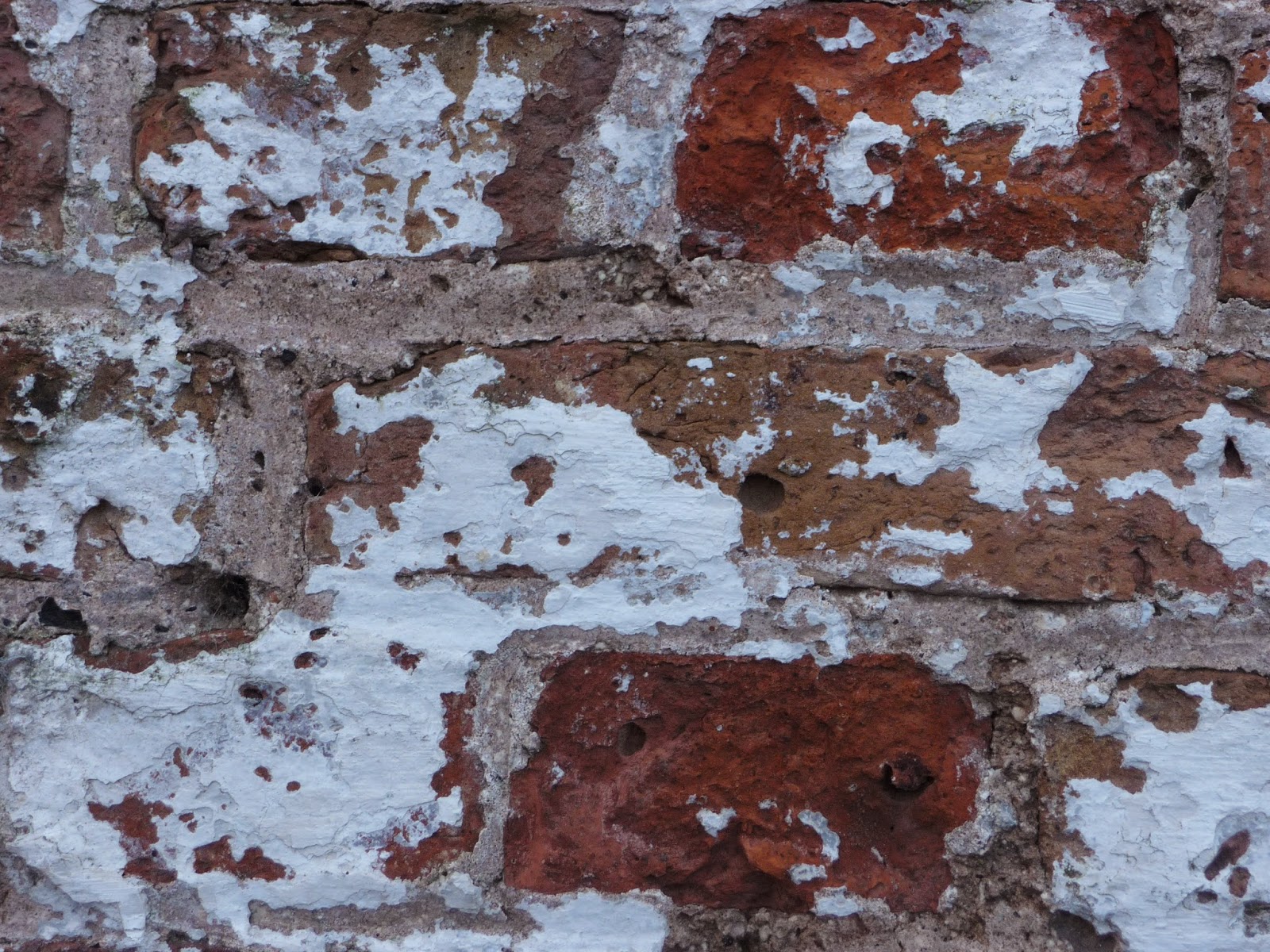
I like the way the untouched building on the left shows its history with layer upon layer of plaster and paint flaking off the wall. On the right the building is apartments but in places the flakiness is still evident almost as if the building is hanging on to its past.


From the warmth of my car I tried to draw what I was seeing but didn't get the proportions right and it was too tight and controlled.

What I wanted to do was show the difference between the renovated and the untouched but it didn't work. I went closer to try to capture the feeling better.
As I walked back to the car I looked over the road and saw a building that simply said "draw me" so I did.


I feel happy that this is nearer where I should be. It has the sense of freedom that I like and the perspective that I've found tricky looks OK.
I have found this exercise difficult for more than one reason; the weather, feeling unable to find suitable material and becoming frustrated and then demotivated.
Two days later:
I've hit very cold, wet and windy weather and simply been unable to draw outdoors. I have taken photos and tried to draw from them but I find it really unsatisfying. As well as that my work from photos lacks fluidity and spontaneity. The fallout is a lack of excitement and motivation - the first time this has hit me on Drawing 1. I'm not sure how to handle this problem.
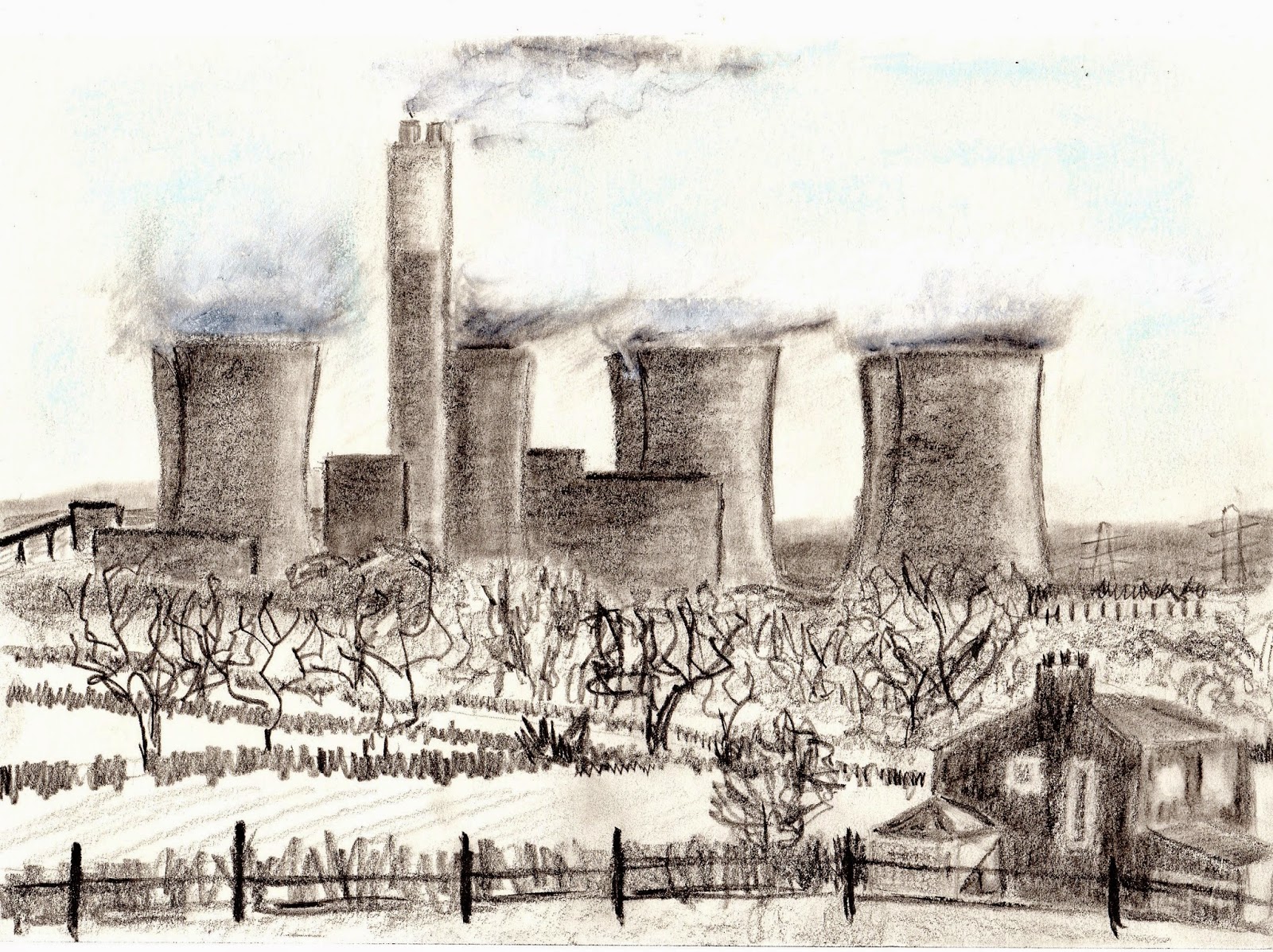
This is what I've drawn.
 |
| Retford Station 1 |
I took notes just as I would have if I'd been able to sketch. The brickwork is a lovely honey colour - not at all a local feature and the metal supports and doorways are very ornate. The whole station looks well maintained.When I took my photo the station was deserted and I recorded in my sketchbook how desolate it felt. It was late afternoon when I was there and the low, intermittent sun made the walls look bright now and then and the shadows were fleeting.
When I was drawing this photo I realised that it wasn't the sort of sketch I enjoy doing. In the countryside I felt able to make bold, swift marks and copying a photo just didn't hit the spot.
I drew from another photo and made a conscious effort to keep marks more fluid. The view is slightly to the right of where I was before.
 |
| Retford Station 2 |
This feels a little less "tight" and it was certainly done a bit quicker. There's less detail but more feeling in this work.
The ornate supports for the roof are rather lovely.
 |
| Retford Station - detail |
I went to other end of the platform and tried to draw but it was far too cold.
 |
| Retford Station - unfinished sketch |
When the weather was awful during my rural sketches I stayed in the car but I've found it much harder to park in town and get a view I want to draw. There's some thinking to be done.
I decided to re frame my strategy and look for a place to park my car then see what was on offer. I went to Gainsborough which in the past had heavy industry and has an interesting river front. There were some old buildings that used to be maltings but are now apartments.
I like the way the untouched building on the left shows its history with layer upon layer of plaster and paint flaking off the wall. On the right the building is apartments but in places the flakiness is still evident almost as if the building is hanging on to its past.
From the warmth of my car I tried to draw what I was seeing but didn't get the proportions right and it was too tight and controlled.
What I wanted to do was show the difference between the renovated and the untouched but it didn't work. I went closer to try to capture the feeling better.
As I walked back to the car I looked over the road and saw a building that simply said "draw me" so I did.
This is built of red brick but it is dirty and run down. The roof is slate and has some moss on. I liked the idea that it looked as though it was "To Let" but in fact the sign refers to one of the apartments on my side of the road as are the railings. Because the area is built up and the river runs alongside the building I couldn't look at the building from another angle so I did a tonal sketch to try to immerse my self a little more.
And then I used light water soluble crayon to subtly tint my drawing. The use of heavy colour seemed wrong as the scene was very dull and devoid of bright colour.
I feel happy that this is nearer where I should be. It has the sense of freedom that I like and the perspective that I've found tricky looks OK.
I have found this exercise difficult for more than one reason; the weather, feeling unable to find suitable material and becoming frustrated and then demotivated.


.JPG)