Search This Blog

Thursday, 1 January 2015

Part 3 Project 4 Ex 3

Aerial or atmospheric perspective


This section is about another sort of perspective, aerial or atmospheric perspective.  The principle is that the further away the object to be drawn is the smaller, paler and less distinct it will look.

It is almost New Year and although there is still snow on the ground it is sunny and bright.  I'm lucky to have the Idle Valley Nature Park on my doorstep and I thought this would offer me scope for a few sketches and the chance of a walk.  The Park has been developed by the Notts Wildlife Trust from old gravel workings so there's lots of water and all the attendant wildlife.  It's a wonderful place.

This is the start of one of the pathways:

Willow arch pathway

We were lucky enough to see a kingfisher:


....and take lots of lovely photos.


It was pretty cold to be hanging about so I did a couple of 5 minute sketches that I worked on later at home. Each of these were no more than 15 minutes in total.


Looking over the lake at the Idle Valley
Charcoal and soft pastel


Field with fence at the Idle Valley
Charcoal and soft pastel


There's another wildlife haven I often go to called Treswell Wood.  It is ancient woodland again run by the Wildlife Trust. Recently they have bought a piece of farmland that fills in a gap in the wood and I visited to see how restoration work was progressing.

It was another cold, bright day and the view I sketched was looking over the valley.  I completed it at home as my fingers got so cold.


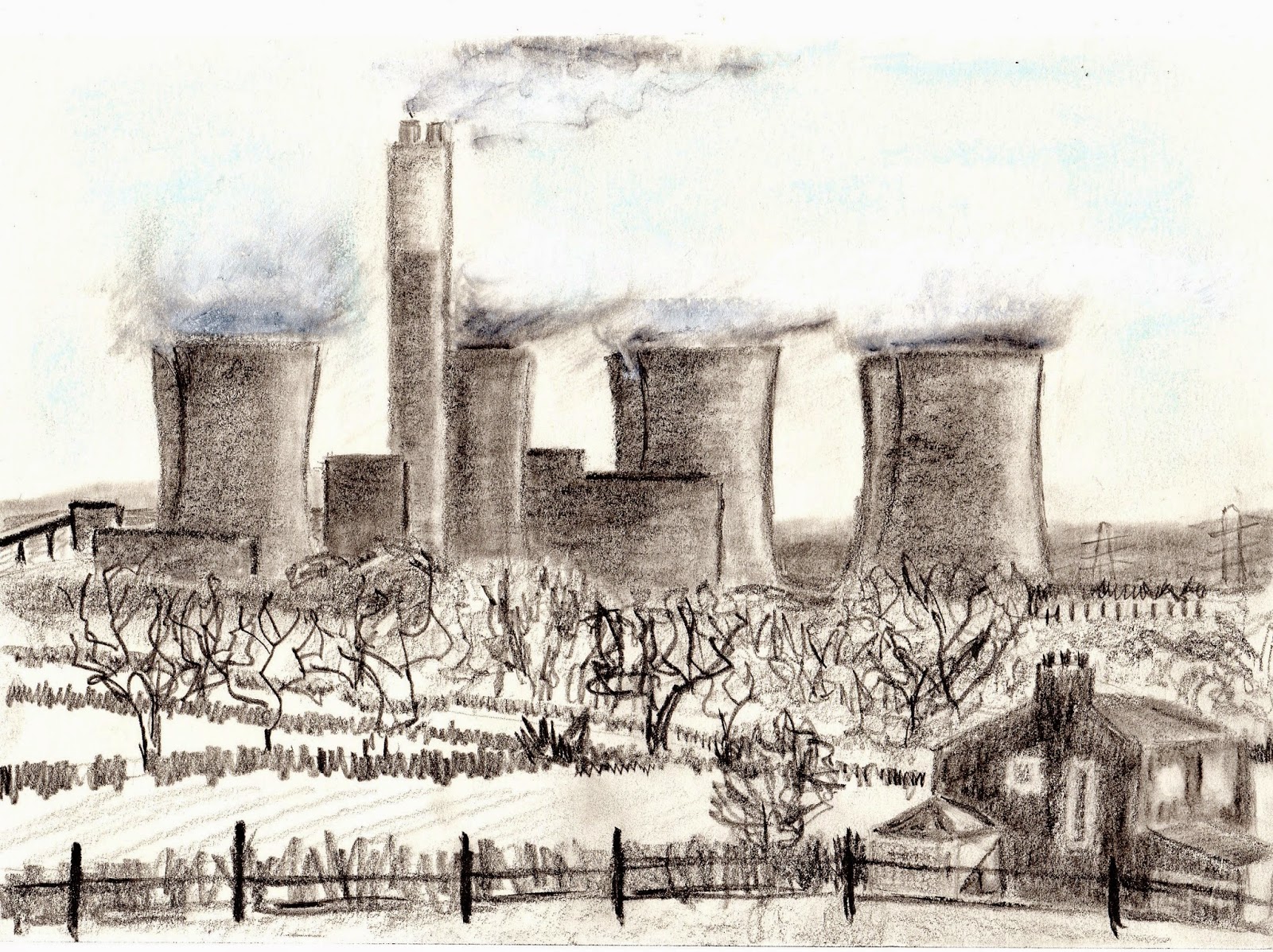
Cottam Power Station from Treswell Wood
Graphite stick, pencil,soft pastel and charcoal

I spent more time on this mainly because it was more involved and I used different materials.  I'm really enjoyed making marks to represent things.  The hedge for instance is just a closed up squiggle.

I'm a glutton for punishment and on New Years Eve I went to the flood bank at Littleborough.  It's a desolate place - wild, lonely and very remote.  Just over the river is Lincolnshire.

The day was another bright and sunny one but the wind from the river was bitterly cold.  I took my small sketchbook and some pencils and did a couple of rapid sketches but I had to give up because my fingers became cold so quickly.  I intended to carry on at home but I really didn't have enough of a basis to work on.  I decided to use my sketches as an aide memoire and supplement them with photos taken from a similar position.


My very quick, inadequate sketch


These sketches show the Folly on the snowy hill and at the bottom of the hill winds the River Trent.


The Folly from Littleborough


I find this drawing too busy.  I drew exactly what was there and I'm beginning to understand that I can leave some things out and get a better result.  I often draw water and I'm going to have to put some work into learning how to do it properly.


Lincolnshire from Littleborough


I like this much better because it's more atmospheric - it looks like a cold day.  In the foreground is snowy, boggy land with marsh grass.  In the mid distance there's the River Trent and the bank followed by a few fields.  In the background indistinct trees and hedges.

I used charcoal and conte crayon and held them on their side for much of the time.  The hawthorn on the left is in heavy pencil. The grasses were done with quick upward and downward movements at a variety of angles.

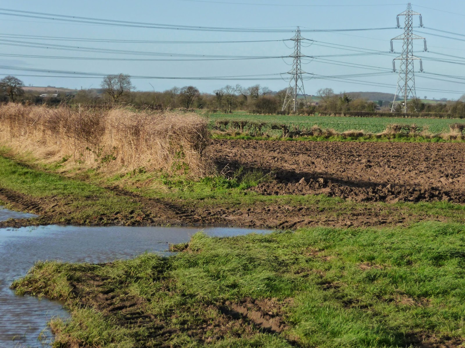
Until I started to draw the landscape around me I hadn't appreciated just how dominant the power stations are.  It was a bit of a relief to look over into Lincolnshire and see no pylons or looming cooling towers.


Monday, 29 December 2014

Part 3 Project 4 Ex 2

Two point or angular perspective


It is the day after Boxing Day and although the weather is bright the ground is covered in a substantial depth of snow.  In view of that I've opted to draw a pile of books on a table rather than a building seen corner on.

I am reminded of my very first work on this course and how I tussled with drawings books on a table.


My early drawing of books on a table


I can only hope that the things I've learnt help a bit!


I now know that what I was attempting was just too complicated for someone who didn't know what she doing!


Only in the interest of honesty in my blog am I including this.  I've marked on my eye level and drawn in some perspective lines but it seems so wrong I couldn't continue.  I think maybe it's the fact that all the books are at a different angle.  I ended up getting so frustrated I put it to one side hoping that something would drop into place.

Fortunately the following day there was less snow around so I was able to draw the corner of the barn.


I felt fairly confident in what I'd drawn only to find it was very inaccurate when I drew on the perspective lines.


The barn on the corner


The barn on the corner with perspective lines


Once again I can see clearly that it's not right but at the time I drew it looked OK.

I went back to the building and had a closer look (see photo).  There was snow on  the ground that stopped me getting a proper base line and the walls were well out of square which ever way I looked. However, all that did was to make me a more difficult job and I should have spotted the problems before I started.

I'm understanding 2 point perspective intellectually but practically I'm floundering.  Time for some practice.


I've found a  you tube video that gives me a bit of help (1) and so I'm going to give it a try because it means lots of practice so I might get my head around what I'm doing.


Cityscape after Tom MacPherson (1)


This was an excellent way to try lots of angles and I've gained a better understanding of what I'm doing and why.  I've been unexpectedly plunged back to my schooldays when my constant question in maths was "why" or "how" and I've realised that what I've been doing is very maths based.

I'm hoping that the work I've done will give me a good grounding for the townscapes that are coming up in the Project 5.

My next task in this exercise is to check the accuracy of the perspective in a drawing by Sir Muirhead Bone.  Rome was sketched in pencil in 1910.

From OCA manual


I was asked to copy a simplified version of this image then superimpose the perspective lines.  I stared at my blank paper for ages and simply couldn't fathom out where to start so I took a photocopy and used that.


The accuracy of the drawing is variable - some windows are out of alignment and there are lots of curves around.  The perspective lines are all in the same general area so I am beginning to conclude that "good enough" is OK although in a sketch.  That's not to say it should be sloppy!  An architectural drawing would need to be much more accurate but then it wouldn't need to be sensitive as this sketch is.  Horses for courses I think.


(1) https://www.youtube.com/watch?v=yNq78n02fMQ

Saturday, 27 December 2014

Part 3 Project 4 Ex 1

Parallel perspective - an interior view


I find perspective both intriguing and difficult especially when I'm indoors.  It seems like ages ago that I did a sketch looking from the hall into the kitchen and found it tricky:


I decided to try a similar but less complicated drawing for this exercise.  I sat at the point in my sketch where the door in the mid distance is open but found I couldn't get the scale right never mind the perspective.   As I discouraged from using an eraser and my mistakes were starting to lead me astray I abandoned this sketch having learnt that I need to measure to get the proportions right.


I realise that the door frame isn't tall enough and the fridge is too broad and squat.  The distance between me and the fridge is too big.  It's a mess but I did come to know that I learnt my lesson about the difference between guesswork and measuring!

I simply turned round my chair and drew the view into the hallway.  This time I did lots of squinting and holding up my pencil to get the proportions right.  I'm always amazed that in the distance things look much smaller that I think particularly when they are foreshortened (like the rug in my sketch).

The view into the hall marked with my eye level


I did my best to draw what I saw and had the make some adjustments particularly with the skirting board in the foreground.  Next I put on the perspective lines - how wrong can you be?

I superimposed perspective lines

I began my lines by putting in the sides of the hall as my markers (purple) and found that I wasn't too bad on the right but the left was miles out.  Where the hall receeds through the opening the skirting boards weren't at a sharp enough angle.  However, the rug I struggled with wasn't too bad.  The changes to the floorboards and the slate tiles prompted me to look at the foreshortening in the foreground and I put these on the drawing with darker pencil marks.

Foreshortening of the slate tiles in the foreground.


This work has serious implications for the drawing of buildings and townscapes that are fast approaching.  I'm not sure how to apply this from a practical point of view but I can foresee that starting with a level and some basic perspective lines might be a way to go.

Tuesday, 23 December 2014

Part 3 Project 3 Ex 1 & 2 Reflection

I am required to reflect on the last two exercises and there are four points for me to consider.


Ex 1 - Wintry Landscape


Ex 2 - Trent Valley Pylons


How did you simplify and select?  Were you able to focus on simple shapes and patterns amid all the visual information available to you?

I used my viewfinder to make my selections.  My part of the country is very flat and at first I was unsure how to make an interesting composition. I found things like the tree and the blue bale of hay made a focal point and were balanced by the poles carrying cables.  In Wintry Landscape the watercolour I used forced me to think in blocks of shape.  I didn't draw trees or hedges I simply made marks that looked like them.

How did you create a sense of distance and form?

In Ex 1 I used the idea of things getting smaller as they get further away.  For instance the lane and the poles seem to recede into the distance.  I used marks to depict landmarks and colour to shape things a bit.  The lane was very wet and I used a little Payne's Grey on a brush that I rolled across the paper to leave white patches that look like the wet tarmac.

Were you able to use light and shade successfully?

I struggled with this a bit.  The weather was generally dreary so there was not much by way of clear shadows. However, I noticed that the bottom of the hedges was usually much darker than the top and indentation on the ground gave a darker tone (tractor tyre marks Ex 2).

What additional preliminary work would have been helpful towards the larger study?

I felt very hampered by the weather during this work.  It would have been lovely to work outside much more.  My water soluble pencils didn't arrive until my work was finished so I still have to play with them and see what they can do.  


Monday, 22 December 2014

Part 3 Project 3 Ex 2

Foreground, middle ground, background.

I changed the position of the pylons
in my drawing to try to get distance


The area I live in is quite flat and some might say uninteresting.  I might have said so myself until I started to do sketches and think about composition.  At first I was troubled because it was hard to find a focal point but I have realised that a focus can be anything not necessarily something really powerful like a building or a beautiful tree.

In this drawing the focus is the pylons which disappear into the distance and diminish in clarity.  In the foreground is a hedge which is covered in dead goose grass and a track that has been churned up by tractor tyres. In the mid ground is a ploughed  field and beyond the hedge a grassy field.  In the far distance the hills at the edge of the valley.

The image is developed from one of my 360 deg sketches but taken from a slightly different angle. I went back to do some checking on the pylons and look at the perspective more closely.   I took the photo above and worked from that but tried to incorporate the feel of my original sketch with the towering pylons.

I went to the site just before mid day and it was bright and very windy - I had a hard job to stand up. The sun shone on the pylons and cast a shadow from the near hedge.

.

The image here is cropped simply because my scanner is A4.  In the original (A3) there is a large puddle in the immediate foreground that is only just evident on the left here.


Trent Valley Pylons

I used graphite pencils on cartridge paper.  My manual suggested I should try water soluble graphite but I haven't any at the moment. I used charcoal for the sky and smudged it vigorously.

I tried to capture the expansiveness and the bleakness of the scene and I think monochrome helped with this. I didn't want to draw images of hedges, trees, grass and so on but to represent them with suitable marks rather in the way that van Gogh did in my previous post. I also tried to use the rough paper to get texture and tone as Seurat did.  The ploughed field worked well in this respect. The detail below clearly shows how I managed to get the pencil to skip over the paper leaving white paper visible.


Trent Valley Pylons - ploughed field detail

This is the first drawing I've done where I've manipulated the scene to suit my purposes (I wanted the pylons to indicate distance).

Part 3 Project 3 Research Point 2

This research point asks me to compare the approach of some contemporary landscape artists. It is suggested that I start by looking at Tacita Dean's blackboard drawings and Seurat's Landscape with Houses.

Seurat I have come across often but Tacita Dean is an unknown quantity so I'll investigate her work first.

Tacita Dean b1965 - 


Tacita Dean (1)


Dean used chalk in her earlier career then moved on to work in film.  After a ten year gap she returned to chalk and drew Fatigues in 2012.  Nothing unusual there except that this work was truly monumental in size. What is amazing is that the space available was a two story building. The work depicted the mountain peaks of Hindu Kush slowly moving down into the space as descending rivers, snow melt and eventually flood; the bringer and taker of life.


Fatigues - Tacita Dean 2012 (2)

The images are awe inspiring as individual works but together they must be wonderful as they tell a story.


Fatigues (detail) - Tacita Dean. 2012 (3)

If ever there was an object lesson in tone it is in this work.

But how does it compare to Seurat?

Georges Seurat - 1859-1891


Georges Seurat - self portrait (4)


My notes suggest that I look at Seurat's Landscape with Houses:


Landscape with Houses - Georges Seurat.  1881-2
Conte crayon. 10x 12.5 inches (5)

I have looked at Pointillism in the past and admired the use of colour but been unaware that Seurat drew so beautifully as well.  I can't really see in a detailed way how the marks are made but there are quite wild ones on the left that I think might be tree branches.  There are trees in the background and the whole image is very hazy and indistinct and the foreground lacks detail when you might expect something different.

Margaret Davidson (2011) believes that Seurat was the first artist to explore the way the medium and the paper interrelated.  Seurat experimented with textured paper and crayon to produce a speckly, broken tone.

Davidson says this technique works in 3 ways

  • It prevents strokes from being too detailed or too refined
  • It requires the artist to draw form according to light and shadow ... and not according to an outer edge, contour or detail
  • It forces every crayon stroke to break into dots of black and white. 
This technique is very definitely Seurat's as no other artist has developed it (Davidson, 2011).

Whilst I was looking at these I was reminded of the landscapes of van Gogh so I decided to incorporate one into my comparison:


Farmhouse with Wheatfield along a Road- van Gogh, 1888 (6)

This work by van Gogh is everything I wish I could do.  The marks are deceptively simple but the wheat  is rhythmical as blows in the wind.  There is the portrayal of distance and the trees on the horizon become just smudges.

I recently became acquainted with the atmospheric landscapes of Nicholas Herbert so I've compared one of his drawings as well. L774 has the same feel as the Landscape with Houses; hazy and difficult to grasp.

L774 The Chiltern Hills - Nicholas Herbert. 2014 (7)

Herbert's work seems very spontaneous and immediate.  I find it quite inspirational but it seems well beyond me right now.

For the sake of clarity I've used a table to identify the similarities and differences between these artists and their work.


Fatigue
Landscape with Houses
Wheatfield
L774
Herbert
Monochrome
x
x
some brown ink
x
Large
x


Small

x
x
x
Chalk
x


Conte crayon

x


Acrylic


x
Soluble crayon


x
Pencil


x
x
Pen


x

Panoramic
x


Mid view


x
x
Close up view

x


Tonal
x
x
x
x
Artist uses other media
x
x
x

Paper

x
x
x
Board
x


Quick sketch

x
x
x
Lengthy endeavour
x


It has been interesting to compare work in this way and find the only similarity across all the pieces is tonality.


Davidson, M. (2011) Contemporary Drawing. Watson Guptill, New York.

(1) http://arteseanp.blogspot.co.uk/2013/10/tacita-dean.html
(2) http://vmagazine.com/site/content/639/analog-dream
(3) www.mariangoodman.com
(4) http://wortleyvillage.net/postimp/G_Seurat/indexB.html
(5) http://www.metmuseum.org/collection/the-collection-online/search/337676
(6) http://www.vangoghgallery.com/catalog/Drawing/912/Farmhouse-with-Wheat-Field-along-a-Road.html
(7) https://nicholasherbert.wordpress.com/

Wednesday, 17 December 2014

Part 3 Project 3 Ex 1


I've made a shortlist of images I might develop and I plan to look at them with the previous post in mind. That is - I will consciously look at the composition rather than let it just happen (or not).
Here the horizon is in the centre and that is solely due to my being sat in the car.  If I stood it would be lower. A way round this would be to crop the sketch and reduce the foreground.


This follows the Rule of Three rather better but I think it loses the expansiveness of the scene and the long sweep of the lane.  It loses the leading lines.  If I use this I'll have to go back and try another sketch and try a different viewpoint.  I might be able to go nearer the hedge as well if the weather improves and I can get out of the car for a few minutes.


Again the horizon is pretty well in the centre but this time there is not such a bend in the lane so the leading lines of the lane are much more vertical.  I can't crop this because I would lose the plastic covered bale and that (and the tree) balances up the hedge and the poles.  Again a site visit is necessary if I am to pursue this sketch.

It is now some time since I wrote the paragraphs above because I've been away and Christmas activities are building up.  I took the opportunity this lovely sunny morning to pay a visit to the place where I made these sketches.  I got out of the car and had a wander up and down and still settled on the view I had sketched.  I took a photo.


I have become very interested in pursuing water colour drawing and I thought I'd have a go at this.  I have learned that water colours need planning so I made a plan that involved working out which panels should be painted first.  I did them in this order:


  1. sky
  2. tarmac lane
  3. green verges
  4. far horizon
  5. mid distance 
  6. hedge
  7. the rest
and it worked out OK.

Wintry Landscape


From the point of view of composition I'm fairly happy.  The tones on either side of the lane balance and the power lines and the tree do the same.  The vectors take the viewer through the image to the horizon way in the distance.

The lane was very wet, flooded in parts, and I'm pleased that the water is evident on the road.  I'm also unexpectedly pleased with the deep ditch on the left, it has worked better than I had anticipated.  I like the textures I've managed to achieve but the grass could do with a bit more work.

On reflection I think this piece is a bit too busy for me to manage at my very inexperienced stage.  I have made some crops that simplify things a bit.

Not quite balanced

I still need the tree

I think I prefer the full version.  I enjoyed doing this and I've learned a lot about what's realistic for me to do using the skills I have.