Search This Blog

Sunday, 28 June 2015

Part 5 Petal colours

The garden is full of colour at the moment with lots of purple, pink and blue.  I wondered about trying to capture the colour just by using the petals of some of the flowers.

I have a lovely old rose that really needed dead heading


so I gathered some petals and liquidised them.


It took this amount of petals


to get this amount of colour


It took a while and a bit of water but I got a lovely (if pale) lilac colour.  My first sample was with the inclusions but then I sieved it and took some of them out.

I used this as a wash and then tried scrunched up peony petals using one of my spiky leaves as a stencil. 

Pink peony


 The colour was more vibrant than the liquidised rose petals.  I did the same with delphinium petals.


Blue delphinium


Petal colours - showing inclusions

I scanned it immediately because I anticipate it going brown pretty soon.

I subsequently tried scrunched up rose petals but they were just as pale as the liquidised variety.

I like the idea of using not only plant material but plant colours as well.

Inspired by this success I took my sketchbook round the garden and tried some further samples.


My paper is absorbent and soon roughed up when I applied pressure - the more watery the material I used the less that happened.  Most samples stayed true to colour but the bright orange of the alstromera and the day lilies went a brown and a pink respectively.  Th purples are stable and the snapdragon is brilliant, Quite literally. Predictably the tomato and the salad leaf gave lovely greens although not vibrant.

I'm going to try some smooth watercolour paper to see if it stays intact.

I began by using the sedum over the whole page and then adding salad and tomato leaf.  I found with the darker colour of the salad and tomato I was able to make more controlled marks.


Getting a decent image to put on my blog was a very different task and neither of these are anything like the real thing.  It is not bright green but neither is it washed out but I hope you get the idea.

I'm going to introduce some flower colours without any knowledge of what will happen when these are combined!

Scary.  But this is what turned out.

Garden flowers 

I used the auto adjust on the computer and this gives me the best representation.  It's not far off this time.  I'm quite pleased with this but I've got my fingers crossed for stability.

Thursday, 18 June 2015

Part 5 Early thinking

The final part of Drawing 1 demands that I invent my own project and work through to a conclusion.

I have decided to re visit Part 2 "Your Own Environment" and work in my garden.  It is always accessible (unlike life models) and can offer something come rain or shine.  In 1998 we were lucky enough to buy an acre of land.  We took a year to build our house and then set about the garden which was just rough ground.  Sixteen years on it is our pride and joy.  Hard work aside it is now a lovely, comfortable place to be all through the year.  It has a bit of everything.

But where to start?

The manual gives me some points to consider


  • subject - my garden
  • format - landscape
  • support - Japanese paper (became lining paper)
  • medium - mixed
  • line, tone - combination (became line)
  • composition -experimental
  • mood, story -  the excitement of texture and form
  • abstract or realist - abstract
  • light - natural light - natural
  • size - less than A3 (became almost A2)


Not many items filled in there!  As I make my decisions I'll come back to this list and fill in the blanks with red


Maybe a little look at what I'm working with will help.


Views ....


.... tranquillity .....

and a bit of bling


The garden is exciting and it is this that I want to work on in Part 5.

I took my camera out to see if I could capture "exciting".  What I found surprised me with its variety; sometimes it was colour, sometimes form and sometimes exciting combinations.


Super combinations

The beautiful heuchera

The weird bearded iris

Orchids that arrived unbidden

Majestic foxgloves

Acanthus

Dawn redwood bark


Exciting leaves


The leaves in the last photo are very curved and I wondered how they would flatten with a view to printing.  To test this I scanned one and it flattened really well.  

The leaf scanned well enough to see the veins


I'm a bit stuck because my printing equipment is behind a heavy wardrobe awaiting collection. While I wait I decided on frottage to see what would show up.  I used copy paper and a chunky graphite stick.

Grey scale

Black and white

I was surprised that so much came through as the leaf is quite thin.  The sharp spikes are very obvious particularly on the black and white version.  There is potential for interesting mark making here.  Here are a couple of crops:


From grey scale

From B & W


I took another leaf, this time a softer one (heuchera)

Heuchera

and tried several combinations of paper and rubbing media:


The purple was wax crayon on cheap tissue and gave an indistinct impression probably because if I pressed hard the paper tore.  The mid pink was also wax crayon but on tracing paper - this too was fuzzy but in a more "foggy"way.  The red was wax on copy paper and was much more literal.  Finally I used my chunky graphite stick on tissue - a delicate manoeuvre.  This gave a very clear impression with each part of the leaf looking tree like.


I was going to try some coloured paper but I got waylaid by some blue foil.  I tried rubbing on both sides and whilst at the moment I can't see where it might go the effect was interesting.  It reminded me of blowing ink in an earlier part of the course.  It fits with the spikiness of the previous leaf.  One to bear in mind I think.


I repeated the grey scale and black and white experiment again and this is what turned up.

Grey scale

Black and white

A crop of the lower black and white scan makes an interesting image.


It looks like a mountain range from Google earth and it makes me want to stitch.

At this point I have decided to concentrate on texture.  This is no great surprise as I am enrolled on the Textiles degree.  This means that I will probably be focusing on the minutiae of the garden as I have today.


These are a couple of promising websites that I've earmarked for further investigation later on.

http://tondro.com/blog/category/leaf-monoprint-process/

http://blog.heathertelford.com/tag/art/


Monday, 8 June 2015

Expressive Figure Drawing - Bill Buchman

I've intended to make a mention of this book for quite some time.  I've used it extensively during Part 4 because it is so very uplifting - it is what I aspire to and where I want to be.


(1)


The text covers the fundamentals of expressive figure drawing in an easily accessible way and gives exercises and strategies for the beginner.  There is an extensive chapter about materials and their use as well as concepts and techniques for gestural drawing.

There is a section about building mass with line and I tried this during Part 4.


Building mass with line - Buchman p77

My early attempt before I had seen Buchman
Me following Buchman's exercise

This exercise enabled me to understand that contours aren't always necessary and that volume can be built up in different ways.

The book is full of useful exercises that have introduced me to lots of new ways to work.  I particularly enjoyed the part on colour and made my own attempts:


The book concludes with a section called The Expressive  Mind Set and is devoted to encouraging self expression and emotional engagement with drawing.

The OCA course I am following aims to put in some building blocks for development and is I suppose necessarily prescriptive.  When I have finished what I have to do I really want to develop this way of working.  It is exciting, innovative and free.


(1)  Buchman B. (2010)  Expressive Figure Drawing.  Watson-Guptil.  New York.

Wednesday, 3 June 2015

Part 4 Reflections

It seems to have taken me a long time to complete Part 4 what with one thing and another.

I was pretty anxious about the availability of a life model at the beginning but I joined a group and hey presto I was drawing nudes.  It must be said that it was very expensive. I found I liked the shapes the body made and I was happiest when I was making expressive marks.  I found that I got pretty bogged down trying to make my figures from the group fit the requirements of the course but then all experience is good experience.

When I look though my work on this part of the course I'm amazed by how much  I've done and quite embarrassed by some of it.  That is particularly true of the early figure drawing. Drawing in a group of very competent artists was very intimidating.

I found drawing moving figures quickly very enjoyable and I'm beginning to think I'm better at this quick work than the more studied poses - they tend to die on me.

I can see a definite progression during Part 4 and increasing confidence to take a risk.  I am particularly pleased with the way pastels work.  I used them in my expressive figure drawing and more recently in quite a different way on my portraits.  It's something I will pursue in the future because I can see it has more potential than I had thought.

I have become very involved is art locally and have found the people both welcoming and generous with their advice.  My tastes have changed as I have become aware of possibilities.

I continue to be very excited by my drawing and if I become disheartened I remember where I was a year ago!


Demonstration of technical and visual skills

This part of the course has been whistle stop with little opportunity to consolidate skills before changing direction.  I am beginning to feel that I have a set of skills I can use and I'm integrating my learning more easily that I have in the past.

I am noticing more than I ever have before; shadows, highlights, shapes and colours.  A particular example is the use of green in the skin tone for my portrait.  It's amazing that I noticed green but I did.  

I know I need to work on my use of tone.  I found pastels were helpful here.

I am more able to be constructively self critical and know where I need to spend more time.


Quality of outcome

I can be surprised by drawing something I think is good and horrify myself by doing just the opposite.

Now that my artistic toolbox is a bit more varied I find I can be a bit more selective about what I use and experiment more.  Sometimes a shot in the dark throws up something unexpected.

 I’ve come both creatively and personally.  I’m proud of what I’ve achieved but not complacent.

Demonstration of creativity

I'm much less bothered now about getting it right.  I've really found pleasure in just letting go and making free marks.  I know there is a basic underpinning to learn, perspective, foreshortening and so on but sometimes it's just good to draw what I feel.


Context reflection

I continue to learn a lot from looking around at what others do.  This ranges from books, the web and increasingly, people I have come to know during the last few months.

I am starting to know what I like and perhaps more importantly why I like it.

I reflect as I go to try to identify my strengths and put right those things that aren’t going so well.

I keep my learning log (blog) up to date because it’s a good record of what I’ve achieved.  I put everything in my log, warts and all, because most learning comes from reflecting on the mistakes.  


Part 4 has offered a very varied range of topics and I have found it challenging not least because it’s been a long haul. 

I hadn't really anticipated the personal growth aspect of Drawing 1.  The idea of continuing to develop well into my 60's has been something of a revelation and I feel very lucky to be of a generation that has the time and health to pursue a path that offers such potential.

Assignment 4c Portrait

In this final part of my Assignment I have freedom to choose my size of paper which is a relief. Although the A1 experience wasn't as daunting as I thought at first. I was doing full size figures and this made it easier.  A1 for a portrait would, I feel be way too big for me.  

I have decided to do a portrait of my husband and as I have done in the other work for my Assignment, play about a bit first to see what happens.  I liked the work I did without looking and I plan to pursue this.  I also enjoyed looking at the work of portrait artists and appreciating their differing styles and techniques. Some styles may be easier for a beginner to have a go at than others.

It might be a good idea to show a photo of my model.

Richard


Drawing without looking


There are always surprises when you look only at the model.  In this first image I used a white pencil crayon on Ingres paper.  I began at the top of the head and worked towards the left as far as the glasses then I went back towards the ear.  After that I got a bit lost and when I got to the mouth everything got jumbled.  It makes no difference because I just love it - in a strange way it it looks just like my model.


White pencil crayon on Ingres paper
(1 minute)

I liked the blue paper but had no more so I turned over and this time used  a white pastel pencil.  This time the image was a bit more consistent but towards the chin it went awry again.


White pastel on Ingres paper
(1 minute)

Blue ink on cartridge paper
2/3 minutes

This is much better but it's all relative!

I think these are fun but they have a serious side in that I'm getting more certain of where I am.

Working like Matisse


Self portrait - Henri Matisse (1937) (1)


This self portrait of Matisse is one I really like but I know its apparent simplicity hides a wealth of skill.  Nevertheless I asked my model to try to position himself as Matisse did so that I could work in this way.  I used Ingres paper in a pale colour and my charcoal pencil. I anticipated that Matisse would have dashed this off quite quickly so I allowed myself 5 minutes.


Richard
(5 minutes)

Once again my darks aren't dark enough and I found it hard to stick to less rather than more.  I need to check out how to draw eyes behind glasses.  The likeness isn't brilliant but the essence of my husband is certainly there.

I tried try similar with ink but I think I'll have to chalk it up to experience.  I know the effects I want but can't seem to get there.  This image is far too long in the face and I found it hard to get a graduated tone.


I do however like the way the ear has turned out.

I feel that I'm floundering around without focus.  Although I'm enjoying what I'm doing nothing is seeming to lead me towards my assignment piece.  My model is very patient but I don't want to push my luck.

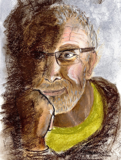
Maybe pastels is a thing to try although I've little experience and not had any tuition.  This is what I did in my sketchbook and I wish now that it had been on better paper.  I may have been happy to call it my assignment piece if I had.


The thinker

I managed to get the dark tones better than in the past and the texture of the hair and beard worked well.  It is a good likeness and I have captured the gentleness of the model particularly around the mouth.

There are some things I need to take note of:
  • the neck isn't good and when I started messing about with it it began to get worse.  
  • the hand is in the same league but it did improve with dabbling.

I often find these peripheral, but very important bits difficult; maybe there's a case for abstracting them.

Rather than try this again and probably be disappointed with it I'm going to do another sketch then develop it in pastel on Ingres paper.  I'm going to try to get some shadows by using strong lighting.

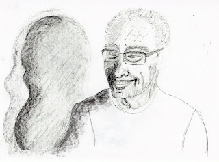
Richard and his shadow x 2

I thought these shadows were interesting and they give me the opportunity to do a landscape format portrait which is unusual. Now that I've drawn them I'm not so sure but I'll think about it.

I need to look more carefully at the eyes.

I decided to go for it and play with the shadow idea.  I photocopied my drawing and fiddled a bit. On my original drawing I was a bit worried that the shadow didn't look as though it was in the background so I darkened the tee shirt and it seemed to do the trick.

Darkening the tee shirt made the shadow recede


I semi abstracted the shadow

I fully abstracted it


Then I went back to the original.

I worked on a dark beige Ingres paper with my soft pastels (various brands).  First I did a light pencil drawing to  make sure things were in the right place.  Because of the size (A3) I couldn't scan it to show the whole so I took a photo as well.  As usual there is a big difference in the quality.


Richard and his shadow (scanned)

Richard and his shadow (photo showing the shadow of the shadow))


As I usually do I'll let the dust settle before I make any comments and subsequent alterations.

Twenty four hours and looking at my image upside down makes a bit of difference.  I thought the face looked a little skewed so I darkened the right cheek and it seemed to recede enough to change it for the better.  I also darkened the shoulder for the same reason.

I darkened the teeth to get rid of the tombstone effect.

This is the outcome.


I think there is still a bit of  twist to the face but to mess about too much risks getting rid of what is OK.

What is OK?


  • the highlights
  • the proportions
  • the likeness
  • the neck is much better than the previous try
  • the composition has atmosphere
  • I'm getting better at tone - even the shadow has tone

I'm happy.


(1) http://www.henri-matisse.net/drawings.html